
If you’ve created visuals for different data sets, you know it’s not as simple as pushing a button and changing a few colors. There’s a lot of thought involved before you even get to the visualization part — at least there should be if you want your visuals to be effective.


Just so you know
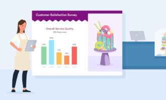
Jotform Report Builder lets you visualize your form data with auto-generated reports — for free! Collect and analyze survey data to make better decisions for your company.
To help you ensure your visuals accomplish their goals and don’t take too long to create, we turned to several experts to share their data visualization best practices. Keep reading to see what they recommend.
Data visualization best practices
- Always know your audience
- Provide context
- Remain unbiased
- Plan before you design
- Ensure data is accurate
- Develop visuals in iterations
1. Always know your audience
Michael Yurushkin, CTO and founder of BroutonLab, recommends keeping your target audience in mind when designing your visuals — as well as the specific business questions they’ll have. “Be prepared to adjust your design approach if needed,” he says.
For example, if your audience consists of executives or other senior leaders, they might have only a few seconds to review what you’ve created. So ensure your visuals present key points they want to know about — using the simplest design. “Anticipate their needs and find the easiest way for them to consume the data you’re showcasing,” Yurushkin says.
2. Provide context
Context is essential whenever you’re communicating data — even in visual form. Yurushkin says you must provide the audience with a clear backdrop of what they’re viewing, especially as it compares to what they deem important.
For example, the audience may be concerned about certain goals or past performance. Be sure to let them know how the visual data relates to these concerns.
“You can even give them a brief summary of how you discovered the data so they can understand the logic behind the data. That way, your audience can better interpret what they’re viewing,” Yurushkin explains.
3. Remain unbiased
“When visualizing data, it’s easy to display it in such a way that supports your hypothesis,” says Kevin Bazazzadeh, former scientist and current owner of Brilliant Day Homes. “We are all faced with the dilemma of how to make our work valuable. Have integrity and don’t misrepresent the data to meet your own agenda, even if it’s on a subconscious level.”
4. Plan before you design
“The worst visuals I created throughout my career were ones where I didn’t have a clear idea of how I wanted to display the information beforehand,” Bazazzadeh reveals. He notes that it’s easier to just start working on a visual and see what it turns into. However, once you go down that path, you put unnecessary limitations on your design efforts. He recommends taking “the time to determine the best way to visualize the data before backing yourself into a corner.”
Elliott Simmonds, associate director at DJS Research, says it’s useful to plan your visuals on paper or in a simple software program first and then run them by someone who is less involved with the data. They may see gaps that you’ve missed since you’re so close to the subject.
“Fresh eyes can highlight things that seem superfluous and can, therefore, be ignored. Someone else may also be able to identify where data points need to be better explained to emphasize why those points are important to the overall data narrative,” Simmonds says.
5. Ensure data is accurate
“Nothing loses trust in a visualization faster than questions about the underlying data’s validity,” says Travis Fell, product manager at Hypori. Whoever develops or presents the visuals must at least know the data source(s) and be able to speak to the data’s quality. If the audience can’t trust the data, they can’t trust whatever conclusions you want them to draw from the visuals.
6. Develop visuals in iterations
To give your visuals the best chance at success, Fell recommends showing a basic version of what you design to a small set of test users. Ask them whether it solves their problem and whether they have any concerns about data quality.
“Capture their feedback, and then create the next version. Repeat until your users have enough confidence in the visualization to make informed decisions about the business or their workflows,” Fell says.
If you aren’t already abiding by the above data visualization best practices, try implementing them in your organization. These practices are sure to give your visuals the foundation necessary to maximize their effectiveness.
Bring your visuals to life with Jotform Presentation Agents
Following best practices is key to creating effective visualizations, but how you present those visuals matters just as much. That’s where Jotform Presentation Agents come in.
These AI-powered tools turn your data insights into fully guided, voice-narrated presentations that are easy for any audience to follow. Simply input your visuals and key findings, and the agent will generate an engaging, slide-by-slide walkthrough. Whether you’re sharing campaign results with clients or presenting trends to internal teams, Presentation Agents ensure your visuals are not only seen but understood.
Start with a professionally designed template or build from scratch, and let your data tell the story it was meant to. With Jotform, creating impactful, audience-ready presentations is easier than ever.


Send Comment: