Jotform’s Grouped Values Dropdown widget lets you organize dropdown choices under labeled categories, making it easier for users to find what they’re looking for. Whether you’re listing products, locations, or service types, this widget keeps things neat and easy to navigate.
Here are a few ways to use it:
- Organize Large Option Lists — If your dropdown has dozens of items (like countries, departments, or product categories), you can group them into sections so users can find what they need without endless scrolling.
- Simplify Product or Service Selection — If you’re selling multiple product lines or services, you can organize them into groups, like “Electronics,” “Furniture,” or “Clothing,” so customers can zero in on the right category fast.
- Make Forms Easier to Navigate — Instead of overwhelming people with a long list, this widget helps break things down into logical chunks, giving your form a cleaner, friendlier feel.
- Perfect for Registration or Application Forms — Use it to group things like school programs, job positions, or event sessions—making it clear and simple for applicants to pick the right one.
Notes
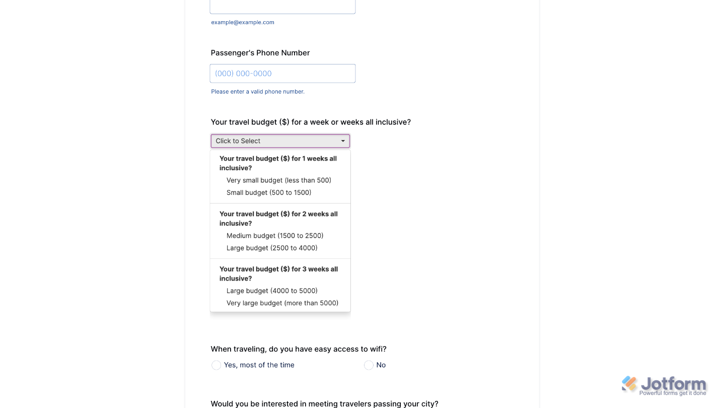
- Each group of options appears under a labeled heading in the dropdown, similar to a menu with subcategories.
- Users will be able to pick just one option from all the grouped choices added in the widget.
Adding and Setting Up the Grouped Values Dropdown Widget
Split your dropdown menu into multiple categories with the Grouped Values Dropdown widget. It only takes a minute to set up. Here’s how:
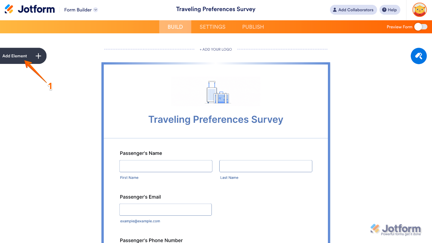
- In Form Builder, click on Add Element on the left side of the page.
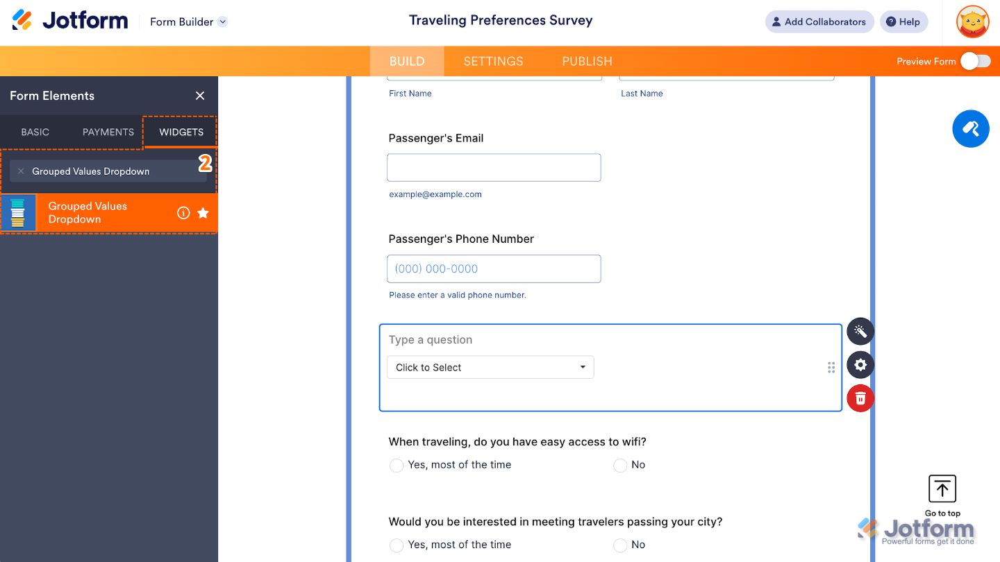
- Now, in the Form Elements menu, under the Widgets tab, search for Grouped Values Dropdown and then click on it. Or, just drag and drop it to where you want it to be on your form.
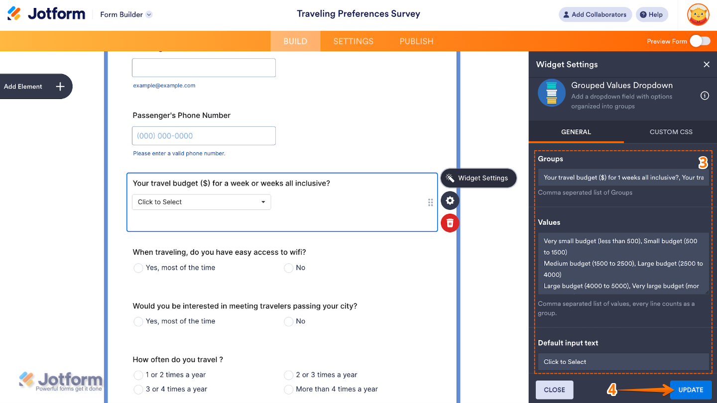
- Next, in the Widget Settings window that opens on the right side of the page, set up the following options:
- Groups — Set this up to define the categories or group labels that will organize your dropdown options and separate each one with a comma.
- Values — Enter here the list of items to appear under each group label.
- Default Input Text — Edit this to add placeholder text shown in the dropdown before a user makes a selection.
- Once you’re done, click on Update.
That’s it. You’ve successfully added and set up the Grouped Values Dropdown widget to your form. Now, you have a field in your form that lets you display a long list of dropdown options organized by categories or groups, making forms easier to navigate. Wondering how it looks in action? Check out this Demo Form.
To further customize how the widget looks, click on the Gear icon to open its properties.
Note
For advanced styling, you can add your own custom CSS under the Custom CSS tab in the widget settings and style the Grouped Values Dropdown field. Our guide on How to Inject CSS Codes to Widgets walks you through everything.

Send Comment: