Comparison Table Widget
Comparison Table Widget Features for Websites
Help visitors choose with confidence by comparing plans, products, and features side by side. Build columns and rows, fill cells with text, checks, crosses, limited marks, or star ratings, highlight your recommended option, match your brand, and keep the table readable on every screen — all without coding.

Compare Options Side by Side
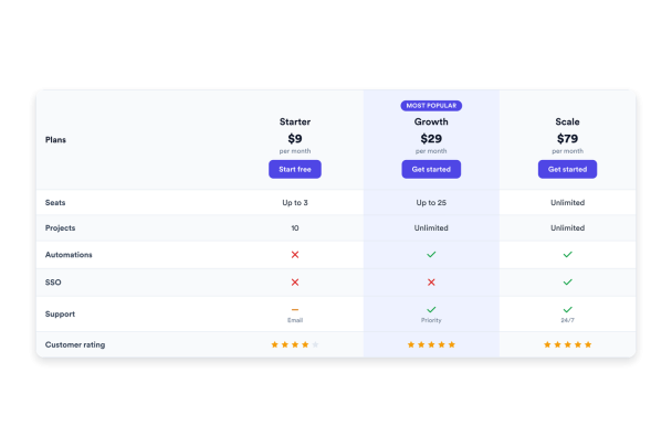
Lay out plans, products, or services as columns and features as rows so visitors can scan differences at a glance. Fill every cell with the format that fits — plain text, a check for included, a cross for missing, a limited mark for partial, or a star rating — and add tooltips to explain features that need context.
Cell types include:
Highlight the Plan You Want to Sell
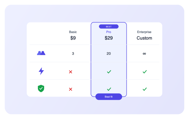
Guide visitors toward the right choice by marking one column as recommended with an accent border or a filled header. Add a badge such as “Most popular,” show a price and caption under each column, and place a call-to-action button below every option to drive the next step.
Highlight controls include:
Match Your Brand in a Few Clicks
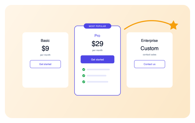
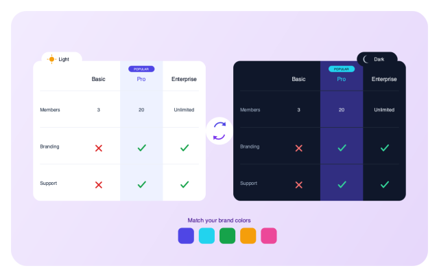
Switch between a light and dark theme, then fine-tune the table, header, feature column, striped rows, highlighted column, feature icons, rating stars, and buttons with individual color controls. Adjust the corner radius and add scoped custom CSS when you need full control.
Style controls include:
Stay Readable on Every Screen
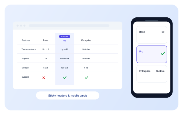
Keep the header row and the feature column in view with floating options on long or wide tables, and set a minimum column width before scrolling begins. On phones, choose horizontal scrolling or stacked cards, and switch between a centered container or a full-width layout.
Layout controls include: