We have done thousands of usability tests and user interviews over the years. But none of them were as special as the one we just did. That’s because it was our first usability test with a blind user. It was an incredible experience, and I wanted to share it with you. We have just released a feature called “Accessible Forms” and it was important to see how a blind person uses online forms.


What are Jotform’s Accessible Forms?
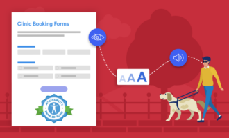
Products are better when everyone can enjoy them. This is the thinking behind our brand-new Accessible Forms feature. We added accessibility improvements to forms so that anyone with a disability can easily navigate, fill out, and submit them. Currently, our users need to enable this feature, but we’re hoping to gradually release it to all of the 10 million forms we host.
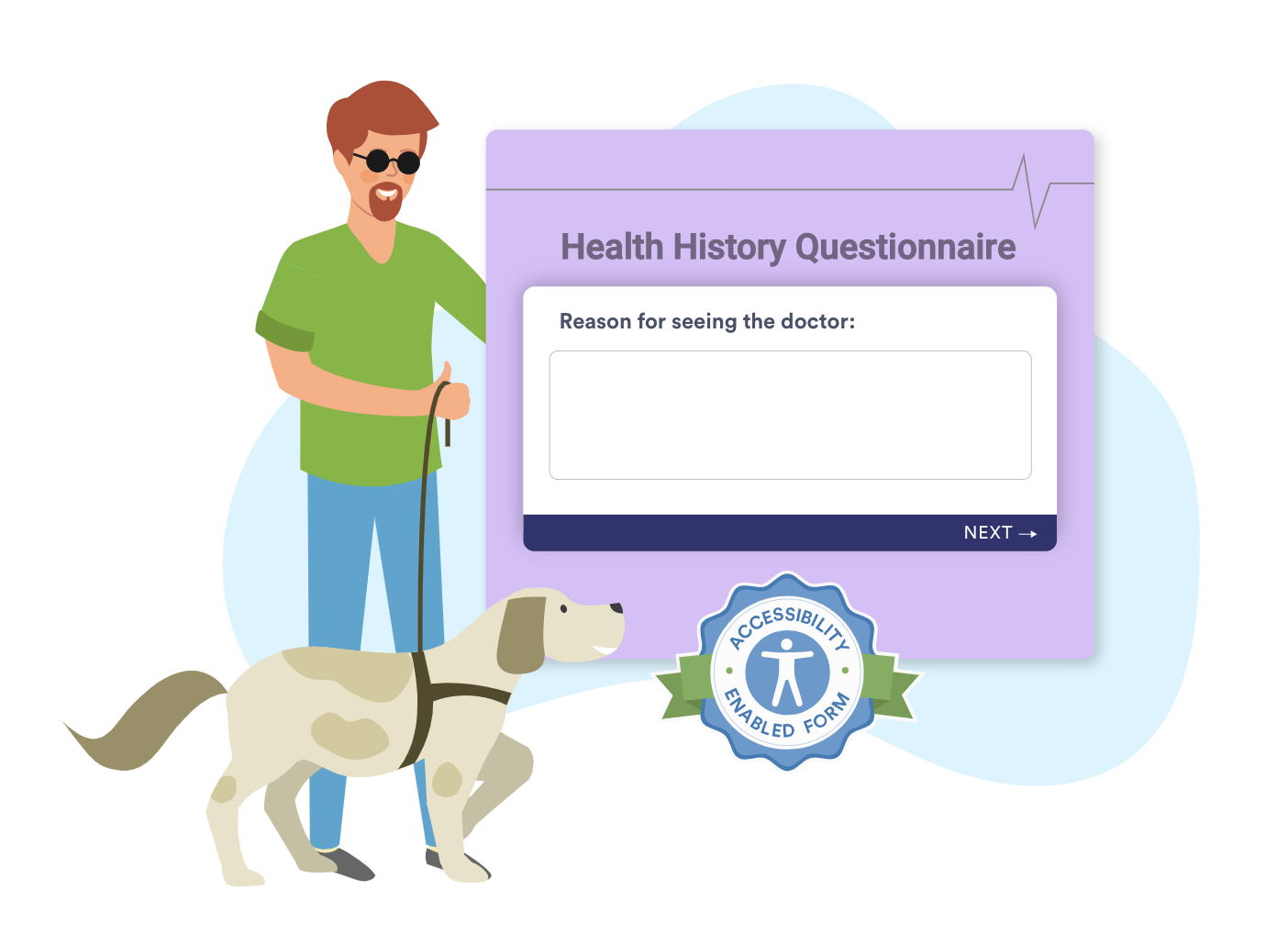
If you’re a Jotform user, you can enable Accessible Forms from the Form Settings in the Form Builder. Then just start building your form as you normally would. The Accessibility Enhancer will notify you of any accessibility issues, so you can create your forms without worrying that people with disabilities won’t be able to use them.
Read on to find out how we put our new accessibility feature to the test.
Getting to know our user
We started the day getting to know Çağrı Artan. He’s a very down-to-earth man with a happy and sincere nature, who works as a coordinator at Istanbul Technical University for The Unit of Students with Disabilities. He’s also a member of the Association of Barrier-Free Access (ABFA). By his own admission, he’s a digital technology enthusiast.
He’s also been blind from birth.
“While I was younger, there were no Turkish voice synthesizers, so I got used to hearing Turkish sentences from English voice synthesizers.”
Çağrı Artan
He volunteered for our research, and we flew him all the way from Istanbul to our office in Ankara to meet with us and help us understand the needs and expectations of people living with his condition.
Prep work and the usability test
As a user research team, this was our first test with a person who is blind, and we were very excited about it. We researched the best practices for this kind of usability testing, and our preparations not only focused on the test at hand but also on logistics and hosting our guest. We made sure that everything — the shuttle transfer, hotel, lab area, restrooms, and even the balcony where we take breaks — was easy to access.
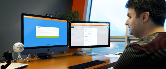
Before the test day, we prepared multiple forms with various form fields that matched common uses, and we ran pilot tests. We turned off the monitor and tried to complete a form without seeing it. It was hard. We then prepared different device types to test, including a Mac, a Windows PC, an Android phone, and an iPad. We made sure that they were working as intended.
In addition, we rearranged our test lab with additional recording equipment with multiple angles, ensuring we didn’t miss any moment.
Before we began, we explained the scope and the extent of the research, how we were going to conduct it, and got Çağrı’s consent to film and document it.
Çağrı shared his experiences and comments with us while trying out most of Jotform’s form filling functions.
He used our Classic and Card form types with various accessibility software such as NVDA on Windows 10, macOS and iPadOS Voiceover, and Android’s Talkback.
We conducted our test with four different forms using different form elements, widgets, and payment gateways.
- Our first form was a contact form with basic fields like name, email, address, and phone. We embedded it into a test website environment as if it was part of a real webpage.
- The second form was a registration form. We used images, text fields, file upload, and CAPTCHA. Also, we used page breaks and made it a multipage form to see if there were any problems with page navigation.
- The third form was a payment form where we tested a purchase order gateway.
- The last form was a feedback form that was built in the Card form layout.
In addition, we tested the accessibility landing page. Çağrı said that it was very easy to understand the headings and texts. He liked the example templates, commenting that, “You guys have covered everything to start with.”
Test highlights
One of the first things we noticed about the benefit of including a summary in one of the first sentences of a content block, such as a blog post like this, is that blind people can get an idea of what’s in the content quickly without having to press a lot of buttons and listen to some random content to get an idea what it’s about. We’re used to skimming through content with a quick glance at the page, but this requires lots of interaction from a blind user.
People who are blind tend to visualize content in a linear path rather than a 2D view of the page like we’re used to seeing. They navigate with the tab key, up and down keys, and content group keys like “H” for headings or “B” for buttons, as well as using various gestures with touch devices. This way they can easily jump between content and reach the information they want to read.
“The reason that we think and navigate in a linear way is very similar to the way the screen readers work. They all work with the same approach as the web content does: top to bottom.”
Çağrı Artan
Unfortunately, things don’t always work as they should. Some form questions like Google CAPTCHA may create problems for non-English speaking people who are blind since it vocalizes some random speech in English and asks the user to type what was said for security verification. Çağrı said that he had a hard time understanding what was said, which prevented him from being able to submit the form.
Adding Alt-text to visuals is another best practice. By visuals, I mean not only images and photos but icons and other visual elements. A detailed description of an image makes it understandable for blind people.
“The point is not changing the way you create and publish content, rather making small adjustments to make it accessible for us to understand.”
Çağrı Artan
Android vs iOS
We also discovered that Çağrı had a hard time filling out some question types like “Date” with Android devices and spent a considerable amount of time trying to figure out the interface. On the other hand, he easily filled out the same question on an iOS device. Since he owns an iPhone, we thought it might be due to his previous domain knowledge and usage habits. He said that he was familiar with Android devices but preferred iOS because the experience could change dramatically with different Android devices.
“Due to the inconsistent nature of Android devices’ hardware, interface, and software, it forces me to change my usage habits on every device. Also, it is very rare to come across a phone which allows me to make the initial set up and start working with it out of the box without outside help. When you think of cost/benefit, I think an iOS device is well worth buying instead.”
Çağrı Artan
Speech speed defines the purpose
During the Windows 10 device tests, he used a software called NVDA. During the setup phase, I thought that there was a problem with the speed of the speech; it sounded so fast that it was just noise. I asked if he knew how we could slow it down to an understandable speed, but he said that this was the normal speed that he was used to using it, which shocked all of us.
“I deliberately slowed the speech down in the other tests so that you can understand where I am and what I am listening to. Normally this is too slow for me.”
Çağrı Artan
He noted that he preferred to have it fast when skimming through the page elements, but he slowed it down when he needed to focus on long content blocks like articles or books. But still, it was too fast for me. 🙂
Next steps
By the end of the day, we discovered many opportunities for improvement, discovered some bugs, and made a new friend. This unique usability test with Çağrı was very productive, and we’d like to continue our research with him and other volunteers so that we can develop a user-friendly product that anyone can benefit from. Emotions were high for us when he said:
“It was one of the best days of my life. Unfortunately, some companies think that disabled users are very few to make an effort for. I am very happy to see the sensitivity and research effort of Jotform in this manner.”
Çağrı Artan


Send Comment:
3 Comments:
December 18, 2019
I would like to see different payment methods that can be intergrated at the same time....like having PayPal AND Square. So the client has a voice.
December 17, 2019
Good day, all I'm trying to do is pay for service. My card is not being excepted.
December 17, 2019
It is a such a great piece to read, thank you Baki!