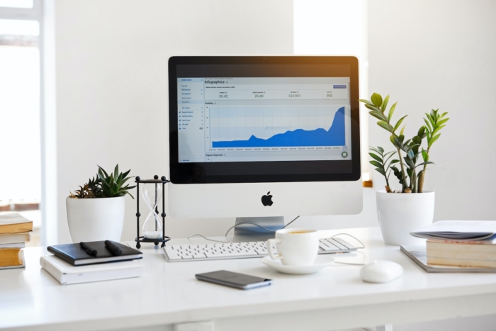
Dashboards provide a quick, easy way to view the data you need to make decisions. Seeing important metrics in one place gives you an immediate overview of the health of a single project or your entire business, and that’s why so many companies turn to dashboards.
Like the gauges on your car, a dashboard is a single place to view different indicators. For example, if you’re in IT, your dashboard would have information on the status of the network, traffic loads, website status, and other key metrics related to your job. You’d be able to see at a glance what needs attention and what’s running smoothly.
If this sounds like something you need, read on to find out how to build a dashboard that works for you.
Determine what information you need on the dashboard
Before you start building a dashboard, it’s important to consider what information is most important to your work. You don’t want the dashboard to be so cluttered with charts, graphs, and numbers that you can’t make sense of it.
Take a cue from your car’s dashboard. It provides exactly what you need to know to avoid any number of automotive catastrophes: the speed you’re traveling, how many revolutions per minute (RPM) your engine is turning, what the temperature of the engine is, and how much fuel you have. The dashboard also includes warning lights for things like low battery life, tire pressure, and oil levels.
For your business dashboard, decide what metrics you absolutely need to view on a daily basis. If you’re in sales, you might want to include the status of pending deals, the most popular products, and the average order amount. On sales calls, this information can assist you as you’re pitching products or following up on deals that haven’t closed.
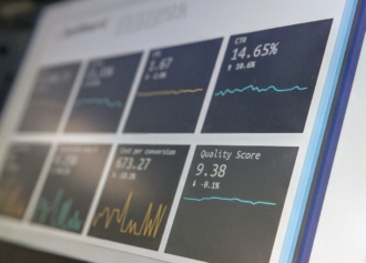
Decide how to visualize the data
There’s a reason why your car’s dashboard puts your speed front and center: It’s a metric you need to follow to avoid getting a ticket or getting into an accident. Part of building a dashboard is knowing what to bring attention to visually and how you can best do that.
For instance, if you specialize in sales of Widget A, your dashboard might include sales of that product as a front-and-center visualization. But viewing sales of Widget B and Doodads as a comparison will also be important, which may require choosing a different kind of gauge, such as a bar chart.
Additionally, a dashboard needs to include some kind of odometer — like the total sales for a period — to gauge whether the company is on track to meet sales goals.
It’s also a good idea to add alerts — such as whether there’s excess inventory for a particular item or if an important deal needs attention. These alerts provide important information that can help you change course, like trying to upsell with the excess inventory, discounting the inventory, or taking action to move a deal forward.
Pro Tip
For inspiration on layout and visual hierarchy before you start, exploring dashboard design examples can help you decide which approach fits your data best.
Create your dashboard
Finally, it’s time to start building your dashboard with the data that’s coming in and your method of visualizing that data. How you build a dashboard depends on what software you’re using and the data sources you choose. Jotform Report Builder provides a fairly straightforward process.
You can easily turn the data you’ve collected using Jotform into a live dashboard. First, navigate to Jotform Report Builder and choose the data you’d like to display. Then, open the report in Jotform Report Builder.
From there, you can choose different templates to help you present the data. You can add charts that help you visualize the data, and you can change the colors and fonts to suit your preferences or the company’s branding guidelines. For example, you might choose a line chart to represent trends over time and a pie chart to display percentages.
Jotform Report Builder pulls in real-time data that updates as soon as the data is submitted through your forms. That way, you’ll have the best available information at your fingertips to make decisions.
Ideally, no matter what you’re using to build your dashboard, you can easily add elements like charts and alert icons, and change the colors and other aesthetics. And you’ll be able to create dashboards for others easily, too.
Important data at a glance
The ultimate goal of your dashboard is to make it easy for you to see what’s going on at a given moment — whether that’s survey results or how well your network is performing. To do that, you need to find a tool that lets you pull in relevant data and arrange it in a logical way.
But before you start building a dashboard, it’s important to know what data you’ll need and to have an idea of what you should display prominently. This will help you build an effective dashboard that gives you the information you need to make sound business decisions.


Send Comment: