
When it comes to analyzing data, the importance of dashboards can’t be overstated. Healthcare organizations have found that using a dashboard helps improve patient outcomes, such as decreasing infection rates. Dashboards give businesses access to important metrics, like sales figures, at a glance.
To get the most out of a dashboard, you’ll need to know the basics of the business dashboard and what one should include. Here’s how to get started.
What a dashboard is
A business dashboard, as the name implies, is a lot like a car’s dashboard. You can view the speed and health of your business on one panel and see alerts when something is wrong. Only, instead of a blinking light telling you to put air in your tires, a business dashboard lets you know that sales of a particular widget are slow, for example.
Depending on what you want to see, your dashboard might pull in data from a variety of different sources and present them in a single place. For instance, you could create a dashboard with Excel data, form responses, and weather information.
What should be included in a dashboard
While the specifics of what you’ll put on your dashboard depend on the information you need to see, there are a few best practices to keep in mind when building your virtual command center.
1. Pay attention to data quality
Before you add data to your dashboard, make sure it’s good quality data. That means you’re pulling from data sources that are accurate and up to date. If you’re not sure whether your data meets this standard, talk to the person or people in charge of it.
Remember, the dashboard is only useful if you’re getting information that will actually help you, so you want the data to be solid. Make sure that there isn’t duplicate information in the database and that it’s coming from a reliable source.
2. Include automated data
A big mistake that a lot of people make when setting up dashboards is requiring manual updates for the data. Not only will this result in a lag in the data you’re able to view, but it could also introduce inaccurate data into the system — and render the dashboard useless as a result.
You might be using a system that doesn’t connect well with the dashboard, like a spreadsheet, and may need to copy and paste data. If someone needs to view the dashboard before you’re finished, they won’t have an accurate idea of what’s actually happening because they’re viewing outdated sales figures, for example.
Instead, use data sources that update automatically. You can pull in a feed from your order entry system to provide sales figures or from your customer relationship management (CRM) software to see what the status of pending deals is.
3. Add enough data for a complete picture
Another common mistake is that, in the name of keeping the dashboard simple, people sometimes don’t include enough data. When you’re designing the dashboard, consider all the information that someone will need to perform their job and include what’s relevant to them.
For example, if data from the accounting system is on the dashboard for an executive, but data from the e-commerce system isn’t, they won’t know what products are selling and will be making decisions with incomplete data.
4. Data that’s relevant to the job
Different roles in a company require different data. For example, a customer service manager needs to see data on how long service calls are taking and what common issues customers are facing.
On the other hand, an IT manager needs to see what systems are working, if there’s any downtime, and how long that downtime lasts. You should design every dashboard with the user in mind so that they have the right data to make the right decisions.
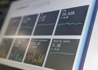
Visually display data
Along with what should be included in a dashboard, consider how you want to display the data. Charts and graphs help you visualize trends and other metrics instead of just looking at numbers. Think of sales: A line graph can show how many widgets sold each day over a period of time, like a week or a month. Bar charts illustrate comparisons, like sales of widgets vs doodads.
Colors also help with data visualization. Choose colors that complement each other, such as a palette of either warm or cool colors, and stay consistent with color usage on the dashboard. A bar chart might display teal for one data point and seafoam for a second, for instance. It’s also good practice to consider what colors commonly represent, such as red for a negative data point like revenue loss or green for a positive representation of exceeding sales goals.
Icons are another good element to include. They’re simple images, but they can speak volumes. For example, you can set up red exclamation mark icons to pop up when the data is incomplete — so you’ll know not to make a major decision based on that information.
The what is just as important as the how
These best practices for including data in a dashboard, as well as displaying the data, will help you make informed decisions. Make sure you include relevant and automatically updated data as well as visuals to help you and others digest the data quickly. This will improve the effectiveness of the dashboard and help it function as a useful tool for your business.


Send Comment: