Jotform Cards is a mobile-friendly form layout designed to enhance the user experience by showing one question at a time. It offers several unique features, along with a few limitations compared to Classic forms. Knowing the strengths of Card forms—as well as when they’re most effective—can help you choose the right layout for your needs.


You can switch your form’s layout from the Layout tab in the Form Designer panel. Our guide on How to Change Your Form Layout has more details about that.
Features Available in Card Forms
Card forms come with exclusive features and options, including the following:
- Form Fields
- Micro Animations
- Built-in Email Verification and Error Checking
- Built-in Address Autocomplete and Geolocation
- Built-in Icons, Image, and Video Backgrounds
- Continue Forms Later
- Embed Options
- Welcome Page
Form Fields
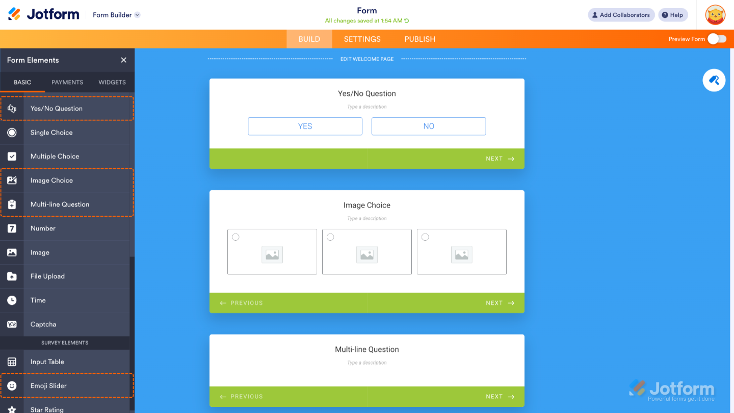
Some commonly used widgets in the Classic layout are already built into Card forms as standard fields. Here are a few examples:
- Yes/No Question — A simple field for choosing between two options, like yes or no, or anything that represents a positive or negative response.
- Image Choice — Lets users select from images that can act like radio buttons (single choice) or checkboxes (multiple choice).
- Multi-line Question — Combines multiple fields into a single card, allowing users to answer several related questions at once.
- Emoji Slider — A fun and intuitive slider that uses emojis to represent a scale, perfect for quick visual feedback.
Micro Animations
Subtle animations guide your form fillers’ attention as they complete the form. For example, if there’s an error, the card gives a quick shake to let them know something needs fixing.
Another example is the smooth transition effect you’ll see when moving from one card to the next—it helps create a more engaging experience.
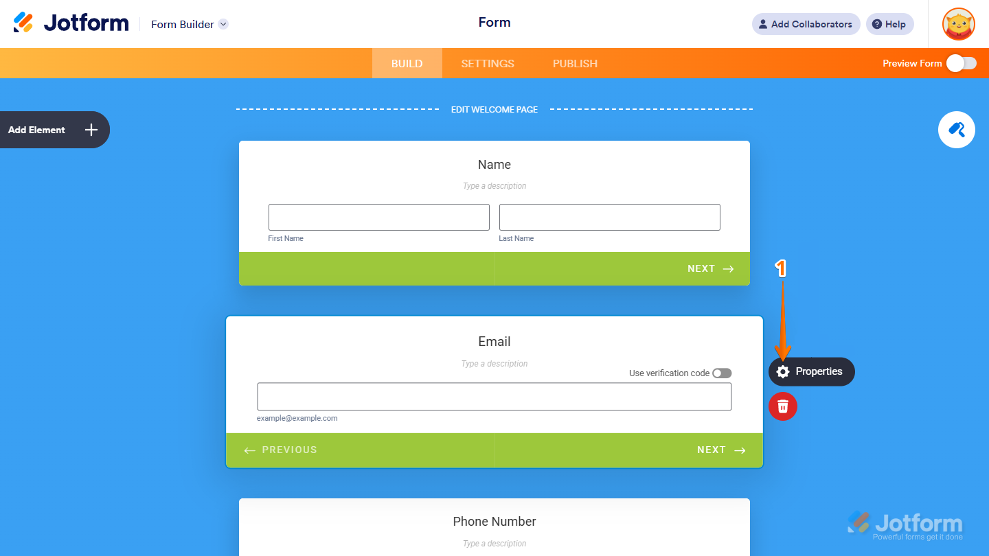
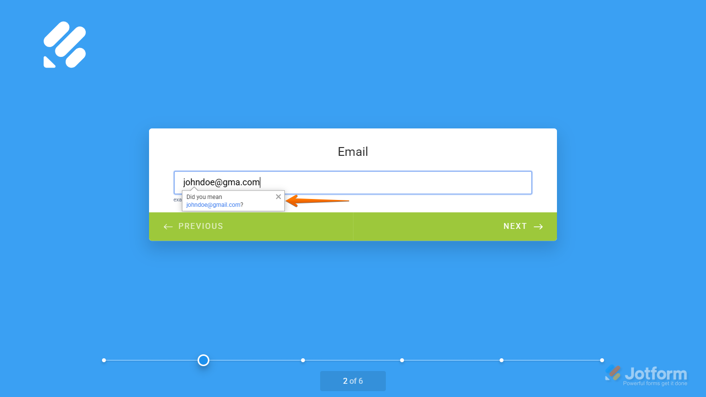
Built-in Email Verification and Error Checking
The Email element lets you verify email addresses right within the form—no need for extra widgets or third-party tools. Setting it up takes no time at all—here’s how:
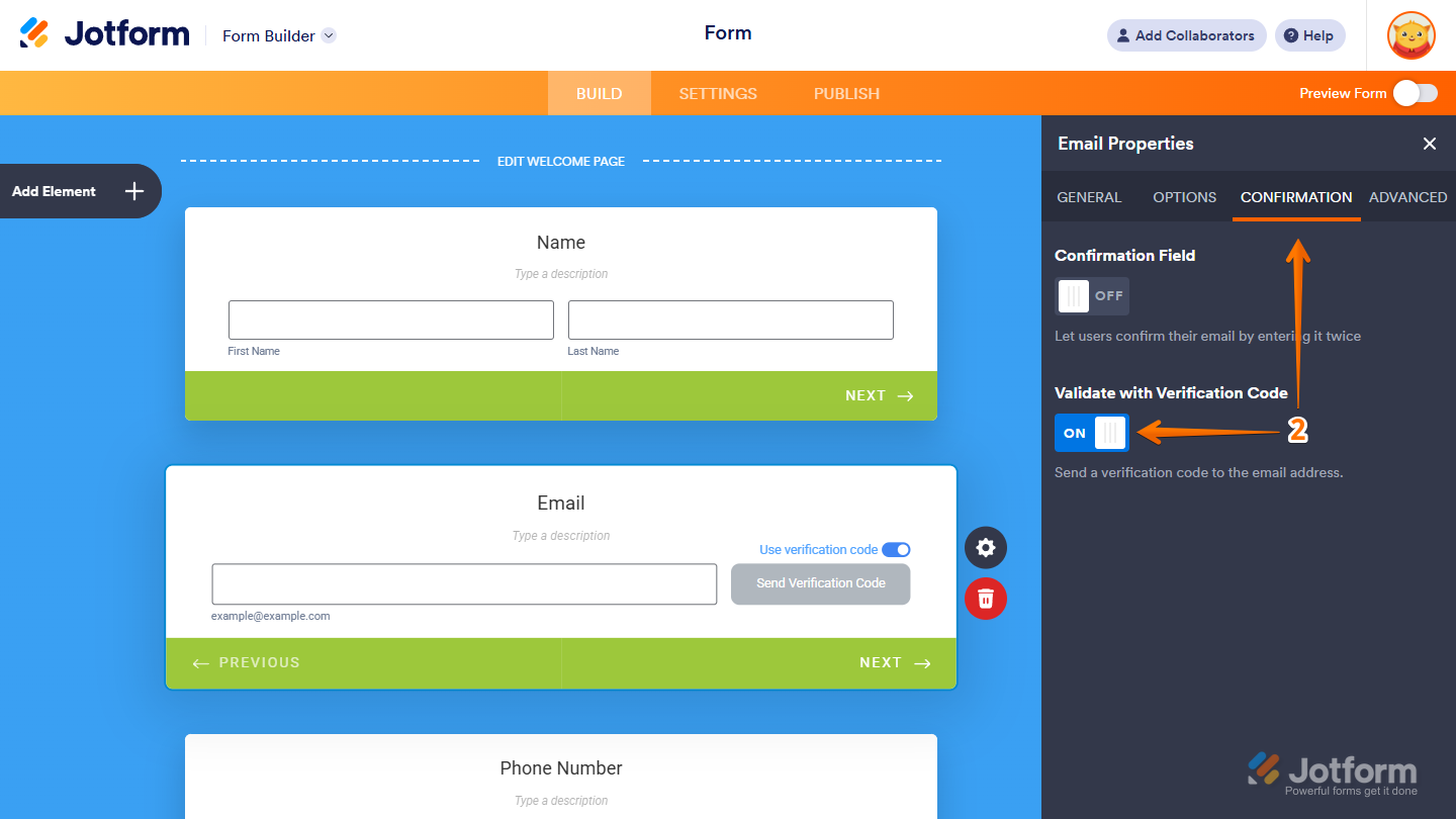
- In Form Builder, select the Email element, and click on Properties.
- In the Email Properties window on the right, under the Confirmation tab, toggle on Validate with Verification Code, and you’re all set.
And you can also do it this way:
- In Form Builder, select your form’s Email element, toggle on Use Verification Code, and that’s it!
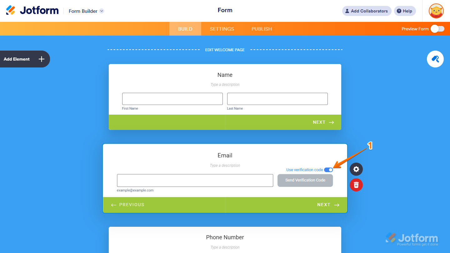
In addition to email verification, the Email element also checks for errors and suggests corrections if an address looks misspelled.
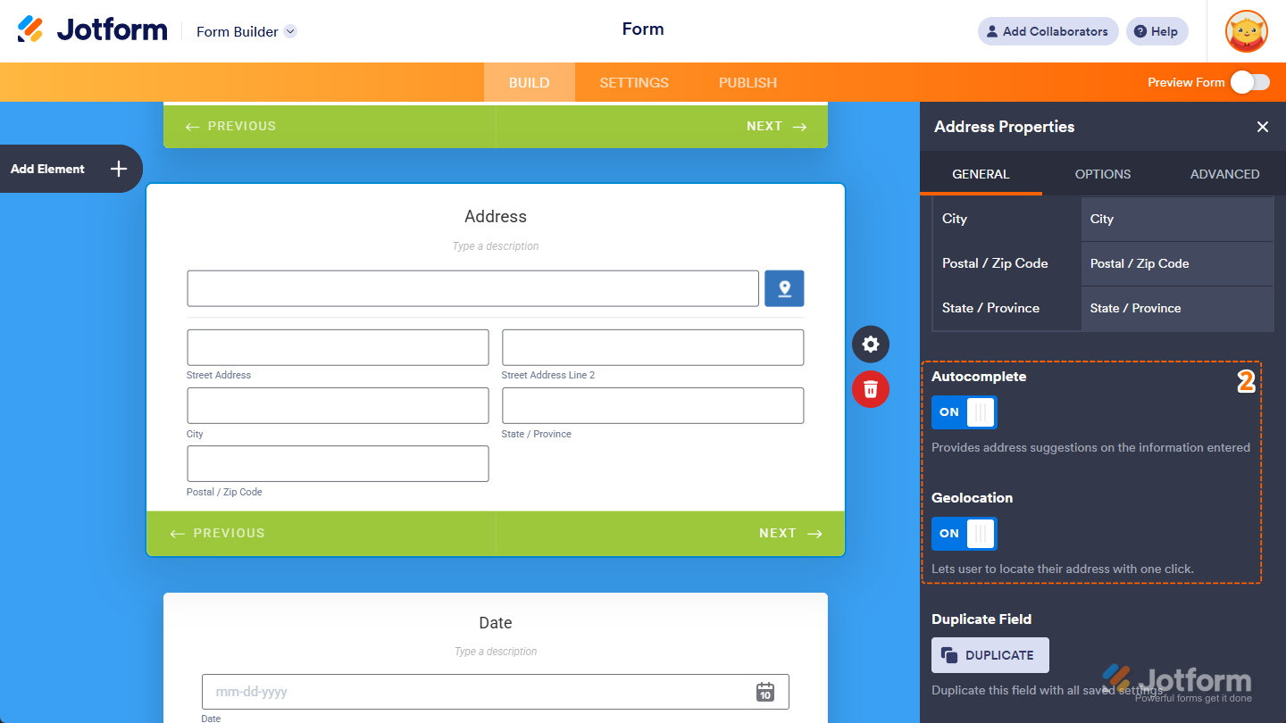
Built-in Address Autocomplete and Geolocation
Jotform’s Address element includes Autocomplete and Geolocation to make entering addresses faster and more accurate. It suggests locations as users type and can even detect their current address automatically. Enabling Autocomplete and Geolocation only takes a second—here’s what to do:
- In Form Builder, select your form’s Address element, and click on Properties.
- In the Address Properties window on the right, at the bottom of the General tab, toggle on Autocomplete and Geolocation, and that’s it!
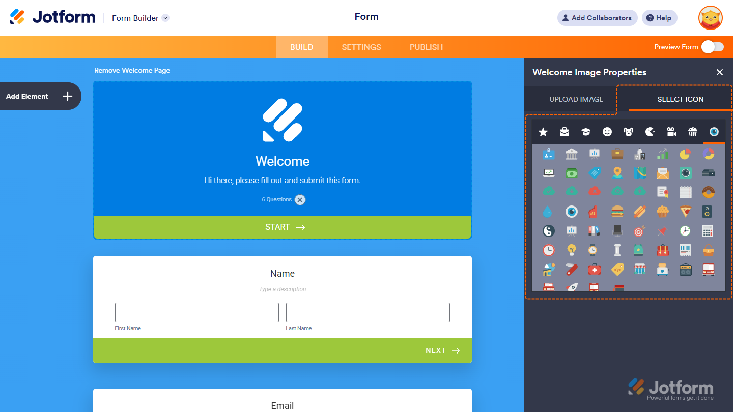
Built-in Icons, Image, and Video Backgrounds
Throughout the Form Builder, you’ll see various icons designed to help you style and customize your form. These icons let you make changes to elements like the Welcome Page, adjust field appearances, and fine-tune the overall look and feel of your form with ease.
You can also use images or videos as your form background to make it more visually engaging.
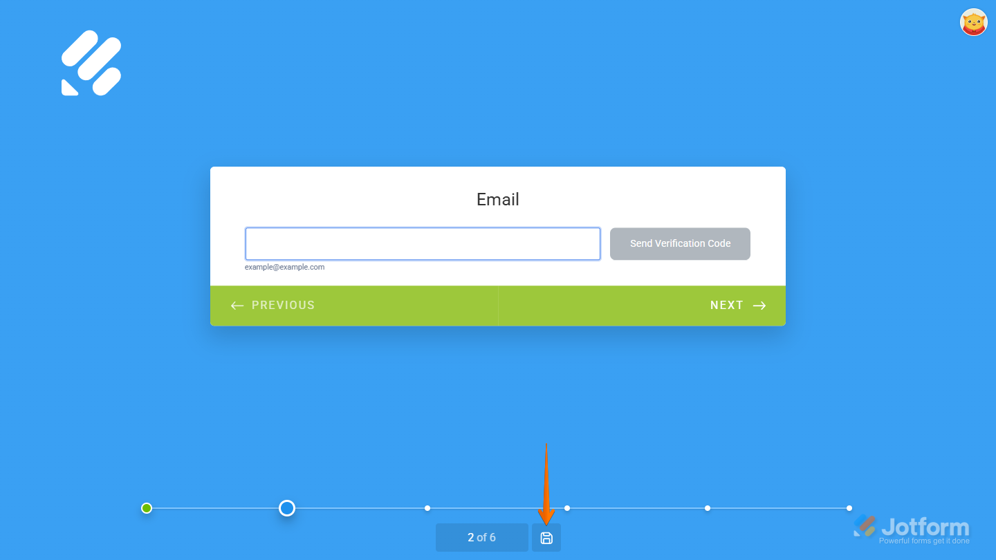
Save and Continue Later
Also called Autofill, the Save and Continue Later feature lets users save their progress and return to the form at any time to finish their submission. You’ll find all the steps in our guide on Setting Up the Continue Forms Later Feature in Card Forms.
Embed Options
Card forms also include additional embed options and features to make them even easier to use.
Full Screen: This option automatically opens your form in full-screen mode. You can turn it on from the Publish tab in the Form Builder.
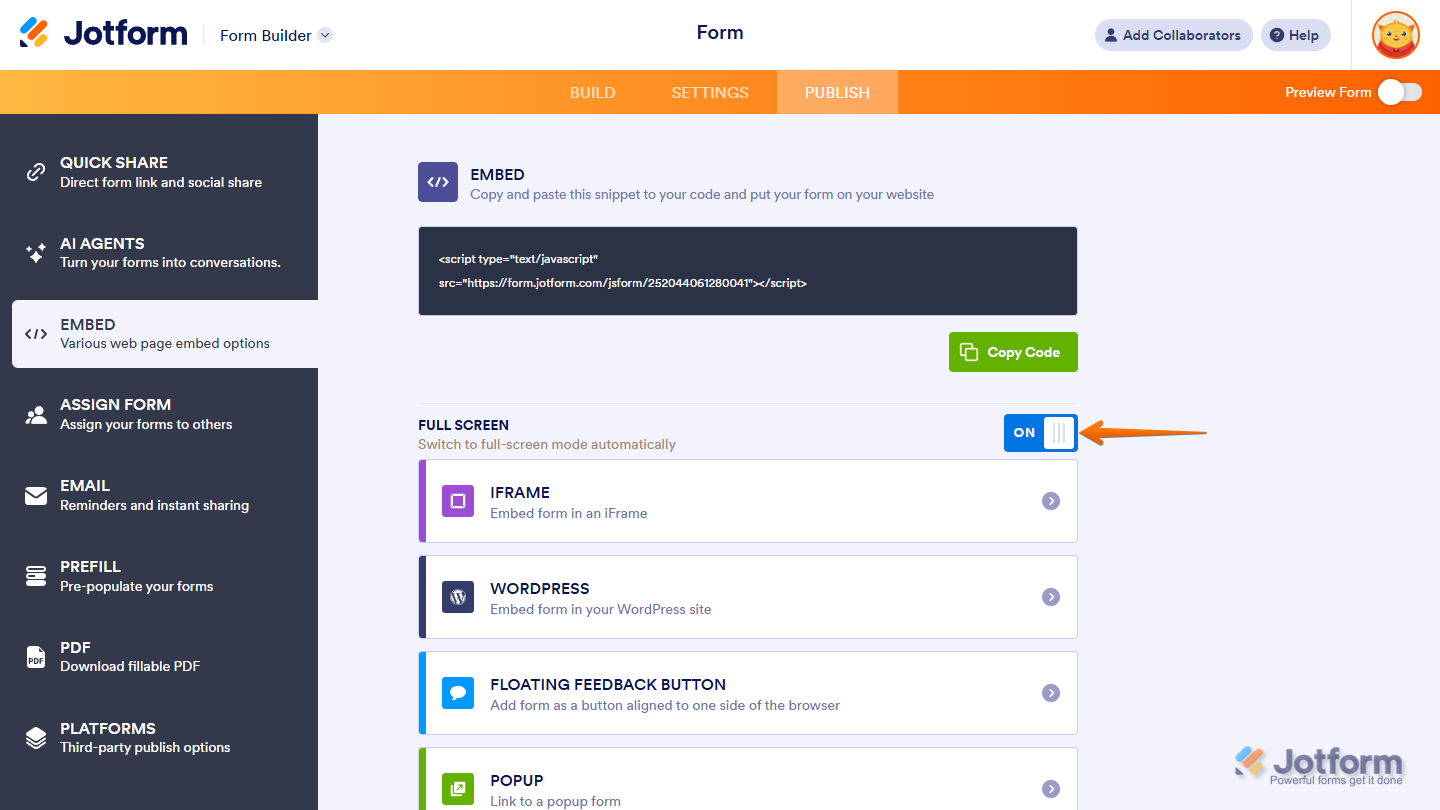
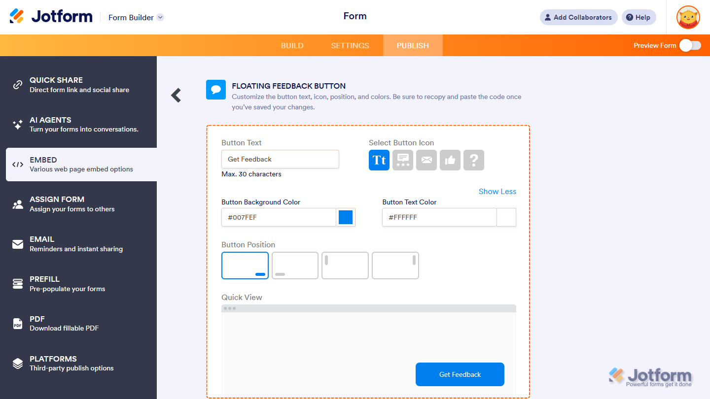
Floating Feedback Button: The Floating Feedback Button embed option lets you add a customizable button to any corner of your web page, so users can easily open and fill out your form. Check out our guide on How to Embed Your Card Form as a Floating Feedback Button to learn more.
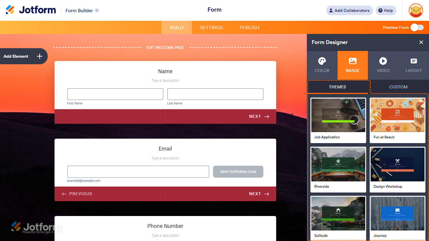
Welcome Page
While you can create a similar experience in Classic forms by combining a few elements, Card forms come with a built-in Welcome Page. At the top of the Form Builder, you’ll find the Edit Welcome Page button—use it to customize your welcome screen or remove it entirely if you don’t need it.
Features Not Available in Card Forms
Some features are intentionally left out of Card forms—or moved to a different section—to better fit the layout’s clean and focused design.
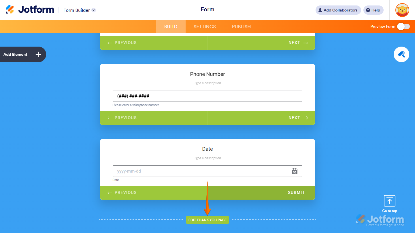
Thank You Page
The Thank You Page settings were removed from the Settings tab and replaced with a simpler version at the bottom of the Form Builder, streamlining the setup process and making it easier to manage.
Custom CSS
Unlike Classic forms, which allow advanced CSS customization, Jotform Cards focuses on simplicity with built-in features like color palettes, background images, and icons—so you can style your form without coding.
Widgets
Some widgets were intentionally left out of Card forms to stay consistent with the layout’s design and functionality. If you search for a widget and don’t see it listed, it means it’s currently not supported in Card forms.
Pro Tip
A Classic Form works best when you need to include many fields or advanced customizations. But if you’re creating something quick and simple—like a contact form, signup, newsletter subscription, registration, or survey—a Card Form is a great choice. Its one-question-at-a-time layout and built-in features are designed to boost user engagement and improve completion rates.

Send Comment:
2 Comments:
February 7, 2023
I like that you want our input and that you have good support for us when we need help
December 29, 2021
How can I transfer my existing card form to a classic form?