
Best 10 data analysis tools
Data analysis is the process of curating, organizing, and presenting data in a meaningful way. Today’s businesses collect several terabytes of data each year — if not each day. This data comes from online customer interactions, store purchases, and client discussions through call centers and myriad other places. It also comes from employees, vendors, and warehouse teams.
Someone then has to compile, organize, and analyze this data.
This need has led to the creation of data analysis tools and online systems that sort through the data and present highlights in digestible formats. The insights allow teams to make changes based on data and identify problematic trends before they become serious.
Choosing the right data analysis tool can help your business grow. Here are 10 popular options on the market.
1. TIBCO
TIBCO was developed with a focus on real-time insights and data visualization, two key features that make it a popular choice for companies looking to invest in data analysis. With real-time insights, teams can quickly jump into action when they notice certain trends, either preventing problems before they get out of hand or taking advantage of growing markets. This feature makes the analytics particularly beneficial for fast-moving sectors like retail.
Data visualization, the other key component of TIBCO, empowers teams that might not be that data-minded. Companies can glean insights without having to sort or analyze data on their own.
Notable features
- Real-time analytics
- Location analytics
- Inline data wrangling
Reasons users like TIBCO
- It’s capable of handling large volumes of data.
- It has an extensive suite of visualization options.
- The geo analytics tool is highly useful and works well.
Drawbacks
- The layout appears to be somewhat outdated.
- There’s a lack of helpful documentation.
Pricing: The pricing starts at $400 per month, billed annually.
2. Sisense
Sisense is a business intelligence tool that can help existing data teams collect and present information within their organizations. The company boasts a diverse range of clients (and more than 2,000 customers), including Air Canada, Philips Healthcare, Verizon, and Instacart.
Notable features
- Predictive analytics and machine learning
- Code-first, low-code, and no code tools
- Natural language querying
- Ability to share company data through applications your organization uses daily
Reasons users like Sisense
- Its user interface is intuitive and easy to use.
- It connects with a wide range of data sources.
- It offers exceptional customer service.
Drawbacks
- Mobile performance isn’t up to par and is limited in its functionality.
- Some advanced features require technical expertise to use, limiting its potential.
Pricing: Contact Sisense for a customized quote.
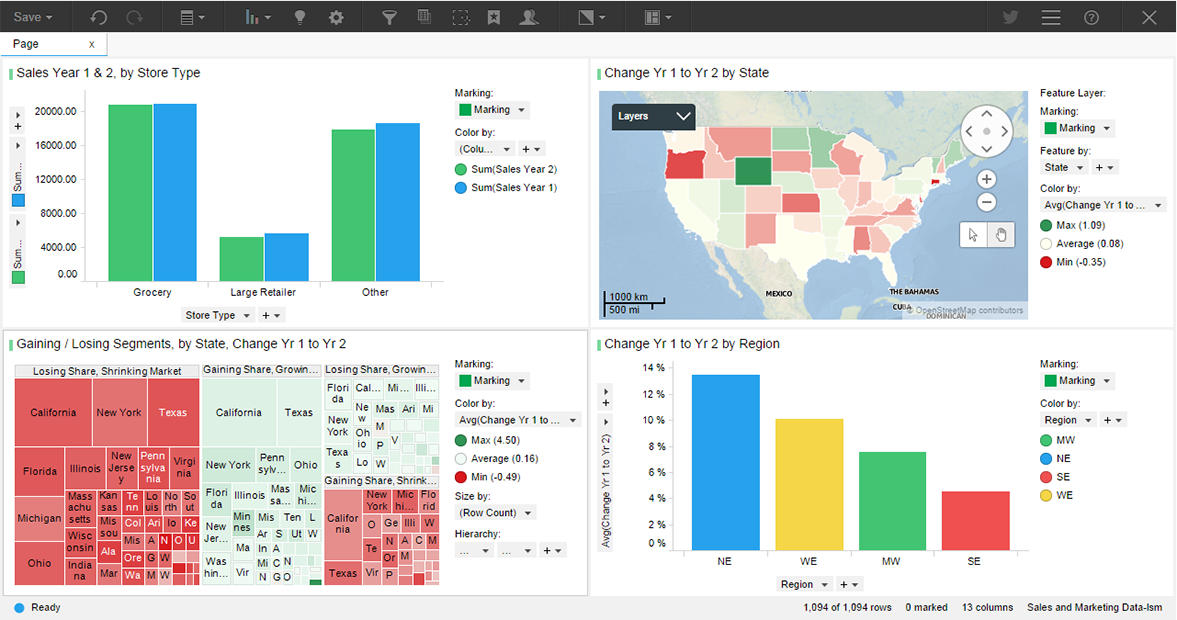
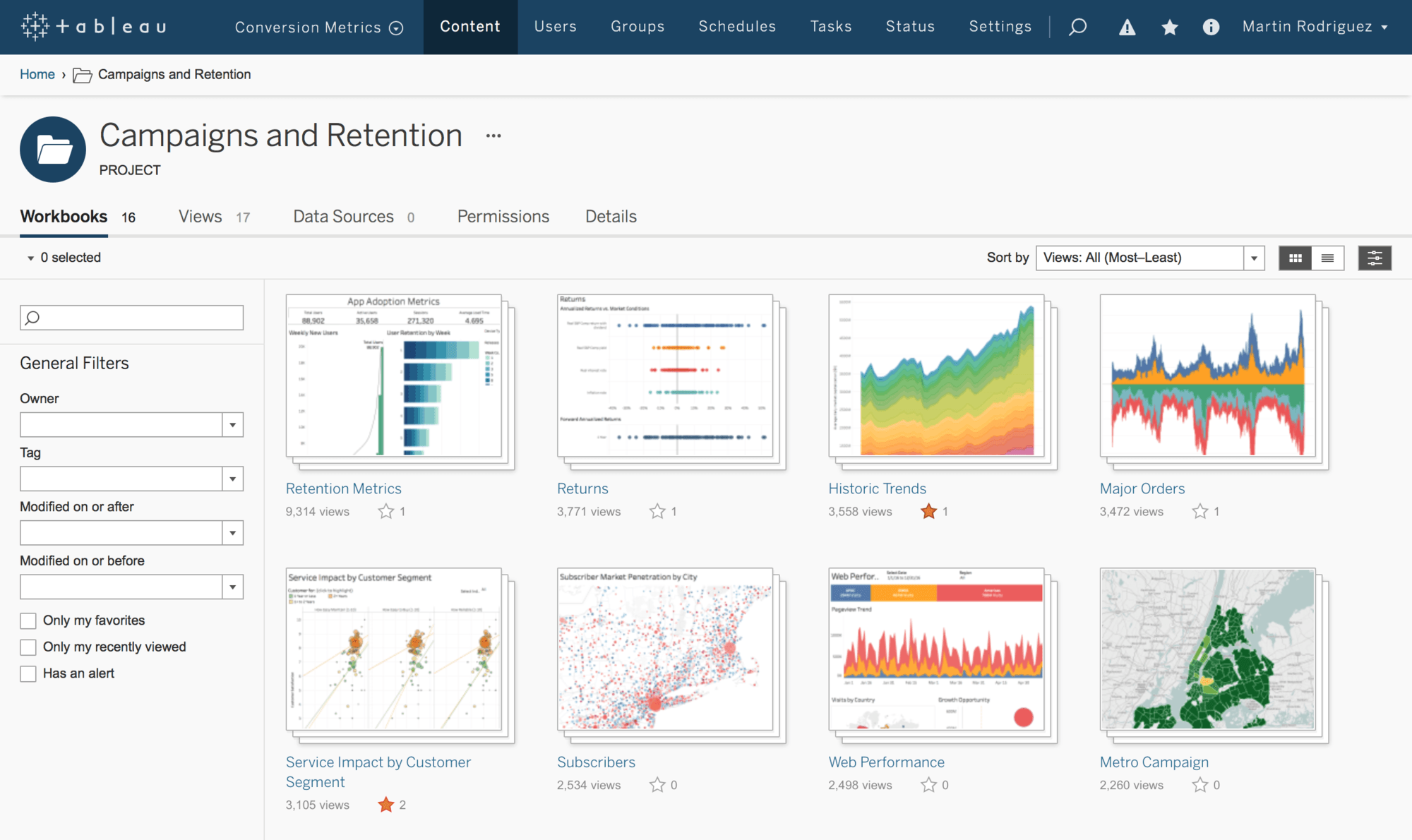
3. Tableau
The team at Tableau says its system can take “any kind of data from almost any system, and [turn] it into actionable insights with speed and ease.” To learn how Tableau can help your team, find your specific department or industry on its website and see how this system has helped clients who’ve been in your shoes. For example, sales teams can better visualize their customer pipelines and better understand how to allocate their resources to potentially close more deals.
Notable features
- AI-driven statistical modeling
- Drag-and-drop visualization tool
- Natural language querying
- Mobile-friendly formatting options
Reasons users like Tableau
- Its large community of members and user groups help each other out on social media and in online forums.
- The results are visually appealing.
- It provides strong collaboration features.
Drawbacks
- Visualizations can be limited in terms of customizations.
- It’s relatively costly.
- Some users have remarked on the steep learning curve.
Pricing: Tableau’s three pricing tiers are Tableau Viewer ($15/user/month), Tableau Explorer ($42/user/month), and Tableau Creator ($75/user/month).
5. Databricks
Databricks offers a unified data analytics platform to help companies pool their data and better understand it. Instead of using multiple data sources and unique platforms, this system syncs up your existing tools to present data in a uniform way. Your team can better collaborate by sharing data instead of operating in analytics siloes. Databricks also uses AI elements for better organization and presentation.
Databricks delivers a unified set of tools that can help you process, store, clean, share, and analyze your datasets. If your organization has a large amount of data that’s spread out and siloed, Databricks is a good option because it makes all your data accessible for analysis without the need for other ETL (extract, transform, and load) tools. Plus, the company continues to grow its lists of tools and partners, which include Redash, Apache Spark, Delta Lake, and MLflow.
Notable features
- Includes additional proprietary tools to optimize performance
- Built on top of distributed cloud computing environments for fast performance
- Strong security features
- Capable of creating dashboards and advanced visualizations
Reasons users like Databricks
- It provides a common security and governance model for all of your data.
- Data engineers and data scientists provide customer service.
- It quickly executes even complex queries.
Drawbacks
- It may be difficult for organizations without expertise in Apache Spark, SQL, and Python to learn to use it effectively.
- They add new features too frequently.
- The documentation could be better.
Pricing: Pricing is based on compute usage as well as storage, networking, and other factors. See website for pricing.
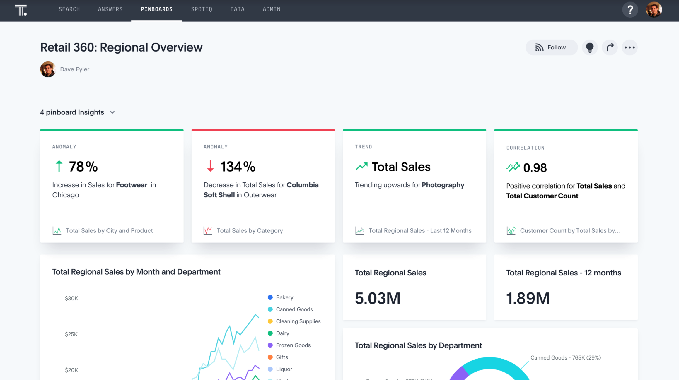
6. ThoughtSpot
ThoughtSpot is a strong option to curate and better organize your information. It features a search function so you can find information quickly and easily spot useful patterns. ThoughtSpot has a large pool of resources to help you take advantage of its services and better use your data. The company regularly publishes webinars and hosts conferences to help both data specialists and industry leaders who are learning more about data.
Notable features
- Advanced AI-powered search functionality
- Integrations with common workplace productivity tools and product suites
- Data notifications via mobile devices
- Natural language querying
Reasons users like ThoughtSpot
- Its customer support is highly responsive and knowledgeable, with users reporting quick response times and helpful support staff.
- It increases data accessibility, making it easy to uncover important insights.
- It has a simple interface.
Drawbacks
- Pricing may be out of reach for some companies.
- It can be complex to set up with large data sets.
Pricing: ThoughtSpot offers four pricing tiers: Team (5 users, $95/month), Essentials (20 users/ starting at $1,250/month), Pro (unlimited users, contact the company for pricing), and Enterprise (contact the company for pricing).
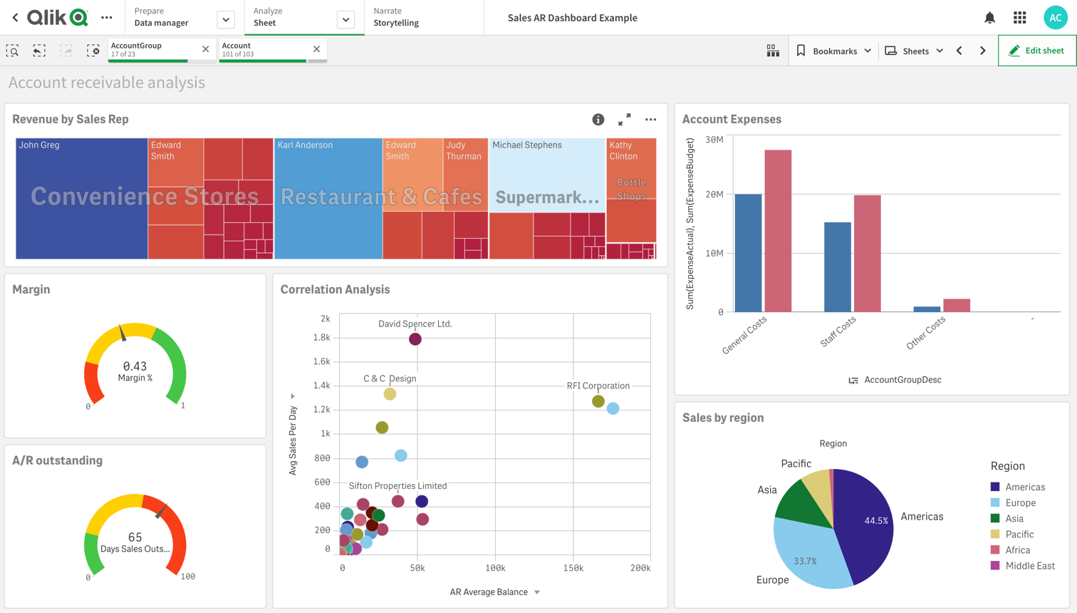
6. Qlik Sense
With its focus on “active” business intelligence, Qlik Sense has positioned itself as a better alternative to traditional, “passive” data analysis methods. It delivers real-time, up-to-date information from all your data sources and makes it easy to uncover relationships and correlations among various data sets. The aim is to allow you to harness the right data, at the right time, to take the actions that will be best for your business.
Notable features
- AI, machine learning, and predictive analytics features
- Alerts about changes in your data
- Natural language processing
- Interactive dashboards
Reasons users like Qlik Sense
- The data storytelling functionality helps users communicate insights effectively.
- The associative search feature allows users to explore data intuitively and discover hidden relationships.
- Qlik Sense has a large and active user community, with plenty of resources and support available.
- The platform offers strong security features and user management options.
Drawbacks
- It can be resource-intensive, which can lead to slower performance on older or less-powerful hardware.
- It may require a significant investment for larger organizations.
- The platform’s user interface can be overwhelming, especially for new users who are not familiar with the software.
Pricing: Qlik Sense offers client-managed pricing, so please contact the company. A free trial is also available.
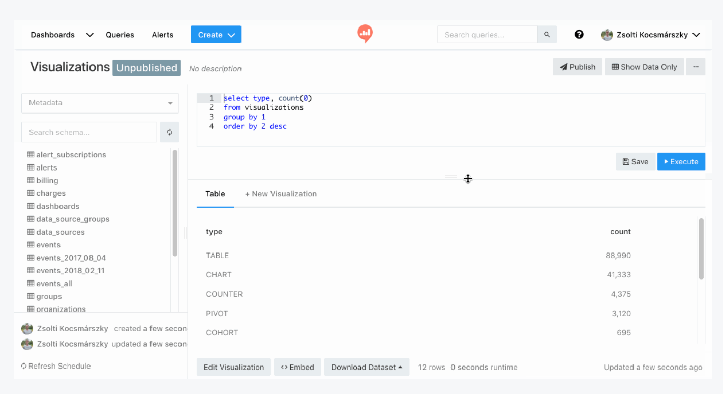
7. Redash
Redash is an open-source, web-based tool that allows you to create SQL queries to manipulate and explore your data. It’s great for businesses that use a multitude of applications to handle business processes because it integrates with a wide variety of data sources. It also has strong data visualization capabilities, and you can share dashboards with decision-makers with the click of a button.
Databricks acquired Redash, so you can easily connect to Databricks to access an even more powerful query engine.
Notable features
- SQL and NoSQL query editor
- Data alerts
- Scheduled refresh of data sources
Reasons users like Redash
- It has strong collaboration features, which makes it easy for teams to work together on data analysis projects.
- It’s highly customizable and allows users to tailor their dashboards and visualizations to their exact needs.
- It has a large and active community of users and contributors, with plenty of support available.
Drawbacks
- Customizing can be a time-consuming and challenging process.
- It lacks advanced capabilities like AI and predictive analytics.
- Its user management options are limited, which makes it difficult to manage large teams or projects.
Pricing: This self-hosted, open-source tool is available for free.
8. Metabase
Metabase helps you explore your data with ease — no SQL required (though you can use it if you want). Great for both beginners and advanced users, Metabase makes it possible for even first-time, non-technical users to build dashboards in just minutes. Reports and dashboards are attractive and easy to understand. And because it’s open source, users can customize the tool to their liking by tweaking the source code.
Notable features
- Automated report generation
- Familiar, intuitive interface
- Visual query builder
Reasons users like Metabase
- Its user management options are robust and flexible, making it easy to manage large teams or projects.
- It uses natural language querying.
- It integrates with a fairly wide range of data sources.
Drawbacks
- Users say it’s not as flexible as they would like it to be, particularly in terms of formatting visualizations and creating data filters.
- Working with large datasets sometimes slows down query speed or causes the application to crash.
- Its data-crunching capabilities aren’t as advanced as some other data analysis tools.
Pricing: As an open-source tool, Metabase is free to use, but it also has Starter (5 users), Pro (10 users), and Enterprise versions for the monthly cost of $85/$500/custom pricing-plus respectively.
9. KNIME Analytics
The KNIME Analytics Platform takes a building-block approach to data analysis, allowing users to create workflows to clean, prepare, and present data. With this type of system, users can take advantage of machine learning and AI with the help of a workflow assistant. It also serves as documentation of your data analysis steps, which is helpful for explaining your results to various audiences.
You can pair the KNIME Analytics Platform with the KNIME Hub, where data workers can collaborate on workflows and enterprises can scale their data analysis efforts.
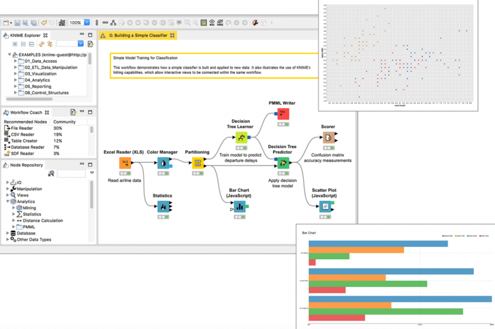
Notable features
- Easy drag-and-drop interface for creating workflows
- 300-plus connectors to data sources
- Numerous data visualization options
- Numerous report export options
Reasons users like KNIME Analytics Platform
- The platform offers a large library of prebuilt nodes and workflows, making it easy to get started with common data analysis tasks.
- It reduces the time involved for data preparation and analysis.
Drawbacks
- Some users have reported issues with the platform’s data connectors, such as difficulty connecting to certain data sources or inconsistent results.
- It can be difficult for beginners to learn and use.
- The platform can be resource-intensive, requiring significant computing power and storage to run effectively.
Pricing: The KNIME Analytics Platform is open source and free to use. For all KNIME business Hub editions, contact the company for pricing.
10. GoodData
GoodData focuses on delivering actionable insights to business users by embedding them into the applications and workflows your employees are already using. That means it serves up insights contextually, making it easier to know exactly what action to take. Different from just a standard data-visualization tool, it’s an end-to-end platform for data integration, data management, analytics, machine learning, and visualization.
Notable features
- User-friendly, no-code user interface
- Headless business intelligence architecture for consistent data across all your end users and applications
- Access to data experts who can help build your data products
Reasons users like GoodData
- The support team provides personal service that makes implementation easy and smooth.
- It offers a variety of ways to embed data insights into applications.
- It has plenty of compelling visualization options.
Drawbacks
- It offers limited choices in terms of pricing tiers.
- It could provide better documentation.
Pricing: GoodData’s two pricing options for embedded analytics are Professional (from $1,500/month, unlimited users) and Enterprise (custom pricing).
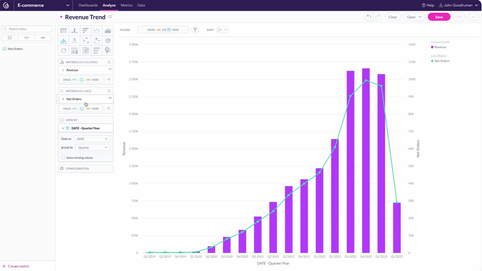
Jotform: A simpler data collection and reporting tool
Jotform makes data analysis accessible to businesses of all sizes, whether you’re a one-person startup or a full-fledged enterprise. Using our suite of products — from our online form builder to Jotform Tables and Jotform Report Builder — anyone can collect essential data, create presentation-ready reports, and analyze the information with ease.
Jotform Report Builder allows you to convert real-time form data into attractive reports or presentations. You can customize reports (no coding required) using a simple drag-and-drop editor, with options for adding tables, charts, images, and your company’s branding. Reports are automatically updated with fresh data as it comes in, and you can easily share them by sending a link, embedding them in your website, or downloading them as secure PDFs.
Jotform Report Builder is included in every Jotform plan free of charge, and it’s an excellent option for data analysis.
So which tool should you use? The best tool for your organization is the one that gives you actionable data insights. When you’re able to use the insights you collect to help your business thrive, you’ll know you have the tool you need.


Send Comment: