
Whether you’re sending a survey to your employees, collecting t-shirt sizes for your kid’s soccer team, buying a plane ticket, or collecting safety data on an active construction site, all of these activities start with a form.
Since 77 percent of adults in the U.S. now own a smartphone, all of the activities above (plus many more) are increasingly taking place on the go.
Creating intuitive mobile forms is different from designing forms meant for people to fill out on their desktop or laptop. In this post, we’re going to share 10 mobile form design best practices.
Here are 10 best practices while you design a mobile form
- Start with your goal or ideal outcome
- Keep it simple
- Make sure your form loads quickly
- Use only single-input fields
- Leverage built-in conditional logic to reduce friction
- Use built-in smartphone GPS and camera functionality
- Don’t rely on colors for calls to action
- Make sure your form is easy to navigate by touch
- Integrate with Siri and Google Assistant
- Explain why you need sensitive information
Start with your goal or ideal outcome
It’s helpful to identify your goal before you build your form. That way, you can work backward and collect only the information you need. This reduces friction and form field bloat.
Keep it simple
The more minimal, easy to fill out, and concise your form is, the more likely people will be to complete it. Here are some tips to keep your form simple:
- Ask only the essential questions.
- Make sure the questions flow in a natural progression.
- Use a single-column layout for easy readability.
- If you have more than six to eight questions, consider breaking the form into sections and using a progress bar to let users know how far along they are in the process.
Optimizing for mobile also means considering how users interact with your form in different orientations, for example, understanding how screen orientation can impact layout and usability.
Make sure your form loads quickly
One of the fastest ways to ensure people don’t fill out your form is if it takes more than a few seconds to load. You should assume that most people are viewing your form on their phone in their in-between time.
At minimum, this means removing popups, banners, and large images on your mobile forms.
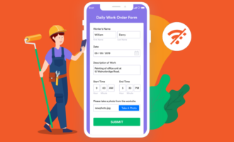
Use only single-input fields
Single-input form fields make it easy for someone to quickly fill out your form on a smaller keyboard and screen without having to pinch and zoom. Multi-input fields, such as splitting up first and last name into two fields; dropdowns; and radio buttons can be clunky to navigate on a smaller screen.
Plus, multi-input address fields can be downright confusing if you have a global audience. Places like South Korea and Japan have different address formats than the U.S. and Canada.
Leverage built-in conditional logic to reduce friction
Another way to reduce friction on your mobile form is to enable smart, auto-filled defaults and use conditional logic, which automatically changes up questions based on responses. This guides people to complete the form with a minimal amount of typing.
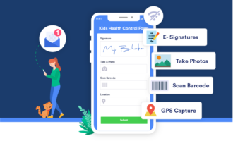
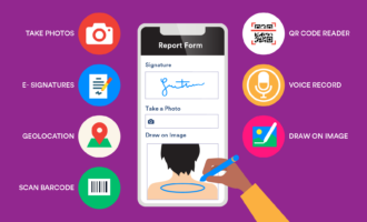
Use built-in smartphone GPS and camera functionality
If you need to collect photos or location data, you can automatically do this using the functionality built into smartphones.
For example, if you’re collecting payments, you can automatically add a customer’s shipping address zip code based on the GPS coordinates on their form. This is one less field for a customer to fill out.
Don’t rely on colors for calls to action
One in 12 men have some type of color blindness, so relying on colors as your sole means to differentiate key calls to action is problematic.
In fact, from an accessibility perspective, it’s better to design your form in high-contrast mode.
Make sure your form is easy to navigate by touch
To ensure your form is easy to navigate and to avoid “fat finger” errors (such as pressing the wrong button or multiple buttons by mistake), keep in mind the size of the average adult finger pad, which is about 9 mm wide, or roughly 48 pixels.
Integrate with Siri and Google Assistant
Another way to reduce form friction and increase accessibility is by tapping into the power of voice.Voice search is growing fast, with 20 percent of all Google searches coming from voice, and 31 percent of smartphone users worldwide using voice tech at least once a week.
Explain why you need sensitive information
If you need to collect sensitive data, such as phone numbers, credit card details, or social security numbers, make sure to let users know what you’re planning on doing with this information.You should also make sure your mobile form looks trustworthy, reputable, and has proper security seals.
Mobile forms are becoming increasingly common. These 10 design best practices can help you build better forms.
Mobile forms are becoming increasingly common. These 10 design best practices can help you build better forms. If you’re looking for an easy way to build a mobile friendly form and collect responses on the go, whether you’re on a soccer field in suburban Ohio or the middle of the Sahara desert, try out Jotform Mobile Forms.
Blog header photo credit: Tierra Mallorca.


Send Comment: