With Jotform’s Popup widget, you can display eye-catching popups on your website to share important messages, promotions, announcements, or calls to action. It’s a simple way to grab visitors’ attention at the right time without interrupting their browsing experience.
Whether you’re growing your email list, promoting a special offer, announcing an event, or sharing important updates, the Popup widget helps you deliver the right message when visitors are most likely to notice it.
Adding a Popup to your website only takes a few steps. Here’s how to set it up:
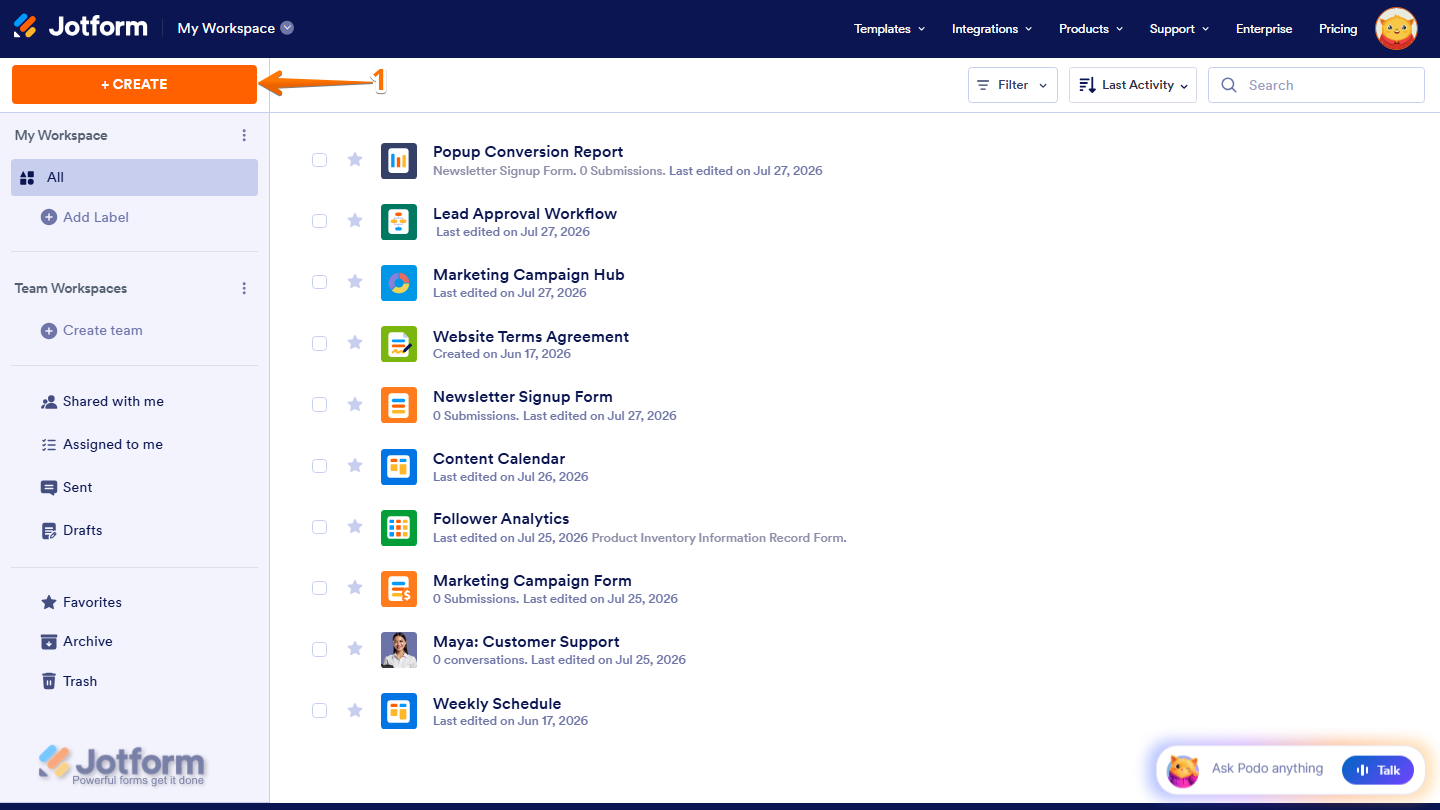
- On the top-left side of your Workspace page, click on Create.
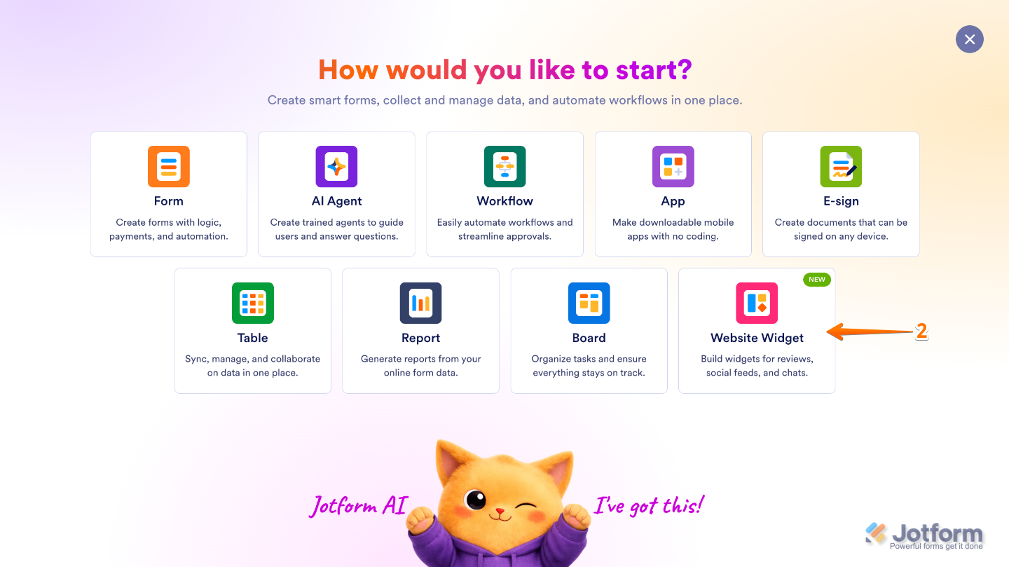
- Then, in the menu that opens up, select Website Widget.
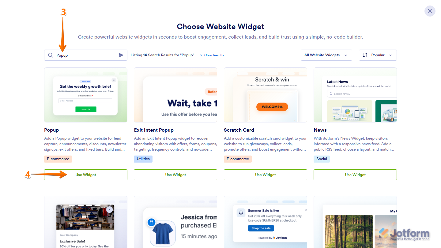
- Next, in the Search bar in the upper-left corner of the Choose Website Widget menu, enter Popup.
- Then, at the bottom of the Popup widget in the search results, click on Use Widget.
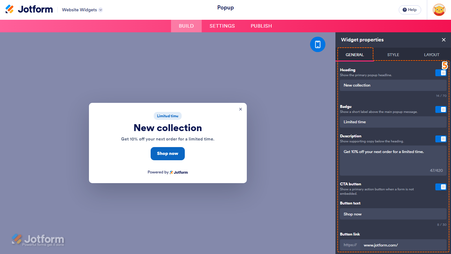
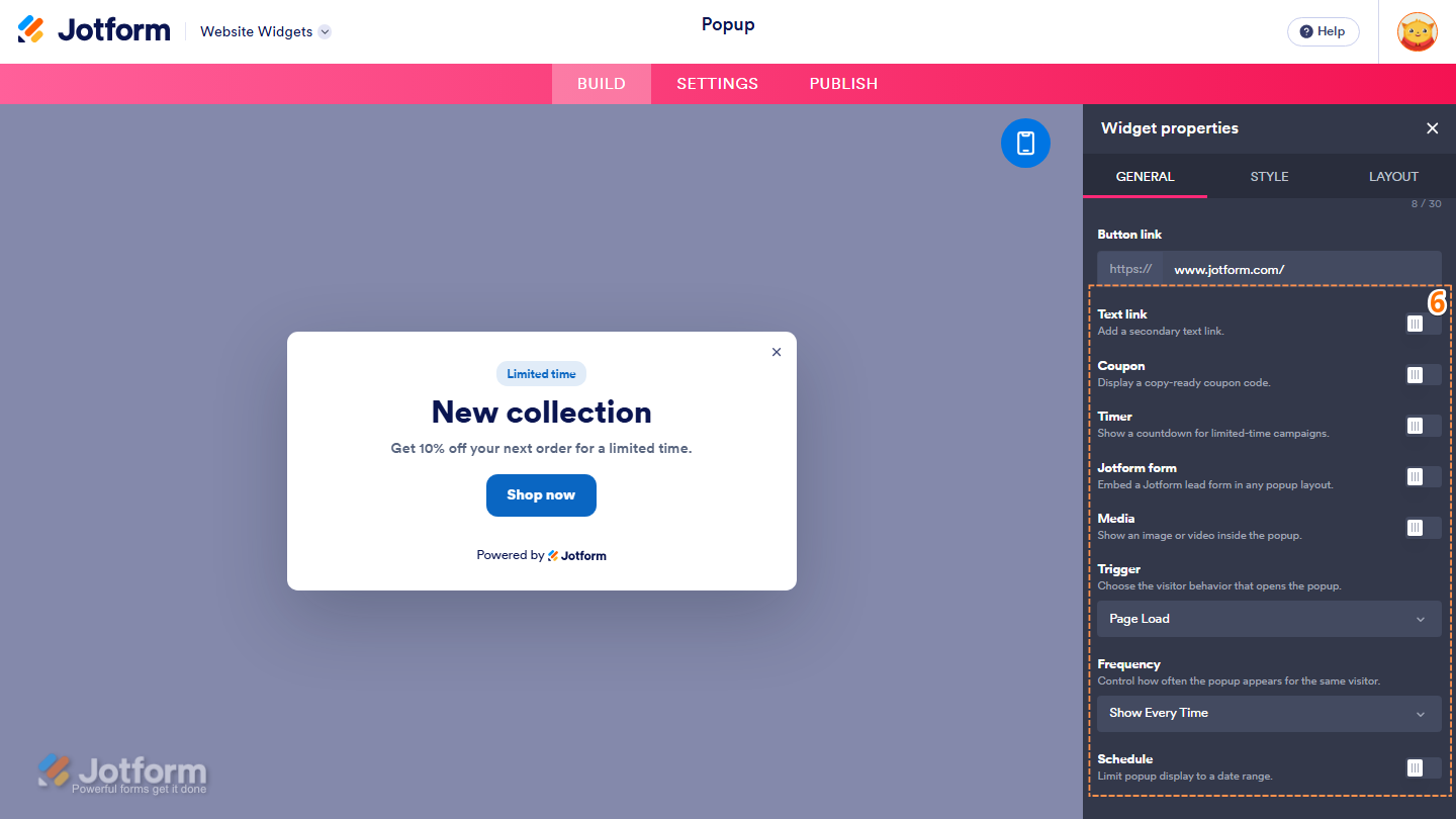
- Now, in the Widget Properties menu that opens on the right side of Website Widgets, under the General tab, set up these properties:
- Heading — Keep this on to display the popup heading, then delete the existing heading in the input box and enter the heading you want to display.
- Badge — Toggle this off to hide the badge above the heading, or leave it enabled and, in the input box below it, delete the existing badge text and enter the label you want to display.
- Description — Keep this on to display supporting text below the heading, then delete the existing description in the input box and enter the text you want to display.
- CTA Button — Toggle this off to hide the call-to-action button, or leave it enabled and customize it with these properties:
- Button Text — Delete the existing button text in the input box and enter the text you want to display.
- Button Link — Enter the URL you want the button to open in the input box.
- Then, scroll down and continue to set up these properties:
- Text Link — Toggle this on to display a secondary text link and customize it with the available properties.
- Coupon — Toggle this on to display a copy-ready coupon code and customize it with the available properties.
- Timer — Toggle this on to display a countdown timer and customize it with the available properties.
- Jotform Form — Toggle this on to embed a Jotform form inside the popup and customize it with the available properties.
- Media — Toggle this on to display an image or video inside the popup and customize it with the available properties.
- Trigger — Keep the default Page Load option selected, or click on the Dropdown menu and select how visitors open the popup.
- Frequency — Keep the default Show Every Time option selected, or click on the Dropdown menu and select how often the popup is displayed to the same visitor.
- Schedule — Toggle this on to limit when the popup is displayed and customize it with the available properties.
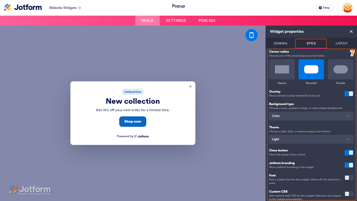
- Now, under the Style tab, customize these properties:
- Corner Radius — Select one of the following options to choose the popup corner style:
- Square — Display the popup with square corners.
- Rounded — Display the popup with rounded corners.
- Circular — Display the popup with fully rounded corners.
- Overlay — Keep this on to display a tinted overlay behind the popup, or toggle it off to remove the overlay.
- Background Type — Keep the default Color option selected, or click on the Dropdown menu and select the background type you want to use for the popup.
- Theme — Keep the default Light option selected, or click on the Dropdown menu and select a different theme for the popup.
- Close Button — Keep this on to display the popup’s close button, or toggle it off to hide it.
- Jotform Branding — Keep this on to display Jotform branding in the website widget, or toggle it off to hide it.
- Font — Toggle this on, then click on the Dropdown menu and select the font you want to use for the website widget. The preview below updates to show how the selected font will appear. When this option is off, the website’s font is used.
- Custom CSS — Toggle this on, then enter your custom CSS in the input box that appears to apply advanced styling to the website widget.
- Corner Radius — Select one of the following options to choose the popup corner style:
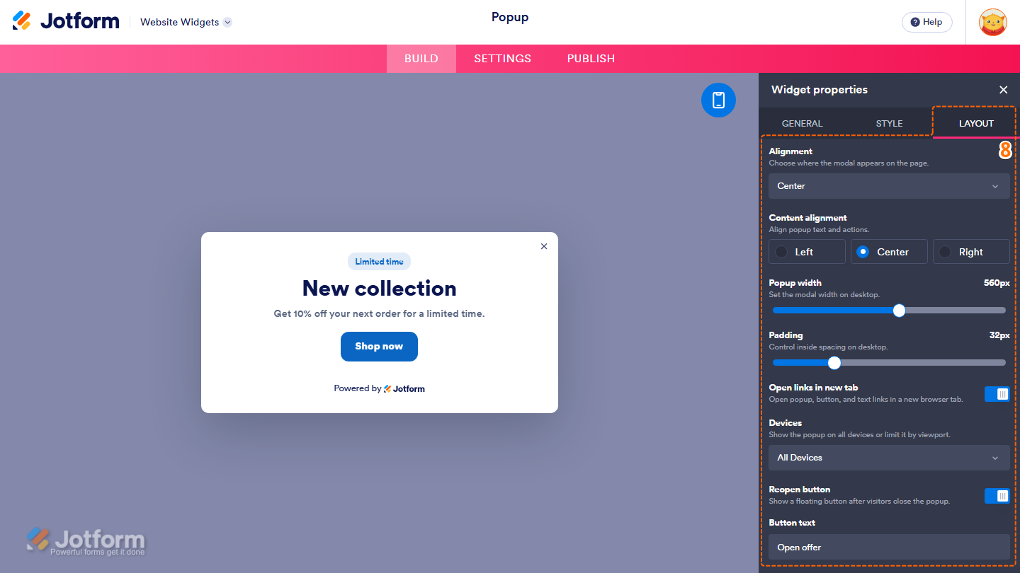
- Next, under the Layout tab, configure these properties:
- Alignment — Click on the Dropdown menu and select where you want the popup to appear on the page.
- Content Alignment — Select one of the following options to choose how the popup content is aligned:
- Left — Align the popup text and actions to the left.
- Center — Center the popup text and actions.
- Right — Align the popup text and actions to the right.
- Popup Width — Keep the default 560px value, or click on and hold the slider handle, then drag it to adjust the popup width.
- Padding — Keep the default 32px value, or click on and hold the slider handle, then drag it to adjust the spacing inside the popup.
- Open Links in New Tab — Keep this on to open popup, button, and text links in a new browser tab, or toggle it off to open them in the current tab.
- Devices — Keep the default All Devices option selected, or click on the Dropdown menu and select the devices on which you want the popup to appear.
- Reopen Button — Keep this on to display a floating button after visitors close the popup, or toggle it off to hide the button.
- Button Text — Delete the existing button text in the input box and enter the text you want to display on the reopen button.
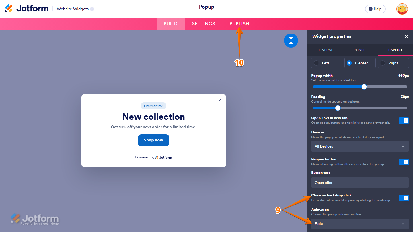
- Then, scroll down and adjust these settings:
- Close on Backdrop Click — Keep this on to let visitors close the popup by clicking outside it, or toggle it off to require using the popup’s close button.
- Animation — Click on the Dropdown menu and select the animation you want to use when the popup appears.
- Once everything’s set, in the pink navigation bar at the top of the page, click on Publish.
Note
You’ll be asked to log in to your Jotform account or sign up for one. Once you’ve done that, you’ll be able to get the embed code for your widget.
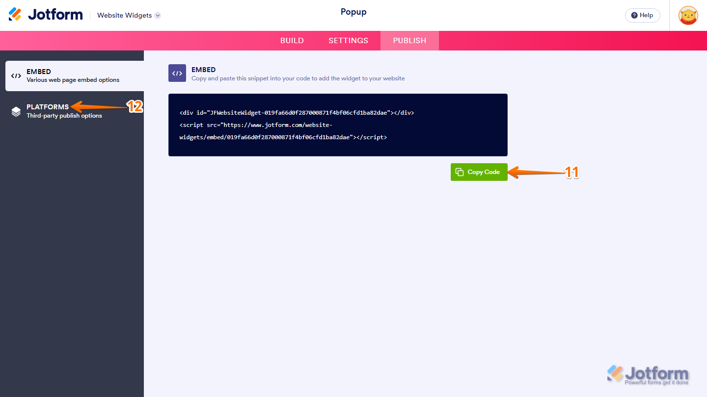
- Then, in the Embed section, click on Copy Code, and, if you already know how, paste that into the Embed section on your platform, and you’re good to go.
- To view embedding instructions for your widget, click on Platforms in the menu on the left side of the page.
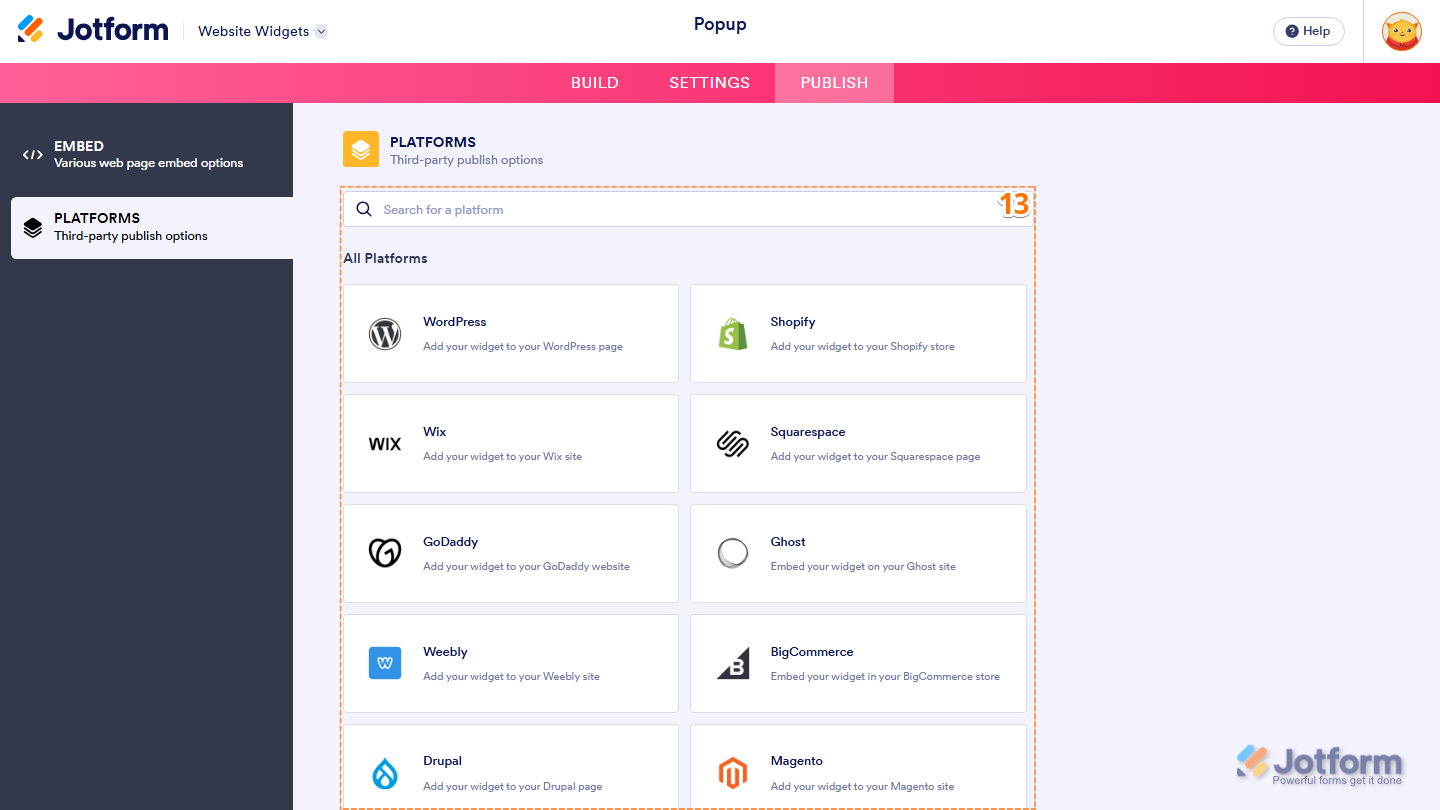
- Next, in the Platforms section on the right, select the platform you want to view embedding instructions for. Or, use the Search bar at the top of the section to find it easily.
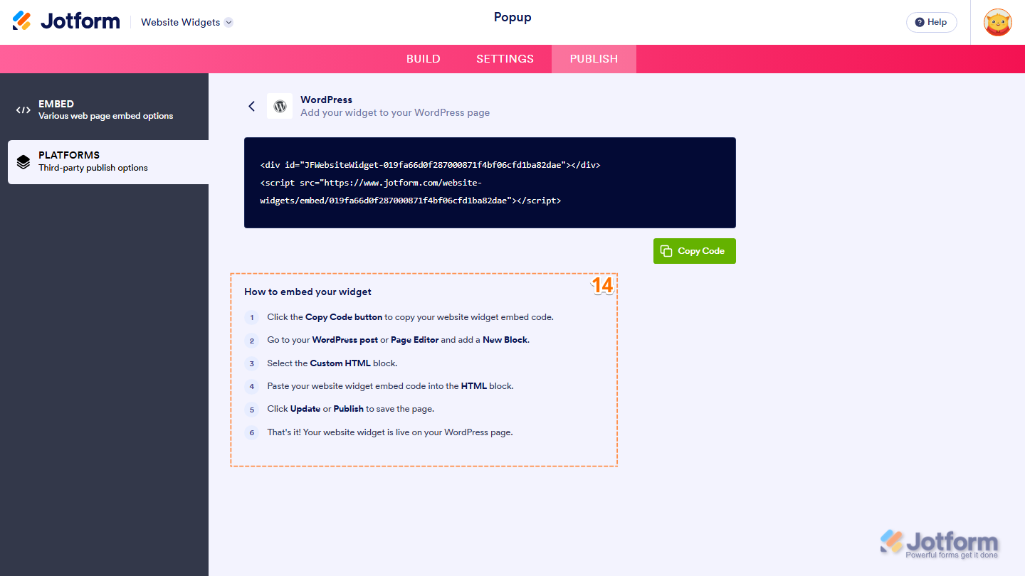
- Then, follow the steps in the How to Embed Your Widget section to add it to your website.
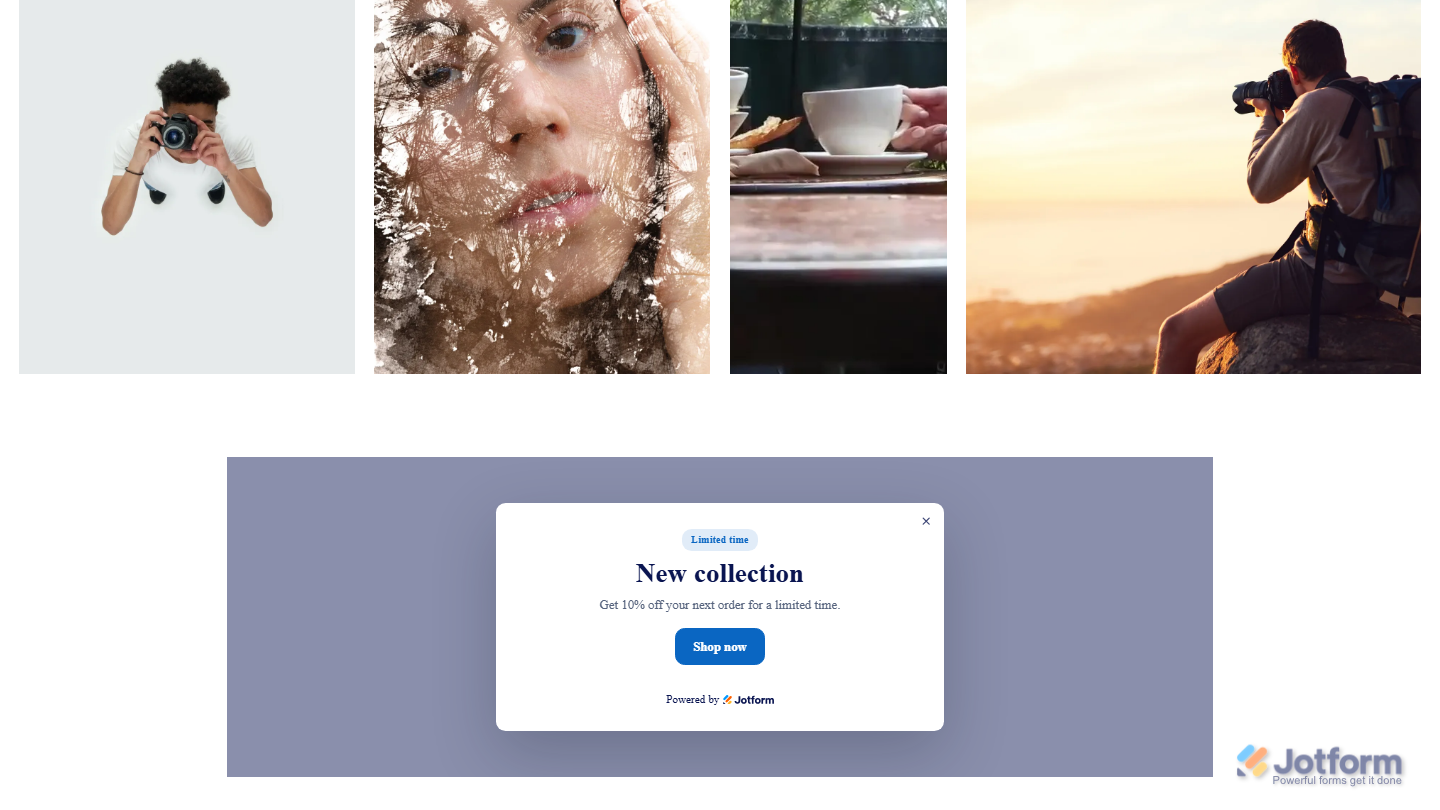
That’s it! Your Popup widget will appear on your website just the way you customized it. Take a look at the example below to see how it’ll look on a website.
Note
You can manage the website widgets you’ve created at any time from your account. For a full breakdown of how to do it, head over to our guide on How to Manage Website Widgets.

Send Comment: