Jotform’s Houzz Reviews widget lets home service, remodeling, design, and construction professionals display client feedback from Houzz directly on their websites. Showing ratings and reviews alongside your services, project galleries, or contact information gives potential clients helpful social proof as they consider working with you.
You can choose a layout that fits your website, customize the widget to match your brand, and embed it without writing code. This makes it easy to present real client experiences in a polished format and help visitors feel more confident about reaching out.
To embed Houzz reviews on your website, you’ll first need to set up the Houzz Reviews widget and copy the embed code for it. Here’s how to get going:
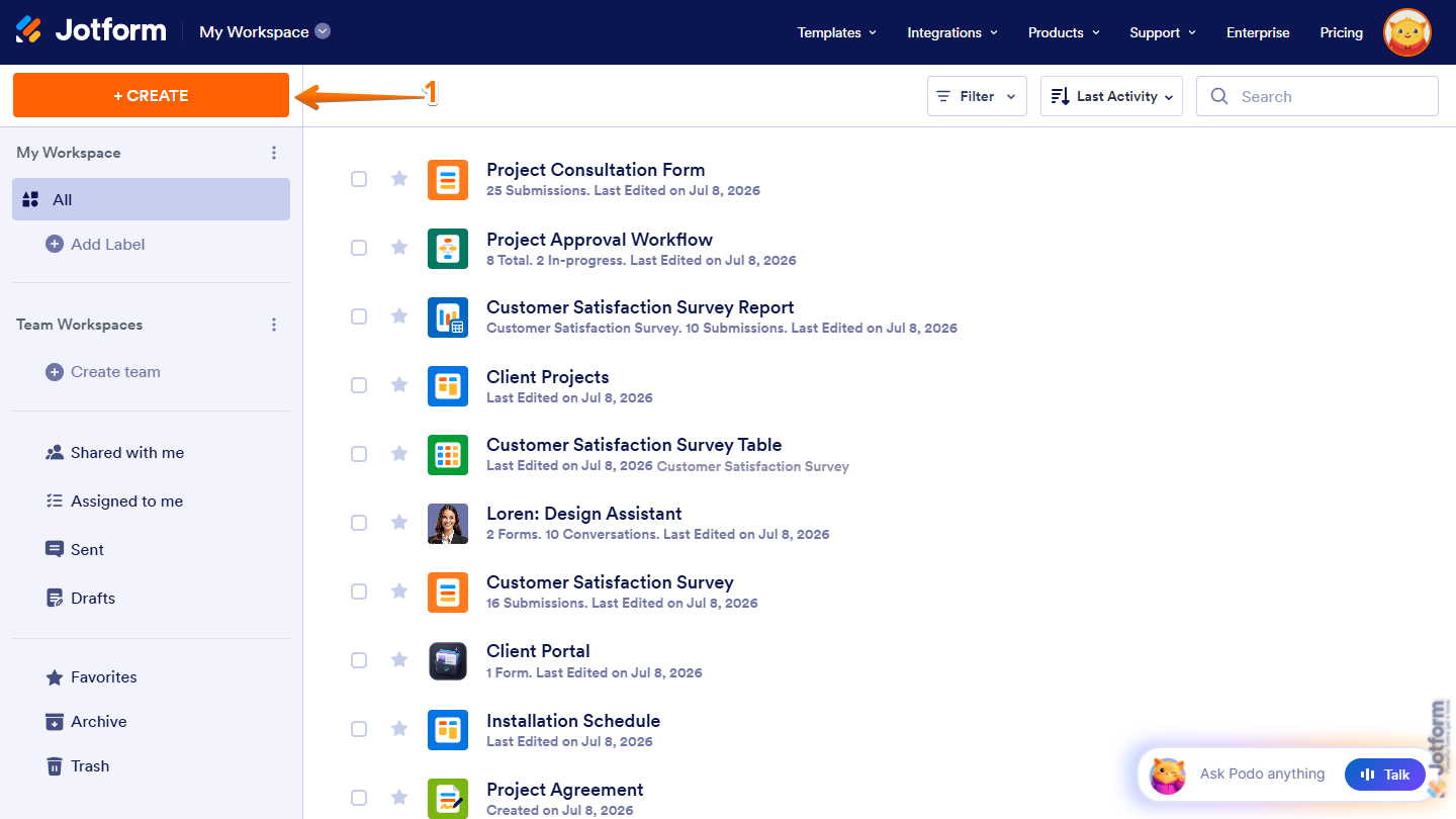
- On the top-left side of your Workspace page, click on Create.
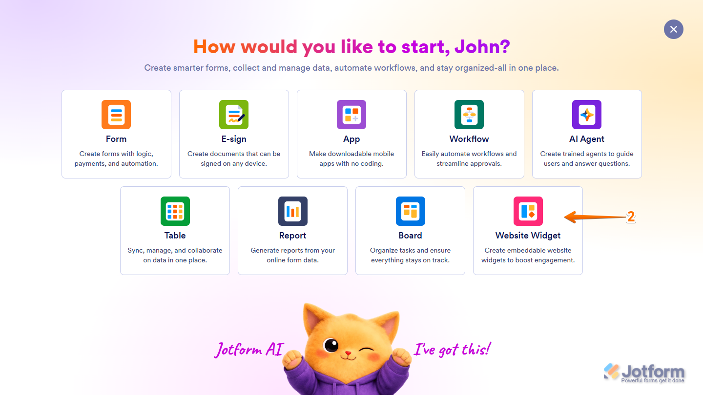
- Then, in the menu that opens up, select Website Widget.
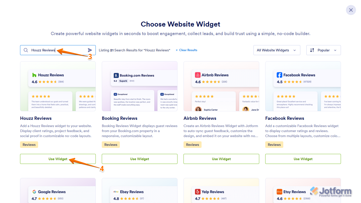
- Next, in the Search bar in the upper-left corner of the Choose Website Widget menu, enter Houzz Reviews.
- Then, at the bottom of the search results, click on Use Widget.
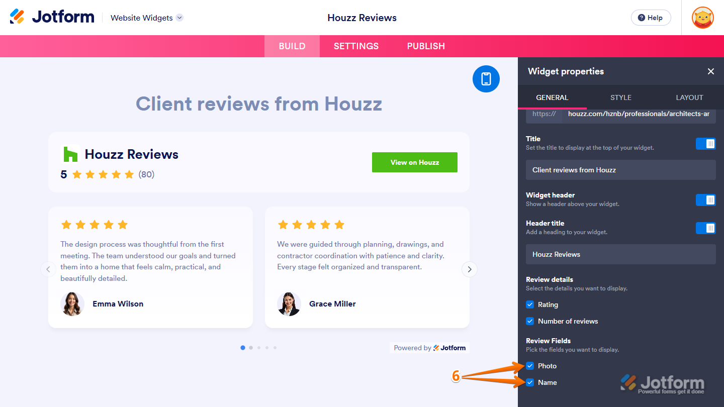
- Now, in the Widget Properties menu that opens on the right side of Website Widgets, under the General tab, set up these properties:
- Houzz Property URL — Enter your Houzz property URL in the input box to display its reviews in your widget.
- Title — Toggle this off to hide the title at the top of your widget or on its badge, or leave it on and, in the input box below it, keep its default title or enter a new one.
- Widget Header — Toggle this off to hide the header above the reviews, or leave it on and customize it with these properties:
- Header Title — This appears only when Widget Header is enabled and a layout other than Badge is selected. Toggle it off to hide the title in your widget’s header, or leave it enabled and, in the input box below it, keep the default title or enter a new one.
- Review Details — You’ll only see this when Widget Header is enabled. Keep the Rating and Number of Reviews options selected to show both details in your widget’s header or on its badge, or deselect either one to hide that detail.
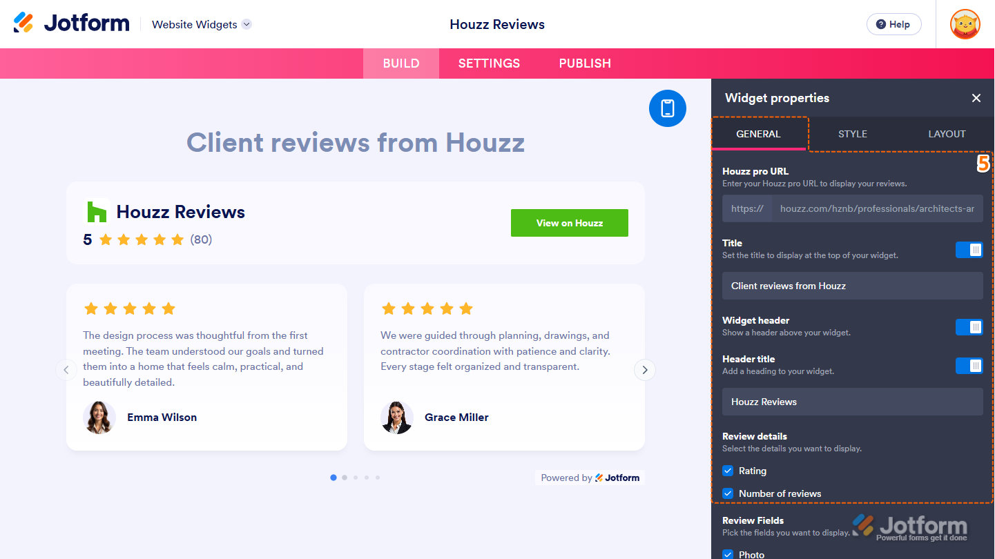
- Next, scroll down to Review Fields and keep the Photo and Name options selected, or deselect either one to hide that detail from the reviews.
Note
When the Badge layout is selected, the Review Fields property is labeled Card Details.
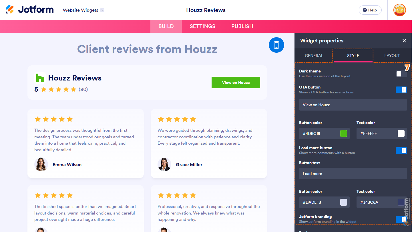
- Now, under the Style tab, customize these properties:
- Dark Theme — Toggle this on to use the dark version of the layout selected for your widget.
- CTA Button — Toggle this off to hide the button from your widget, or leave it on and, in the input box below it, keep the default button text or enter a new one. You can customize it with these properties:
- Button Color — This is only shown when the CTA Button property is enabled. Keep the default color, or enter the name, hex code, or RGB value for a new one in the input box to change the button background color.
- Text Color — You’ll only see this when the CTA Button property is enabled. Leave the default color as is, or enter the name, hex code, or RGB value for a new one in the input box to change the button label color.
- Load More Button — This is only shown when the Badge, Grid, List, or Masonry layout is selected. Toggle it off to hide the button from your widget, or leave it on and customize it with these properties:
- Button Text — This appears only when the Load More Button property is enabled. Keep the default text or enter a new one in the input box to change the button label.
- Button Color — You’ll only see this when the Load More Button property is enabled. Keep the default color, or enter the name, hex code, or RGB value for a new one in the input box to change the button background color.
- Text Color — This is only shown when the Load More Button property is enabled. Leave the default color as is, or enter the name, hex code, or RGB value for a new one in the input box to change the button label color.
- Jotform Branding — Keep this on to display Powered by Jotform in your widget, or toggle it off to hide it.
Note
Each color input box accepts color names, hex codes, and RGB values. The Color Picker on the right side of each input box lets you select a specific color or one of the predefined options.
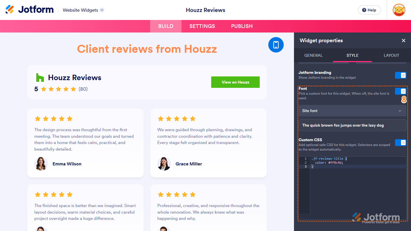
- Then, scroll down and continue with these settings:
- Font — Toggle this on, then in the Dropdown menu that appears below it, keep Site Font selected to match the font used on your website, select System to use the font from each visitor’s device, or select another available font. Leave this off to continue using your website’s font.
- Custom CSS — Toggle this on, then in the code editor that appears below it, enter custom CSS to apply advanced styling to your widget.
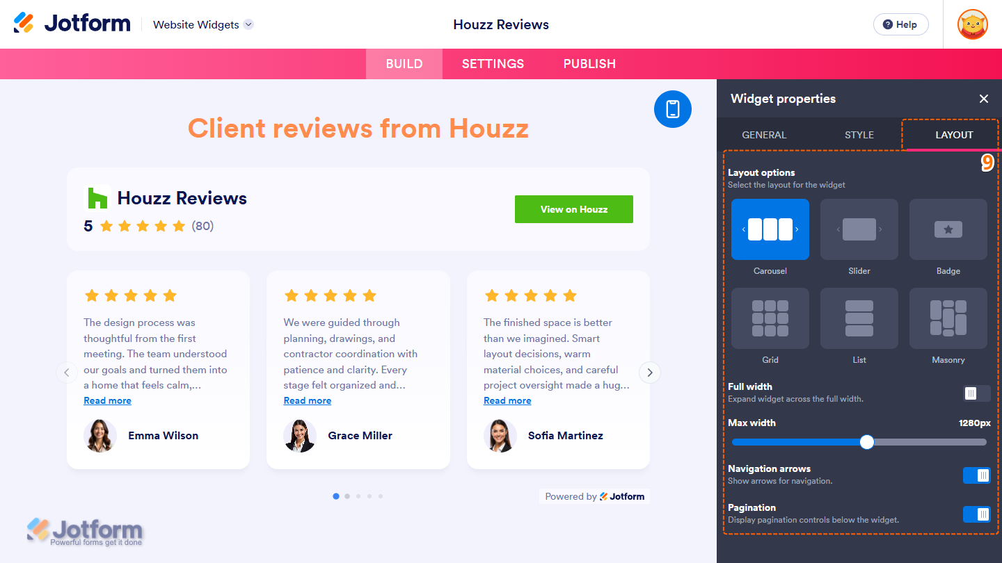
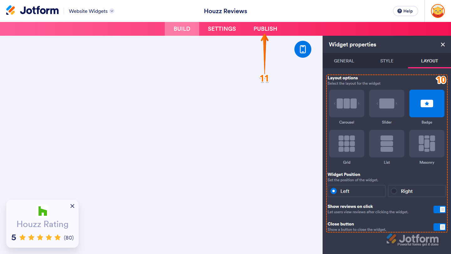
- Next, under the Layout tab, configure these properties:
- Layout Options — Keep the default Carousel option selected to display multiple reviews at a time in a horizontal carousel, or select one of these layouts instead:
- Slider — This displays one review at a time for a more focused viewing experience. Visitors can move through the reviews using the navigation arrows or pagination controls.
- Badge — This displays a badge on the left or right side of your website. Visitors can click on it to open the review panel, scroll through the reviews, and close it when they’re done.
- Grid — Reviews appear as evenly sized cards arranged in columns that adjust based on your widget’s width.
- List — This stacks reviews in a single column, with one review in each row.
- Masonry — Review cards flow into multiple columns, with each card’s height adjusting to fit its content.
- Full Width — This is available for every layout except Badge. Leave it on to make your widget fill the width of the area on your website where it’s embedded, or toggle it off to set a custom width.
- Max Width — You’ll only see this when Full Width is disabled. Keep the default 1280px value, or click on and hold the slider handle, then drag it to set your widget’s width.
- Navigation Arrows — You’ll only see this when the Carousel or Slider layout is selected. Keep it on to display arrows that visitors can use to move through the reviews, or toggle it off to hide them.
- Pagination — When the Carousel or Slider layout is selected, toggle this off to hide the pagination controls below your widget, or leave it on to display them.
- Layout Options — Keep the default Carousel option selected to display multiple reviews at a time in a horizontal carousel, or select one of these layouts instead:
- If you select the Badge layout, use these additional properties to customize it:
- Widget Position — Keep the default Left option selected to display your widget’s badge on the left side of your website, or select Right to move it to the right.
- Show Reviews on Click — Leave this on so visitors to your website can click on the badge to open the review panel, or toggle it off so clicking on it does nothing.
- Close Button — Toggle this off to hide the X button in the top-right corner of the badge, or keep it on to let visitors close your widget.
- When everything looks correct, in the pink navigation bar at the top of the page, click on Publish.
Note
You’ll be asked to log in to your Jotform account or sign up for one. Once you’ve done that, you’ll be able to get the embed code for your widget.
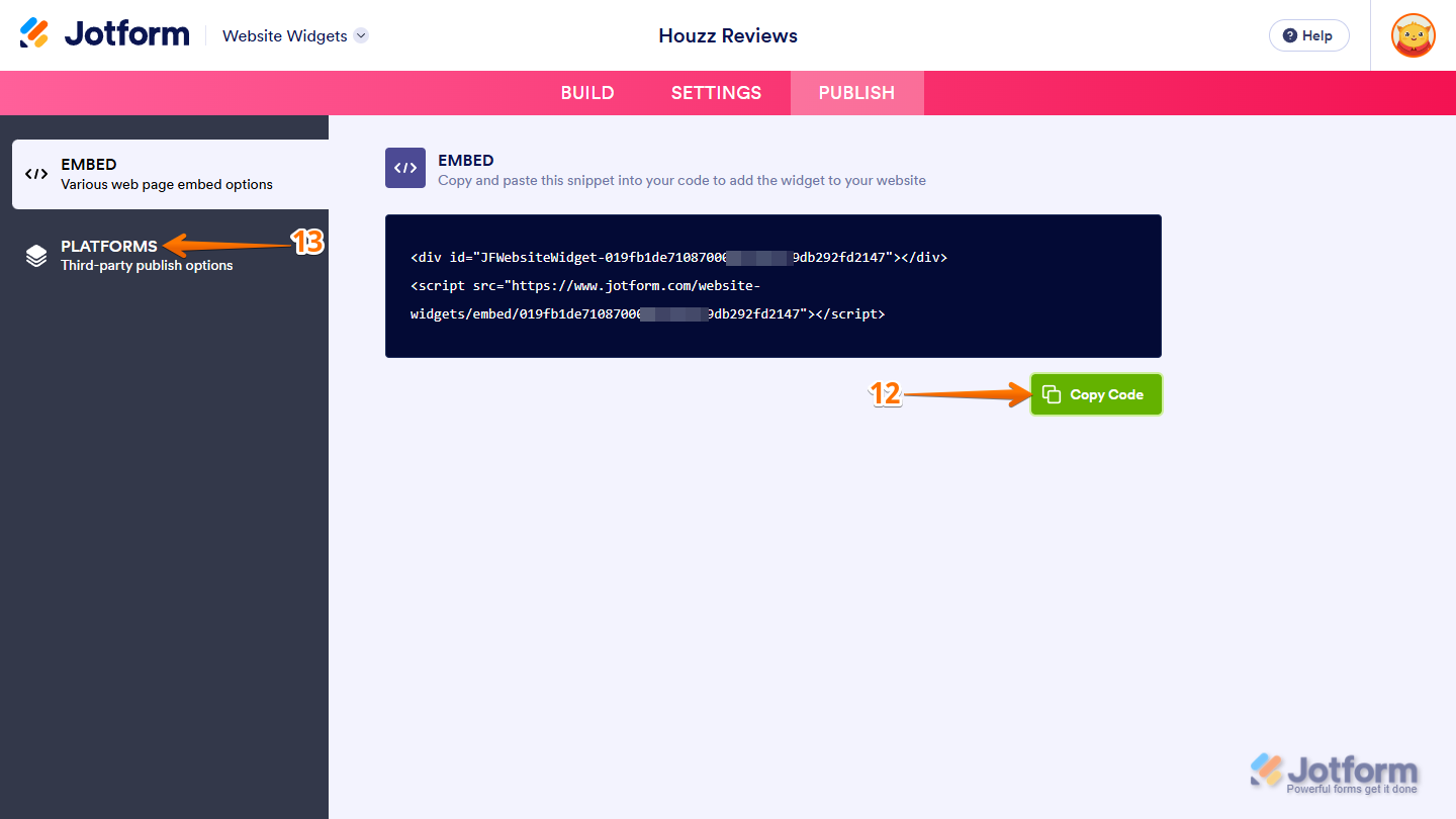
- Then, in the Embed section, click on Copy Code, and, if you already know how, paste that into the Embed section on your platform, and you’re good to go.
- To view embedding instructions for your widget, click on Platforms in the menu on the left side of the page.
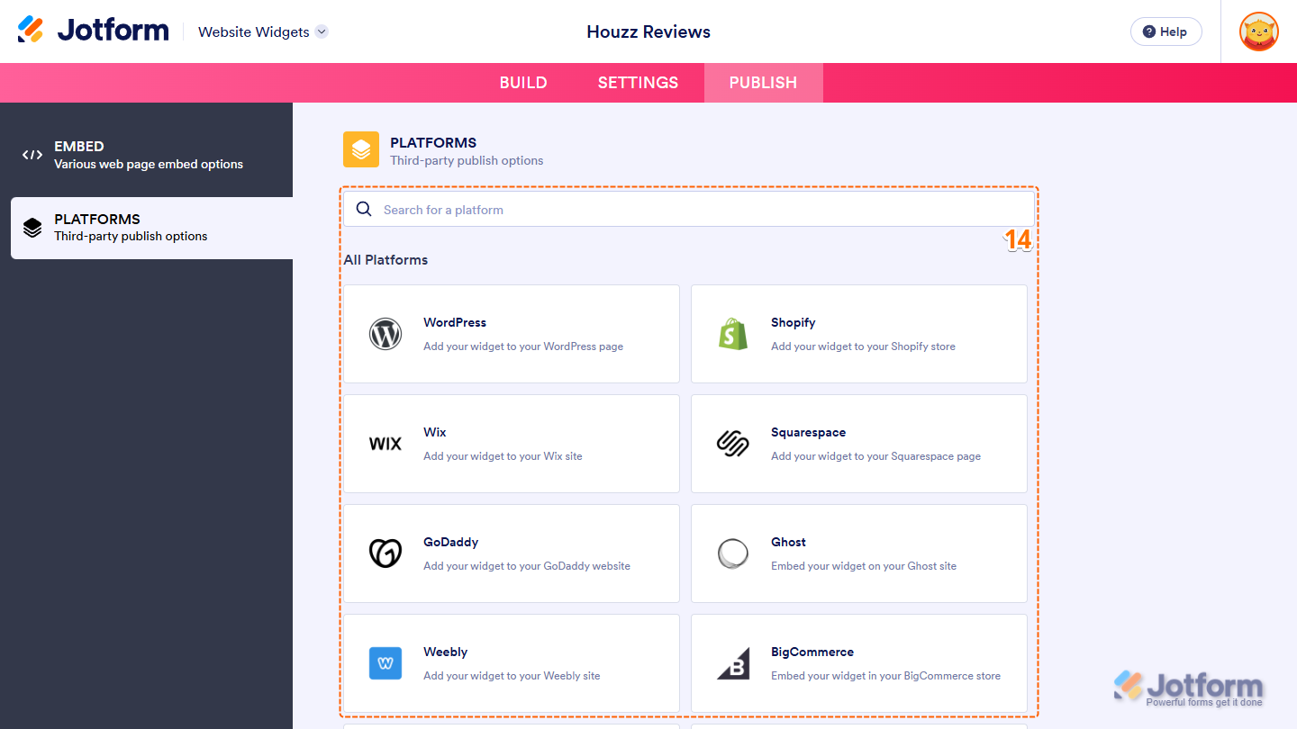
- Next, in the Platforms section on the right, select the platform you want to view embedding instructions for. Or, use the Search bar at the top of the section to find it easily.
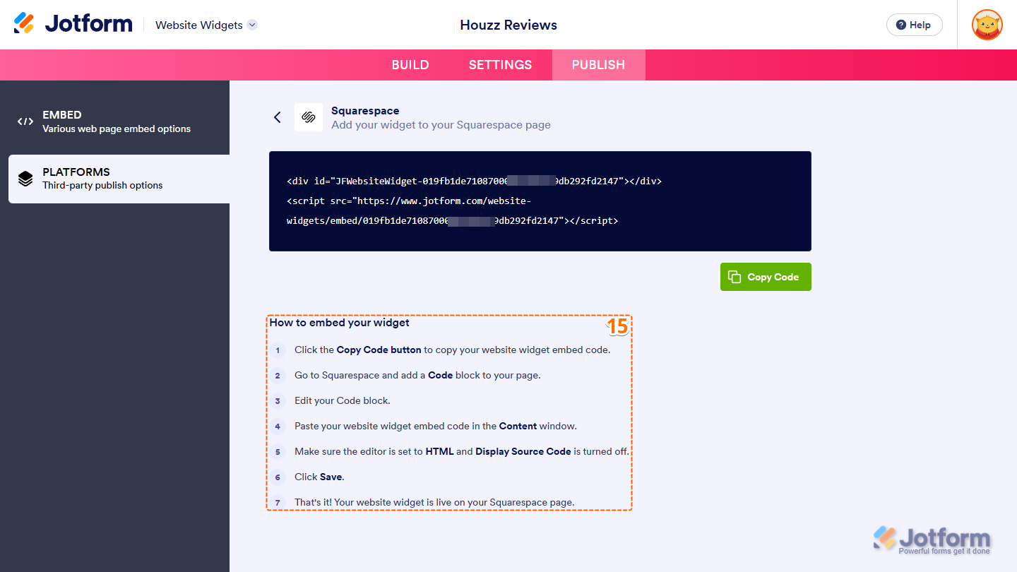
- Then, follow the steps in the How to Embed Your Widget section to add it to your website.
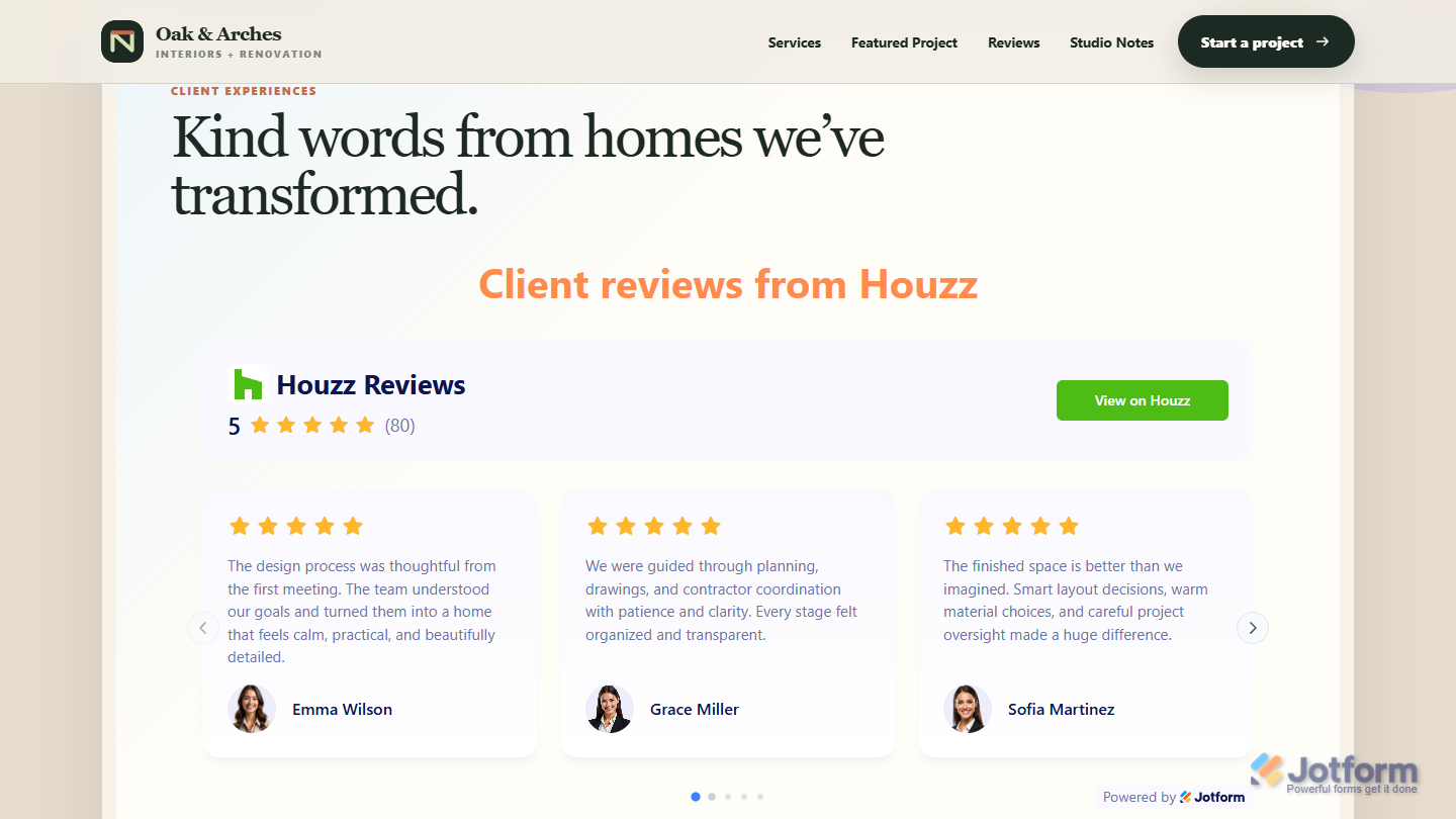
That’s it! Your Houzz Reviews widget will appear on your website just as you set it up. Take a look at the screenshot below to see how it looks on a website.
Note
You can manage the website widgets you’ve created at any time from your account. For a full breakdown of how to do it, head over to our guide on How to Manage Website Widgets.

Send Comment: