With Jotform’s Button Widget, you can create customizable buttons that direct visitors to important pages, products, forms, or other online resources. Personalize the button’s text, colors, size, and style to match your website’s design, then add it to your site in just a few steps.
Use the widget to promote a product or service, highlight an important link, or encourage visitors to take a specific action.
Creating Your Button Widget and Getting the Embed Code for It
Before you can add the Button Widget to your website, you’ll first need to customize its text, style, and destination, then copy the embed code for it. Here’s how to get started:
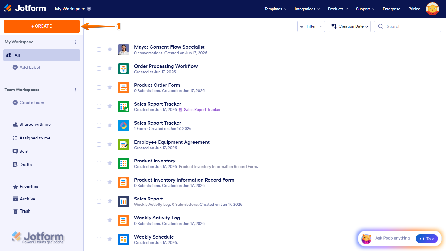
- On the top-left side of your Workspace page, click on Create.
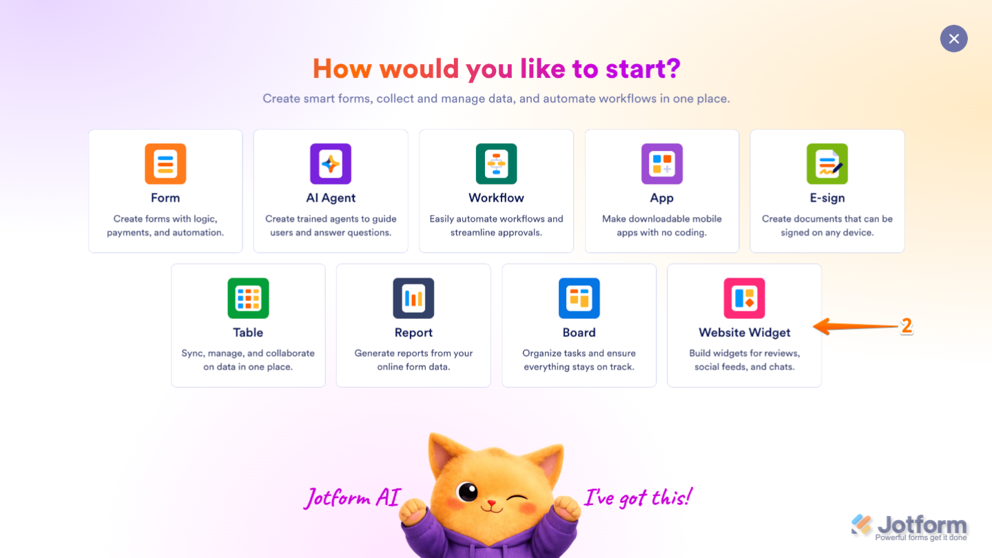
- Then, in the menu that opens up, select Website Widget.
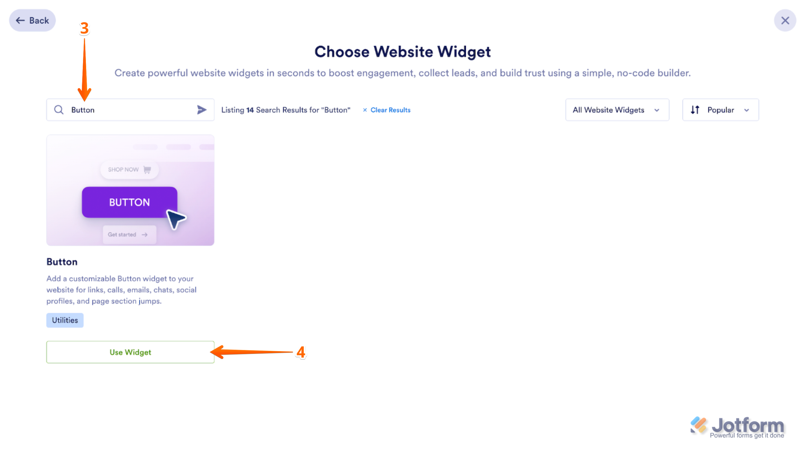
- Next, in the Search bar in the upper-left corner of the Choose Website Widget window, enter Button.
- Then, at the bottom of the search results, click on Use Widget.
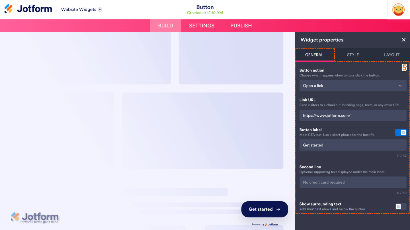
- Now, in the Widget Properties menu that opens on the right side of Website Widgets, set up these properties:
- Button Action — Choose what happens when visitors click on the button, such as opening a webpage or another supported action.
- Link URL — Enter the URL that the button will open when clicked on.
- Button Label — Set the main text displayed on the button.
- Second Line — Add an optional second line of text below the main button label for additional context or information.
- Show Surrounding Text — Display supporting text above or below the button to provide extra instructions or encourage visitors to click on it.
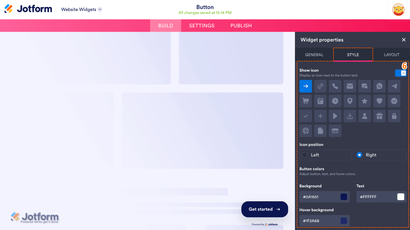
- Next, under the Styles tab, customize these properties:
- Show Icon — Display an icon alongside the button text to make the button more visually engaging.
- Icon Position — Choose whether the icon is shown before or after the button text.
- Button Colors — Adjust these options to change the button, text, and hover colors.
- Background — Select the background color for the button.
- Text — Set the color of the text displayed on the button.
- Hover Background — Choose the background color that’s shown when visitors hover their mouse over the button.
- Show Icon — Display an icon alongside the button text to make the button more visually engaging.
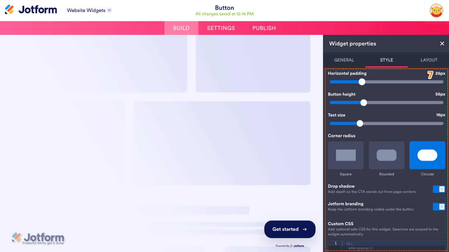
- Then, scroll down and adjust these settings:
- Horizontal Padding — Adjust the amount of space on the left and right sides of the button text.
- Button Height — Set the height of the button.
- Text Size — Adjust the size of the button text.
- Corner Radius — Control how rounded the button’s corners are.
- Drop Shadow — Add a shadow around the button to make it stand out from the page.
- Jotform Branding — Show or hide Jotform branding on the widget.
- Custom CSS — Apply your own CSS code for advanced styling beyond the built-in settings.
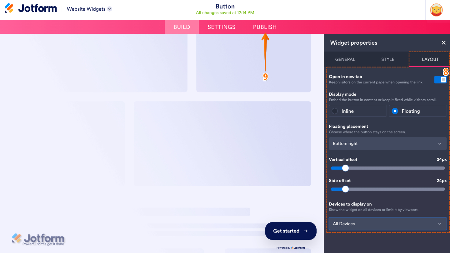
- Now, under the Layout tab, configure these properties:
- Open New Tab — Open the linked webpage in a new browser tab when the button is clicked.
- Display Mode — Choose how the button is displayed on your website, such as inline with your content or as a floating button.
- Floating Placement — Select where the floating button appears on your webpage.
- Vertical Offset — Adjust the button’s distance from the top or bottom edge of the page.
- Side Offset — Adjust the button’s distance from the left or right edge of the page.
- Device to Display On — Choose whether the button appears on desktop devices, mobile devices, or both.
- Once you’ve finished configuring the widget, in the pink navigation bar at the top of the page, click on Publish.
Note
You’ll be asked to log in to your Jotform account, if you’re not already, or sign up for one. Once you’ve done that, you’ll be able to get the embed code for your widget.
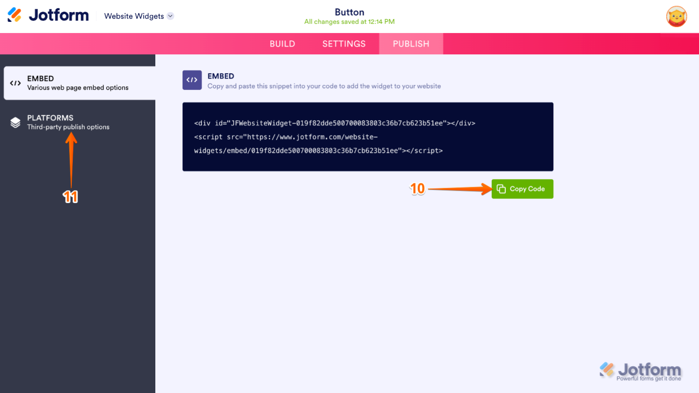
- Then, in the Embed section, click on Copy Code, and, if you already know how, paste that into the Embed section on your platform, and you’re good to go.
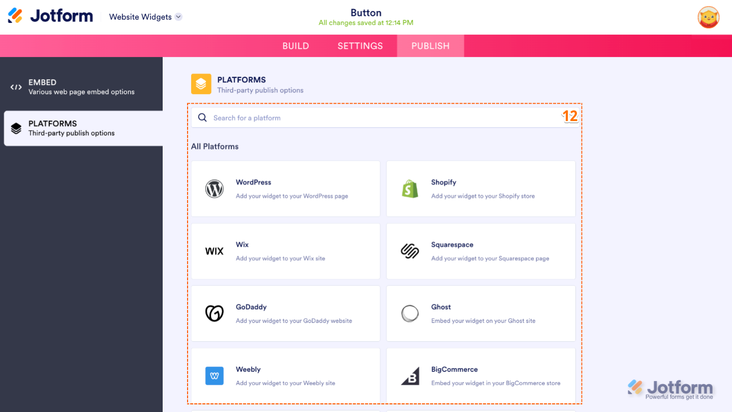
- To view embedding instructions for your widget, click on Platforms in the menu on the left side of the page.
- Next, in the Platforms section on the right, select the platform you want to view embedding instructions for. Or, use the Search bar at the top of the section to find it easily.
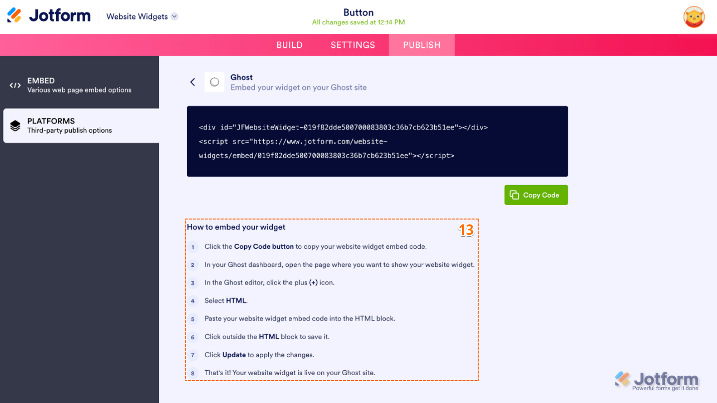
- Then, follow the steps in the How to Embed Your Widget section to add it to your website.
That’s it! Your Button widget will appear on your website just the way you customized it. See the screenshot below for an example of how it looks on a website.

Note
You can manage the website widgets you’ve created at any time from your account. For a full breakdown of how to do it, head over to our guide on How to Manage Website Widgets.
Pro Tips
- Use short, action-oriented button labels like Get Started, Learn More, Sign Up, or Contact Us to make it clear what happens when visitors click the button.
- Choose button colors that stand out from your website’s background while still matching your overall branding to make your call-to-action more noticeable.


Send Comment: