With Jotform’s Content Locker widget, you can control who can view content on your website by setting requirements visitors must meet before it’s unlocked. It’s a simple way to share exclusive content, collect leads, or give access to specific resources.
Whether you’re sharing members-only content, downloadable files, online courses, or special offers, the Content Locker widget helps you decide who can access your content and when it’s available.
Adding Content Locker features to your website only takes a few steps. Here’s how to set it up:
- On the top-left side of your Workspace page, click on Create.
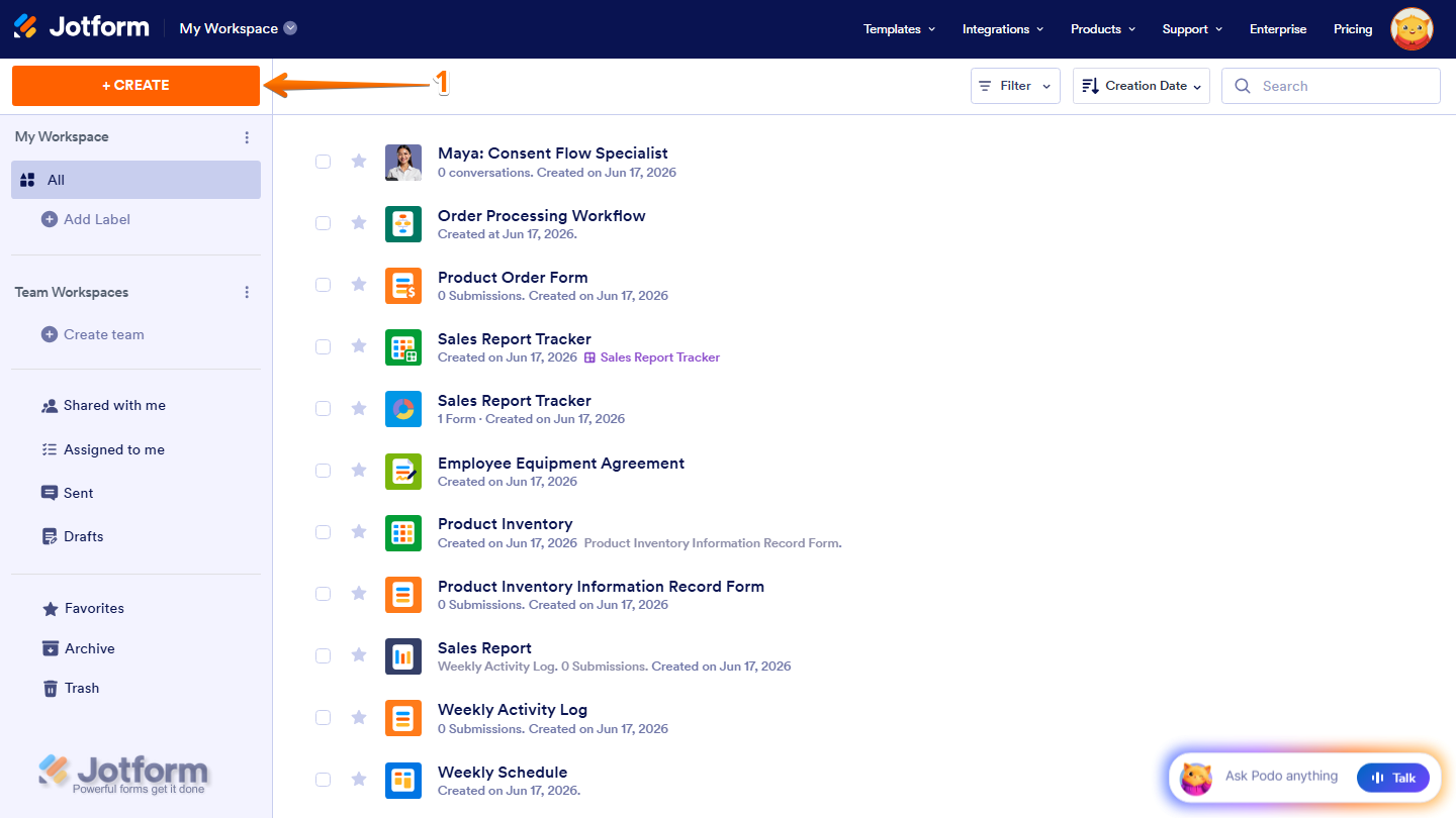
- Then, in the menu that opens up, select Website Widget.
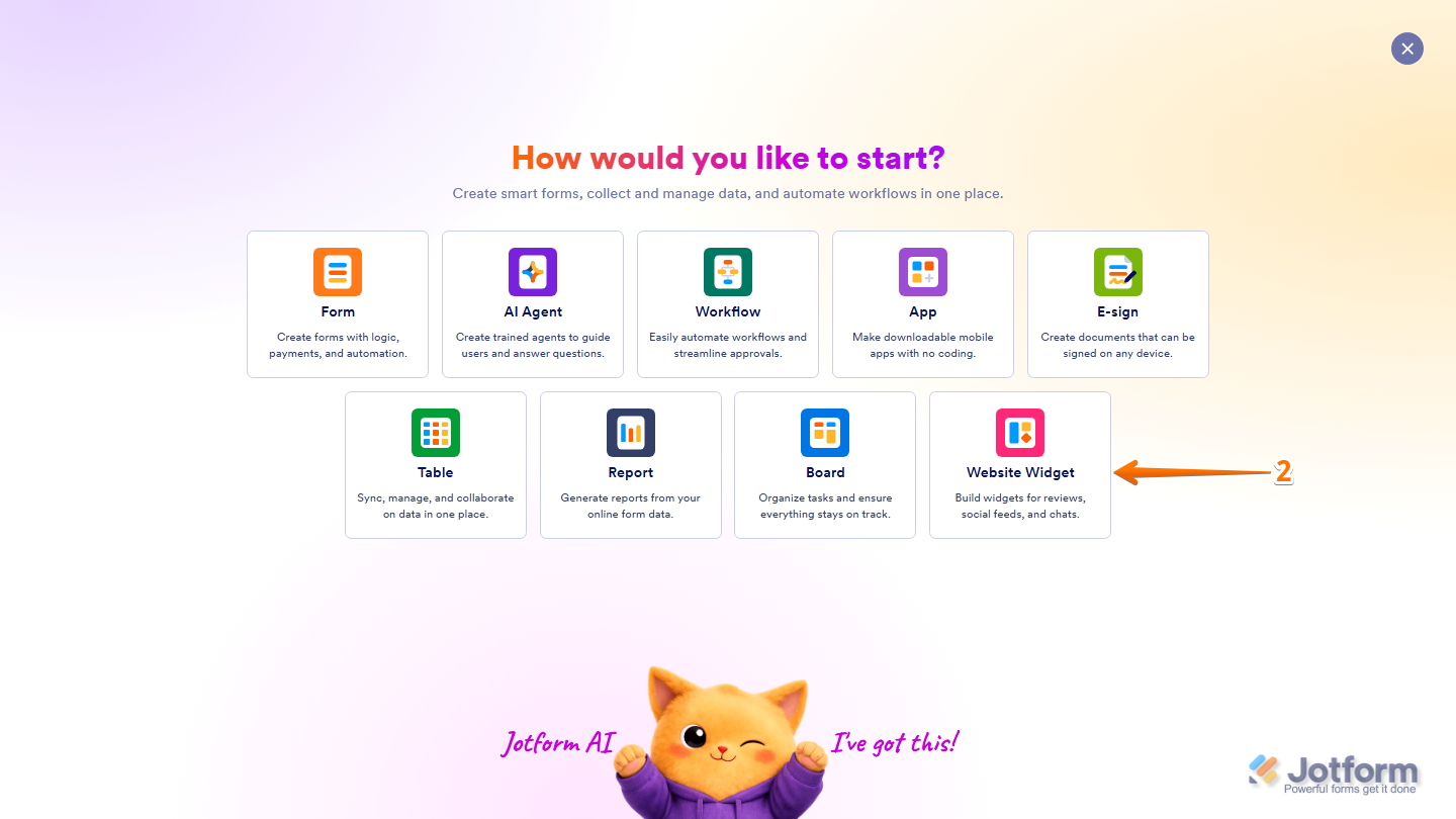
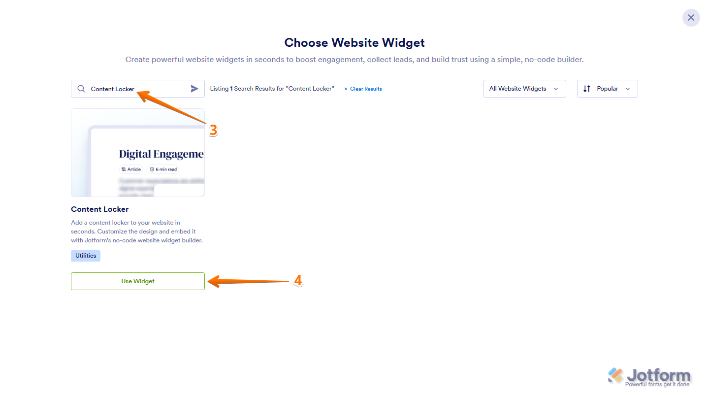
- Next, in the Search bar in the upper-left corner of the Choose Website Widget menu, enter Content Locker.
- Then, at the bottom of the search results, click on Use Widget.
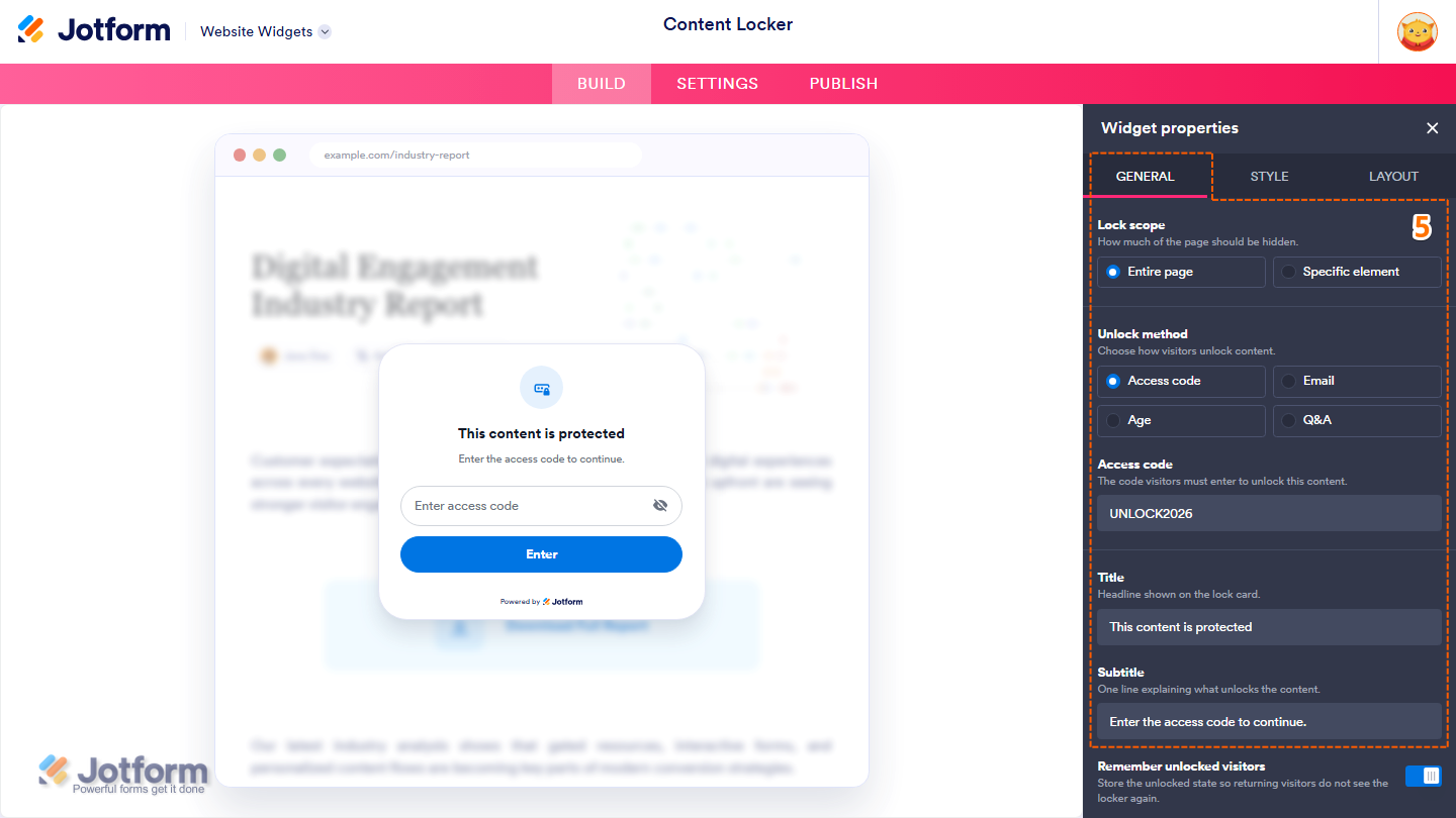
- Now, under the General tab, set up these properties:
- Lock Scope — Select one of the following options to choose how much of the page is locked:
- Entire Page — Locks the entire page until visitors unlock the content.
- Specific Element — Locks only the selected element on the page.
- Unlock Method — Select one of the following options to choose how visitors can unlock the content:
- Access Code — Requires visitors to enter a predefined access code.
- Email — Requires visitors to enter their email address.
- Age — Requires visitors to confirm that they meet the required age.
- Q&A — Requires visitors to answer a predefined question.
- Access code — This is only available when Access code is selected as the Unlock method. Enter the access code visitors must provide to unlock the content.
- Title — Delete the default title in the input box and enter the heading you want to display on the lock card.
- Subtitle — Delete the default subtitle in the input box and enter the text you want to display below the title.
- Lock Scope — Select one of the following options to choose how much of the page is locked:
- Then, scroll down and continue with these settings:
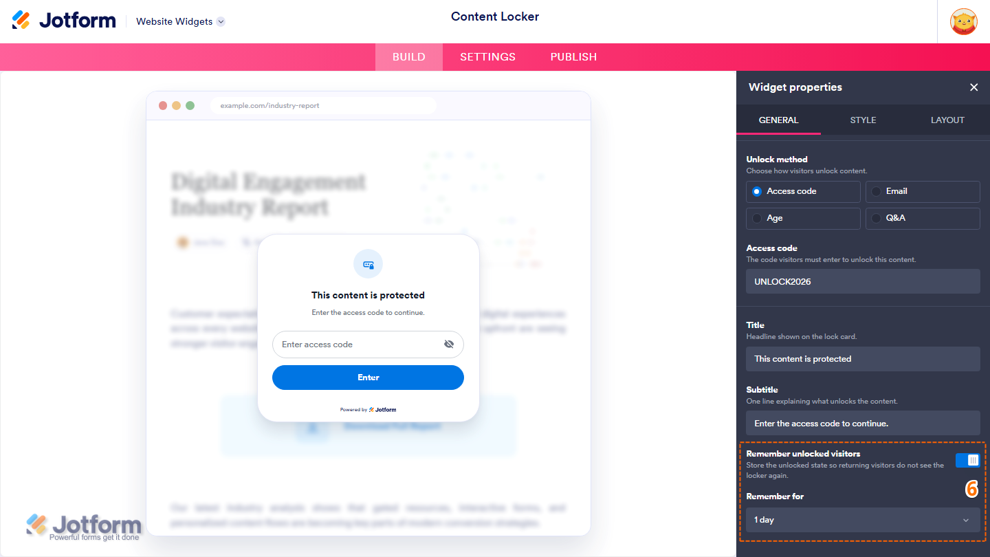
- Remember Unlocked Visitors — Leave this enabled to remember visitors who have already unlocked the content, or toggle it off to require them to unlock it again on future visits.
- Remember For — This is only available when Remember unlocked visitors is enabled. Select how long unlocked visitors should remain remembered from the Dropdown menu.
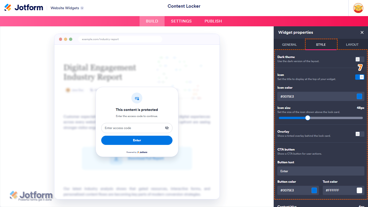
- Next, under the Style tab, customize these properties:
- Dark Theme — Enable this option to display the lock card using a dark color scheme, or toggle it off to use the light color scheme.
- Icon — Leave this enabled to display an icon above the lock card, or toggle it off to hide it.
- Icon Color — Customize the icon color by entering a hex code in the input box or selecting one from the color box.
- Icon Size — Click on and hold the slider handle, then drag it to adjust the size of the icon.
- Overlay — Keep this on to display a tinted overlay behind the lock card, or toggle it off to remove it.
- CTA Button — Leave this enabled to display a call-to-action button on the lock card, or toggle it off to hide it.
- Button Text — This is only available when the CTA button is enabled. Delete the default button text in the input box and enter the text you want to display on the button.
- Button Color — This is only available when the CTA button is enabled. Customize the button color by entering a hex code in the input box or selecting one from the color box.
- Text Color — This is only available when the CTA button is enabled. Change the button text color by entering a hex code in the input box or selecting one from the color box.
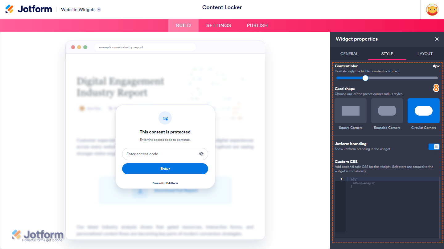
- Then, scroll down and adjust these settings:
- Content Blur — Click on and hold the slider handle, then drag it to adjust how much the locked content is blurred.
- Card shape — Select one of the following options to choose the corner style of the lock card:
- Square Corners — Displays the lock card with square corners.
- Rounded Corners — Displays the lock card with rounded corners.
- Circular Corners — Displays the lock card with fully rounded corners.
- Jotform Branding — Leave this enabled to display Jotform branding in the widget, or toggle it off to hide it.
- Custom CSS — Enter custom CSS to further customize the widget’s appearance.
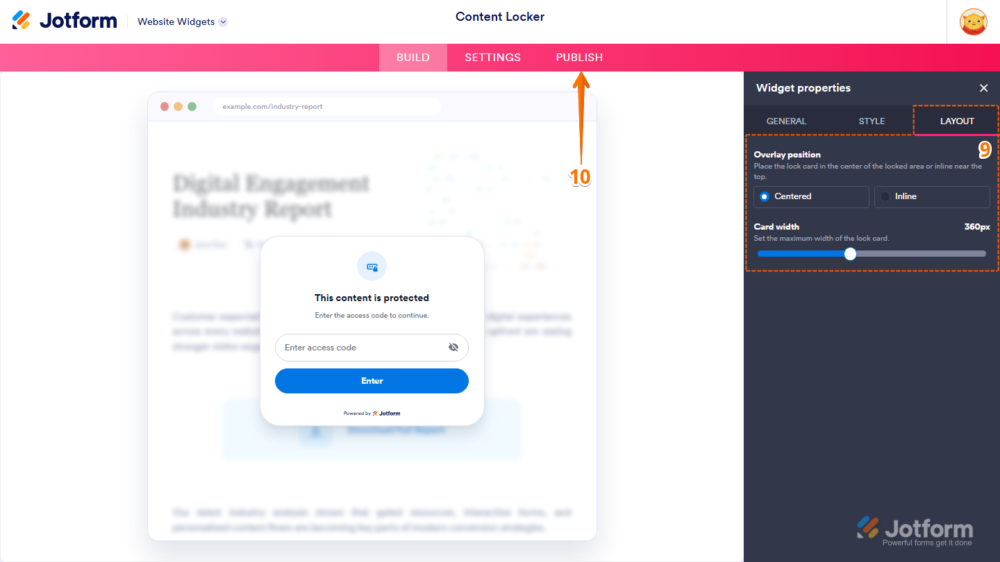
- Now, under the Layout tab, configure these properties:
- Overlay position — Select one of the following options to choose where the lock card is displayed:
- Centered — Displays the lock card in the center of the locked content.
- Inline — Displays the lock card near the top of the locked content.
- Card Width — Click on and hold the slider handle, then drag it to adjust the maximum width of the lock card.
- Overlay position — Select one of the following options to choose where the lock card is displayed:
- Once everything’s set, in the pink navigation bar at the top of the page, click on Publish.
Note
You’ll be asked to log in to your Jotform account or sign up for one before you can continue using your widgets.
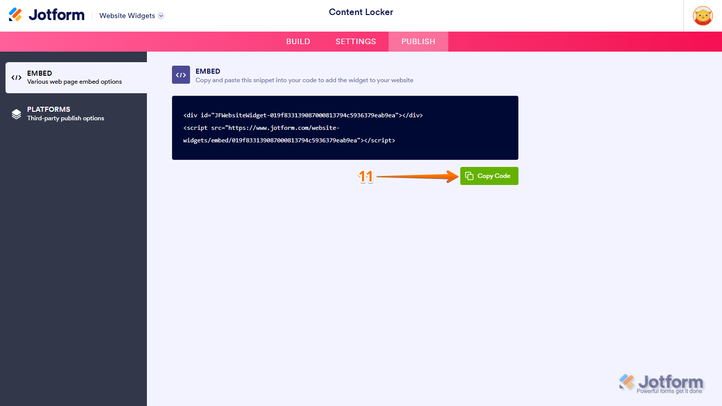
- Then, in the Embed section, click on Copy Code, and, if you already know how, paste that into the Embed section on your platform, and you’re good to go.
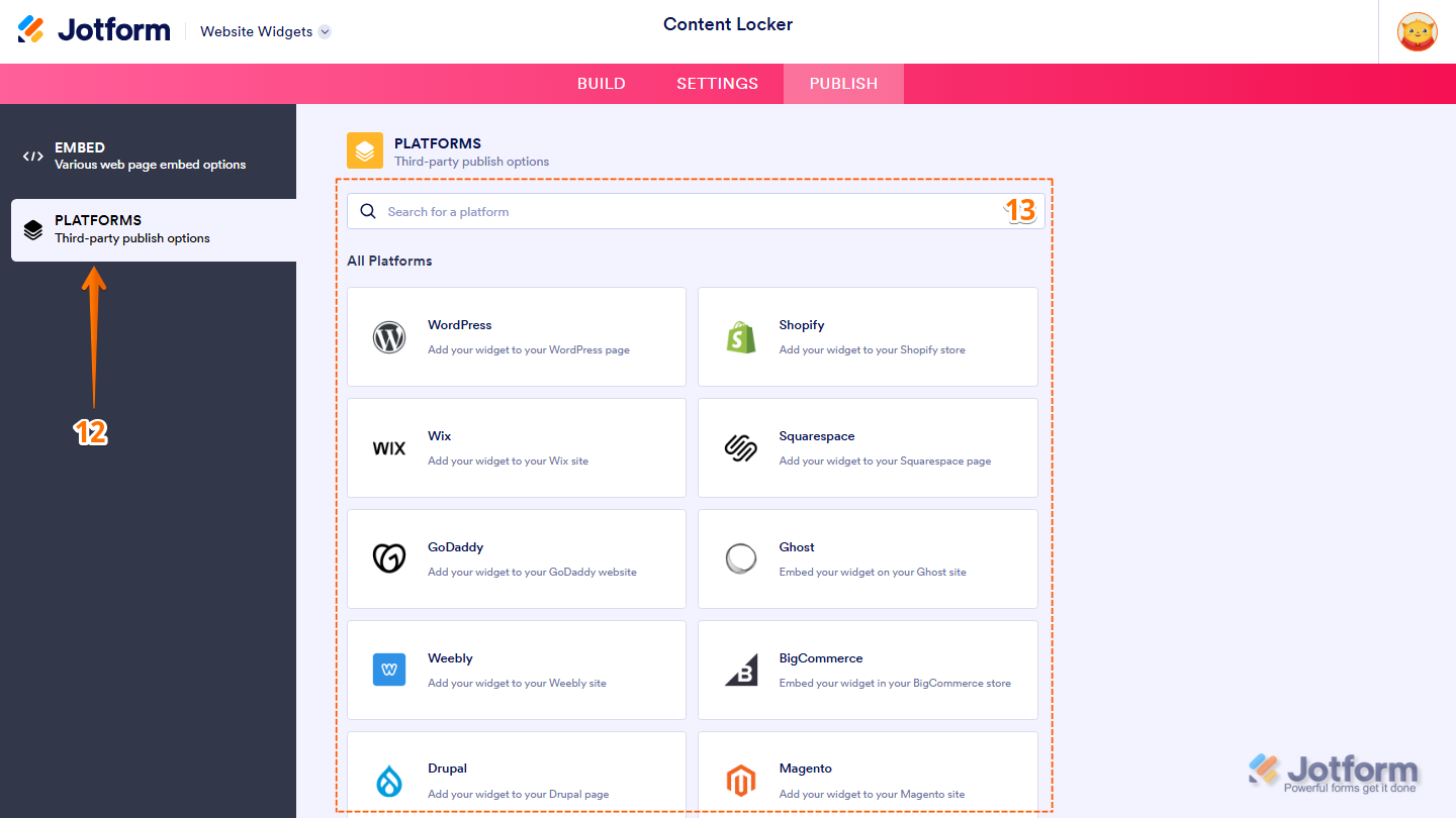
- To view embedding instructions for your widget, click on Platforms in the menu on the left side of the page.
- Next, in the Platforms section on the right, select the platform you want to view embedding instructions for. Or, use the Search bar at the top of the section to find it easily.
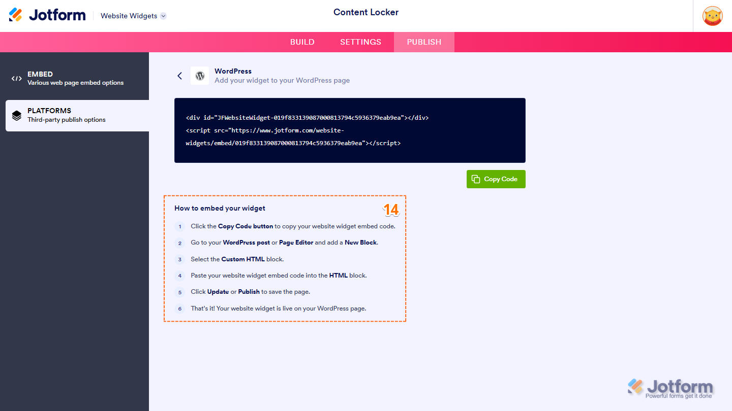
- Then, follow the steps in the How to Embed Your Widget section to add it to your website.
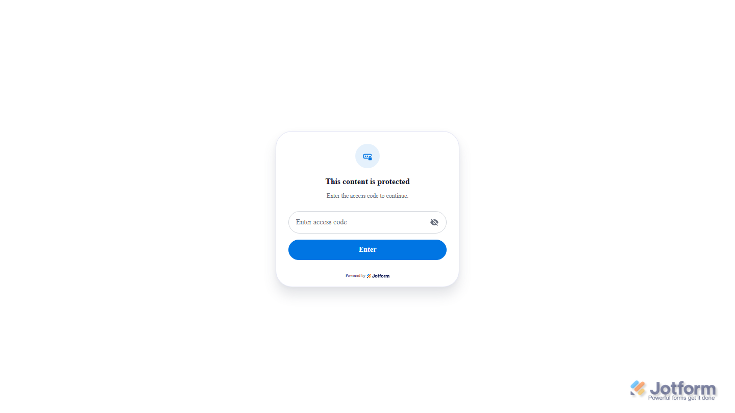
That’s it! Your Content Locker widget will appear on your website just as you set it up. Take a look at the example below to see how it’ll look on a website.
Note
You can manage the website widgets you’ve created at any time from your account. For a full breakdown of how to do it, head over to our guide on How to Manage Website Widgets.

Send Comment: