What’s so important about form widths?
Imagine filling out a form that’s too wide for your mobile device. It’d be frustrating, right? Think about your forms and your audience. Do you provide a positive user experience? Do you know which devices your visitors commonly use?
Not knowing these things could affect your conversion rates. However, with some simple research and tweaks, you’ll be able to give your visitors a better experience with your forms and increase your conversion rates.
Note
Forms are already mobile responsive by default. You don’t need to optimize your form width if your website or the page where you will embed the form is also mobile responsive.
Know Your Audience
Gather data about your audience with an analytics tool to better understand which devices your visitors are using. It is imperative to have this data, so you can outline your next steps towards making your page or form flexible across devices.
Know the Device Widths
Design your forms based on your audience data. If most of your visitors are mobile users and use portrait view when viewing your website, use 320px for your forms.
Here’s a list of common widths:
- Mobile: 320px for portrait view, 480px for landscape view.
- iPads: 768px for portrait view, 1024px for landscape view.
- Desktop and Laptops: 960px horizontal.
Change the Form Width
You can change the width of your form in three simple clicks. Please see the steps below.
- In the Form Builder, click the Form Designer icon.
- Go to the Styles tab.
- Change the value of Form Width.
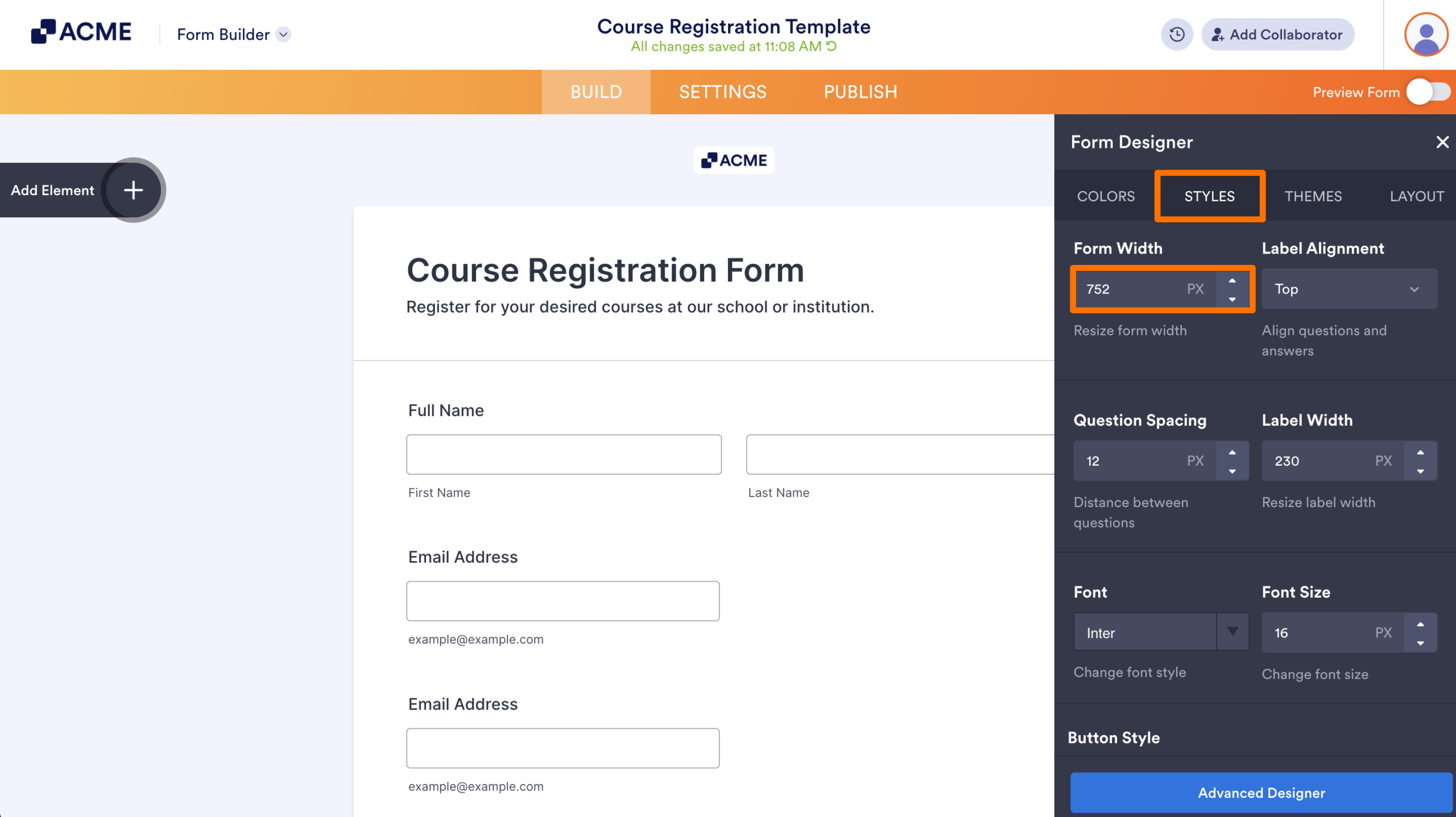
And that’s it. That’s all it takes to change your form width. The changes are automatically saved for you.
Tip
You can also update the form width through the Form Layout tab of the Advanced Designer.

Send Comment: