With Apps, you can create an app that works like a checklist to keep tasks organized and easy to follow. For example, you can build a daily task checklist, an onboarding app for new employees, or a series of intake forms by adding multiple forms and requiring each one to be completed.
You can customize the experience by arranging tasks in a logical order, adding instructions or reminders, and guiding users step by step. This helps users stay on track, complete everything they need, and avoid missing important steps, all within a single, user-friendly app.
Creating a Checklist App with Apps
Creating a checklist app with Apps is quick and straightforward, making it easy to organize tasks and guide users step by step. Here’s how to get started:
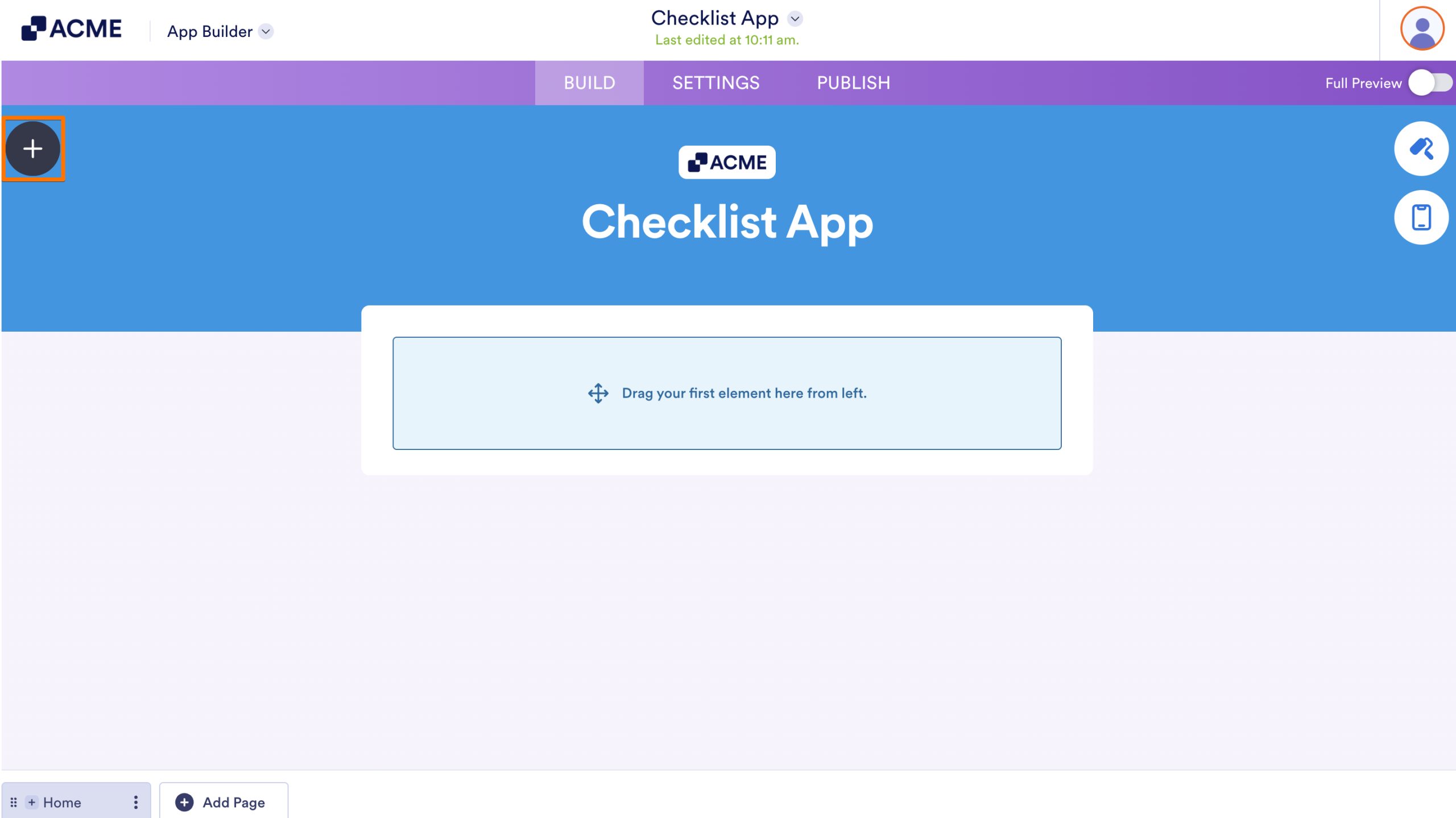
- In App Builder, click on the Add Element button on the left side of the page.
- Now, in the Apps Elements menu, under the Basic tab, click on Form. Or, just drag and drop it to where you want it to be in your app.
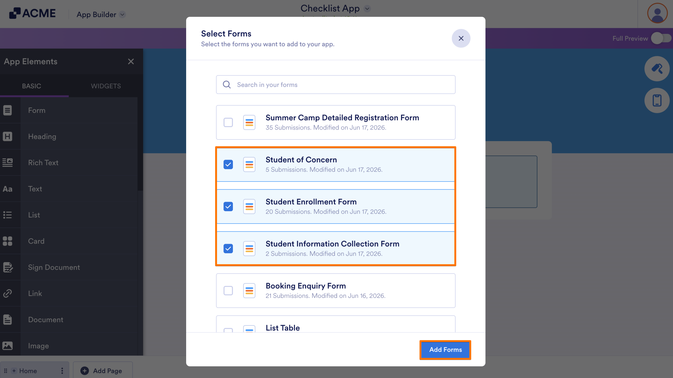
- Next, in the Select Forms window that comes up, select the forms you want to include in your checklist app, and then click on Add Forms.
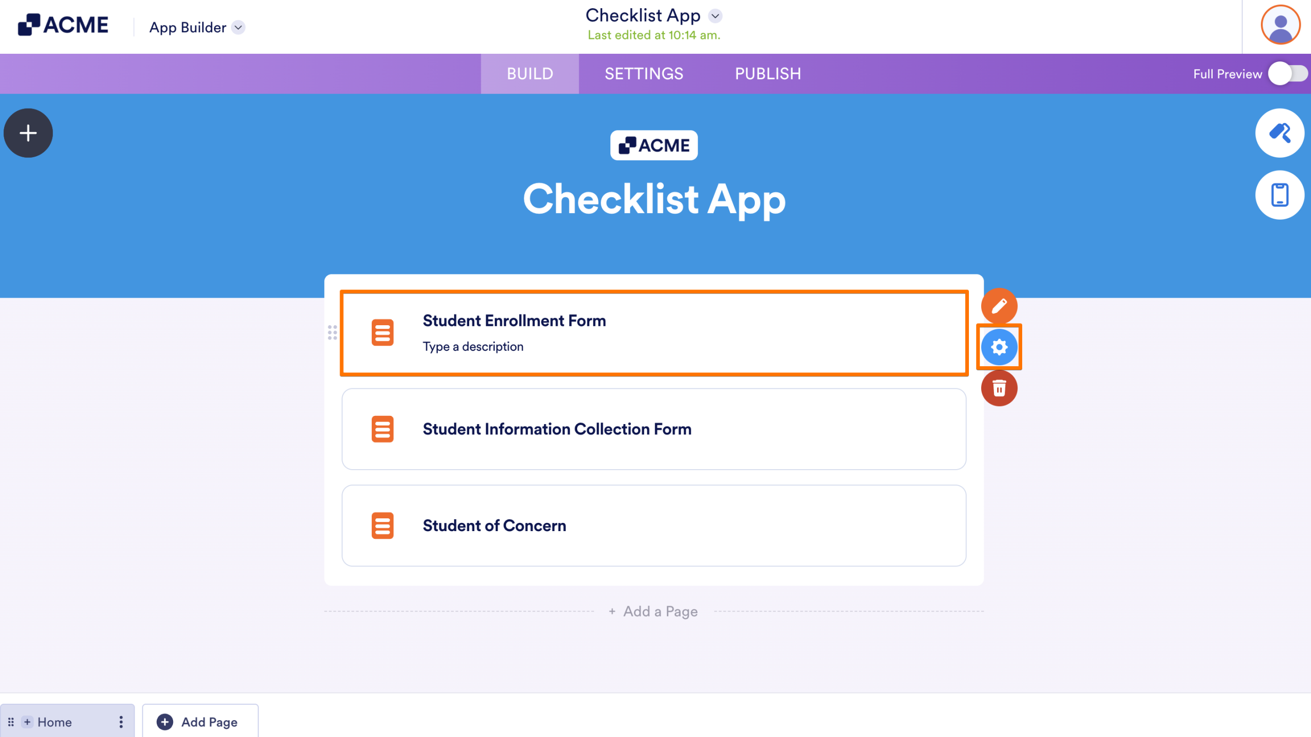
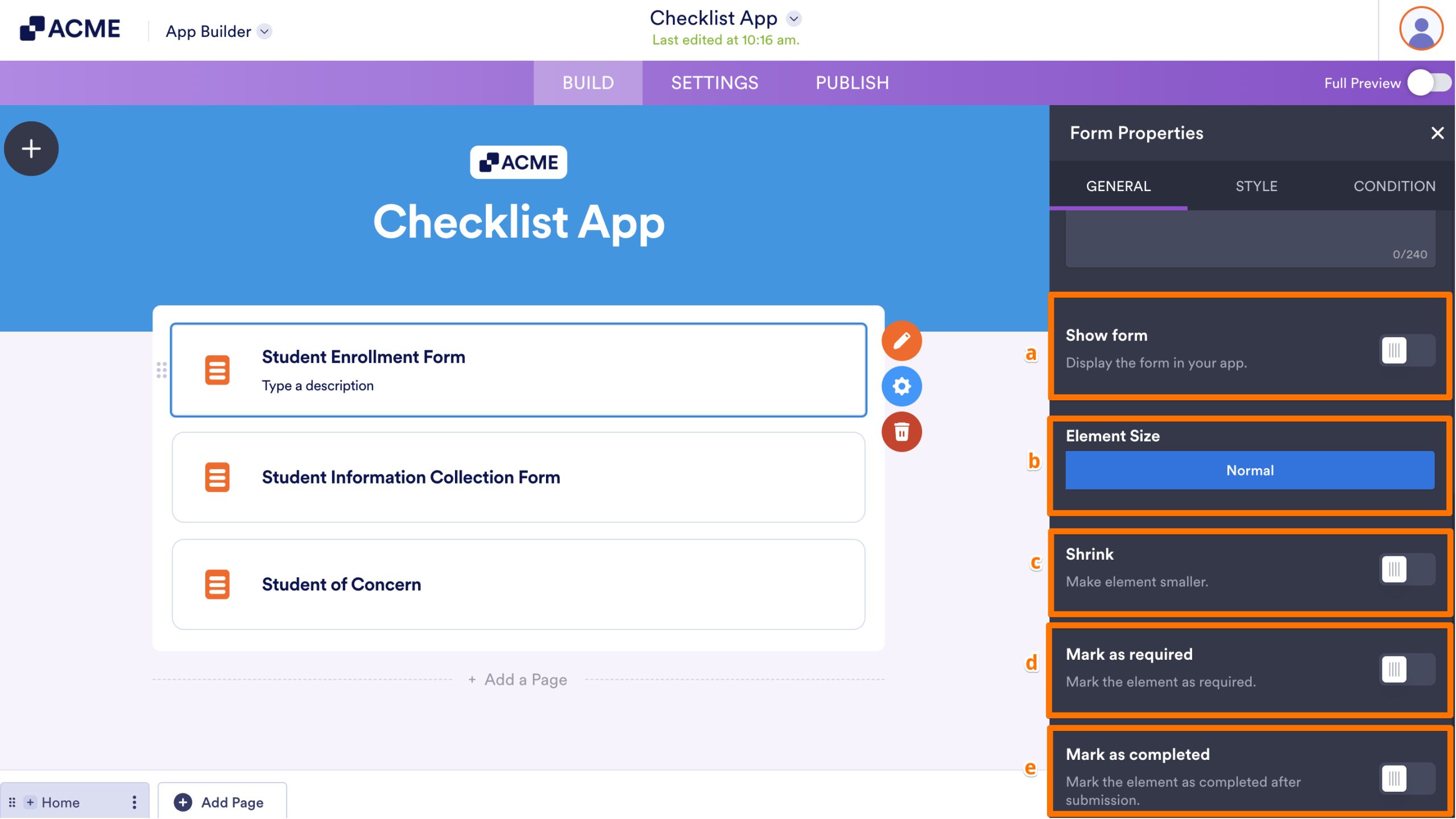
- To configure a form, click on it and then click on the Gear icon.
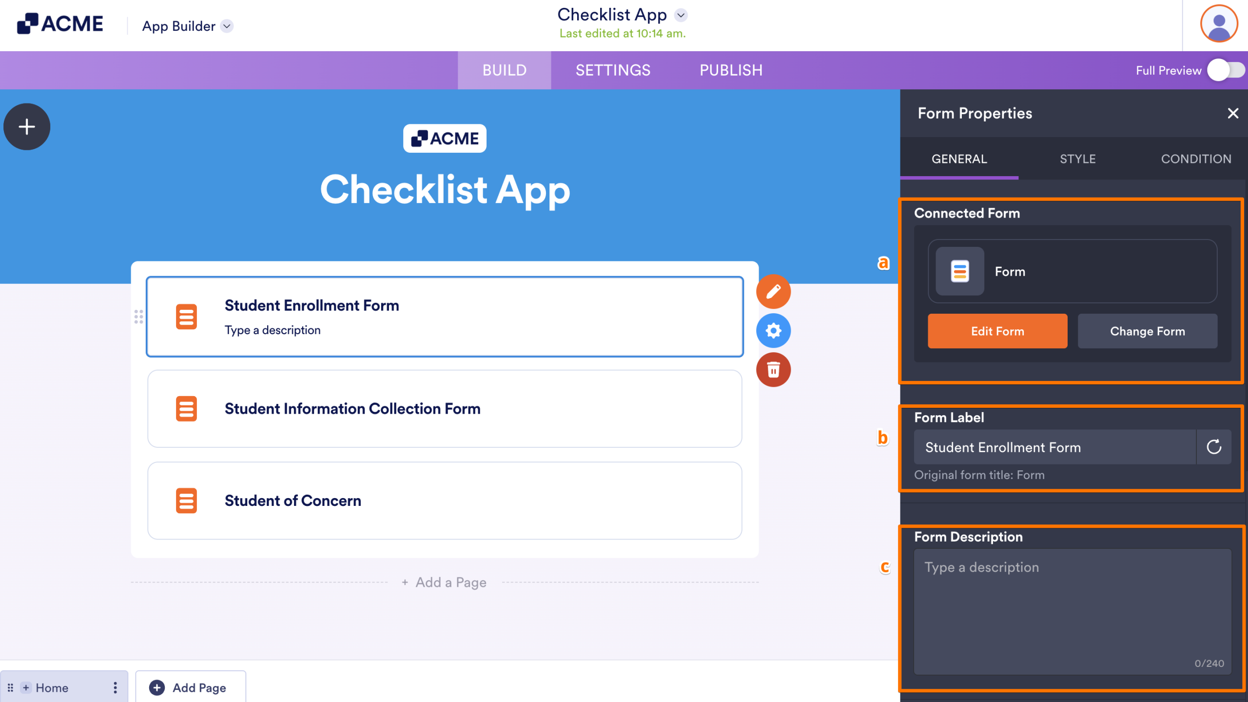
- In the Form Properties menu that opens on the right side of the page, under the General tab, set up these options:
- Connected Form — This is the form you’ve selected, and you can easily manage it from here. If you need to make changes, just click Edit Form, or select Change Form if you want to replace it with a different one.
- Form Label — This is the title of the form displayed in your app, and you can easily change it here if you want to give it a different name.
- Form Description — Use this to add a short description or helpful instructions that appear just below the Form Label, giving users a bit more context before they start filling it out.
- Then, scroll down to the bottom and continue to set up these things:
- Show Form — Show or hide the form in your app. When enabled, you can display it in full height and set how long the Thank You page appears after submission.
- Element Size — Set this up to determine how large the form appears within the app layout.
- Shrink — When enabled, the form shrinks to half its width, creating a more compact, side-by-side layout.
- Mark as Required — Turn this on to make your form required, so users have to complete it before moving forward.
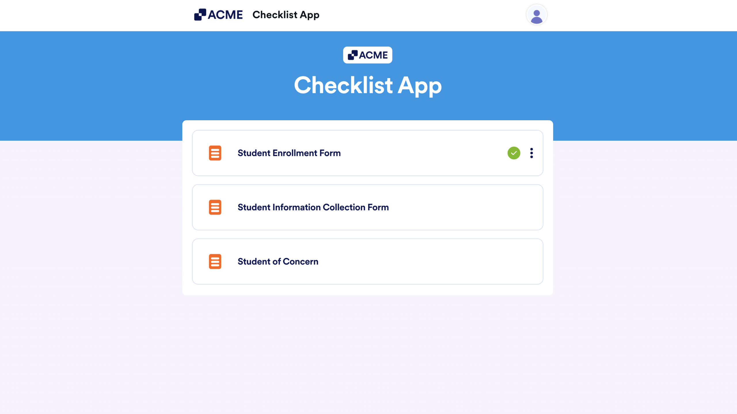
- Mark as Completed — When enabled, a green checkmark appears on the form in your checklist app after it’s completed, indicating the task is done. This also reveals the Reset the Completed Marking settings, which let you automatically remove the checkmark at a chosen interval, either daily or weekly.
Here’s an example of how the Mark as Completed feature works after a form is submitted:
- After that, switch to the Style tab and then set up these options:
- Use Original Form Styles — Toggle this on to preserve and keep your form’s original styling.
- Element Style — Use this to customize the visual appearance of the form element. You can choose the Background, Border, and Text Colors to match your app’s style.
- Element Background Image — Add a custom image as the background of the form element.
- Text Alignment — Control how the text appears inside the form element⸺align it to the Left, Center, or Right.
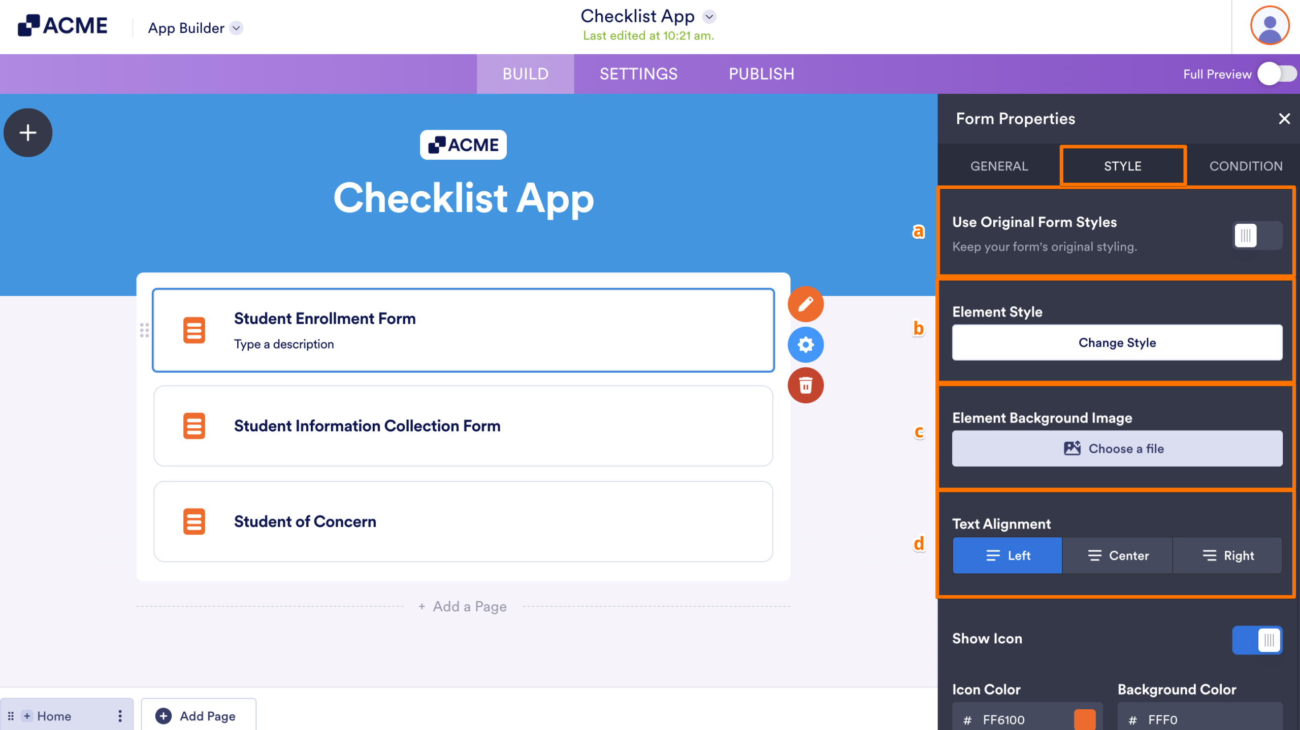
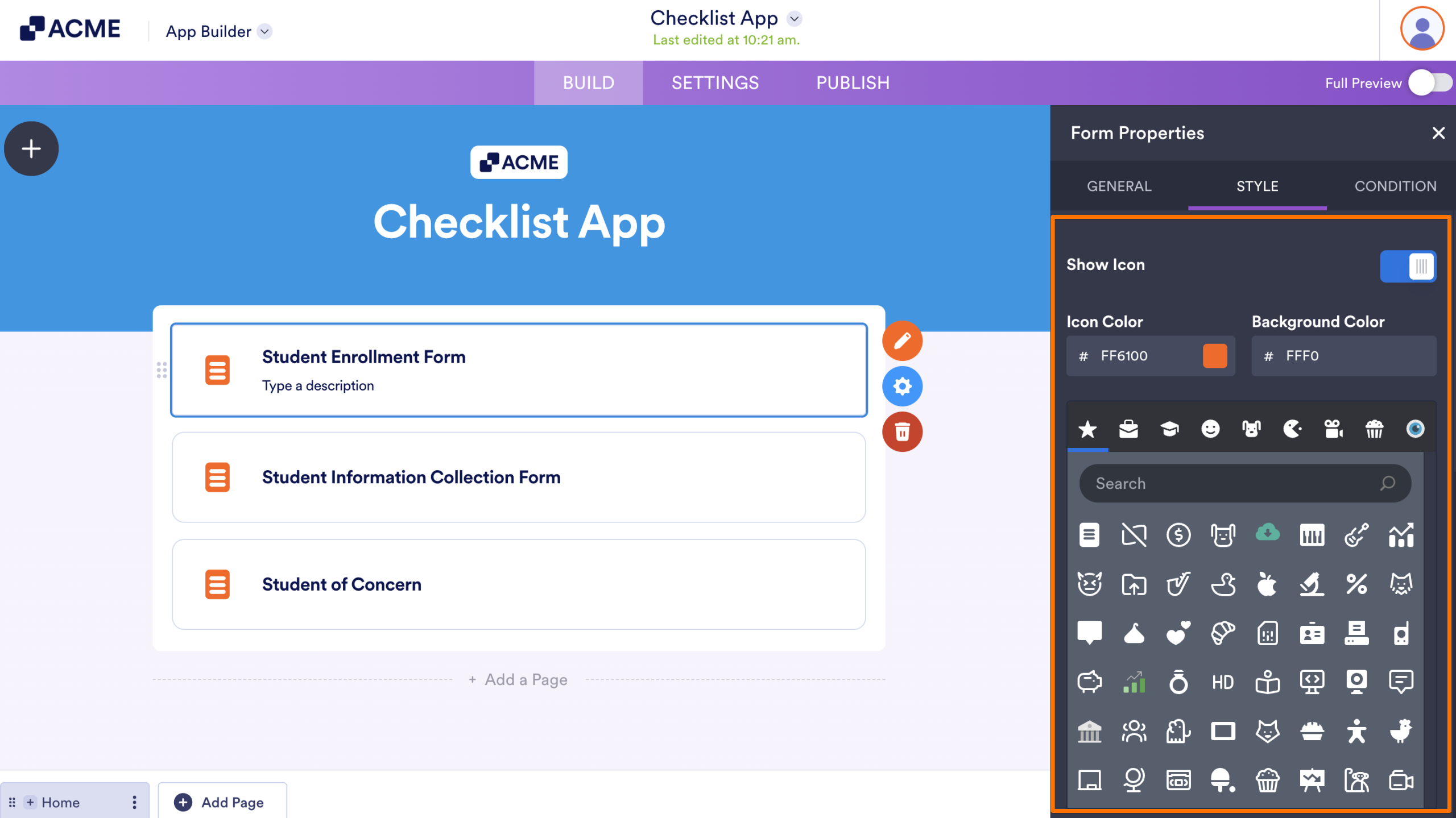
- Then, scroll down to the bottom and continue to set up your icon:
- Show Icon — Display an icon next to the form element. When enabled, you can choose the Icon, customize its Color, and set a Background Color.
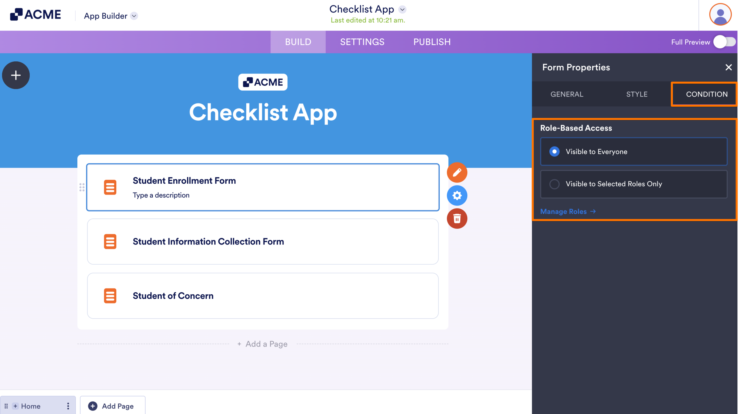
- Finally, click on the Condition tab and set up the Role-Based Access if you want the element to be seen or interacted with assigned roles within your app.
That’s it. Your checklist app is ready, helping you organize tasks, guide users, and keep everything on track in one place.
Note
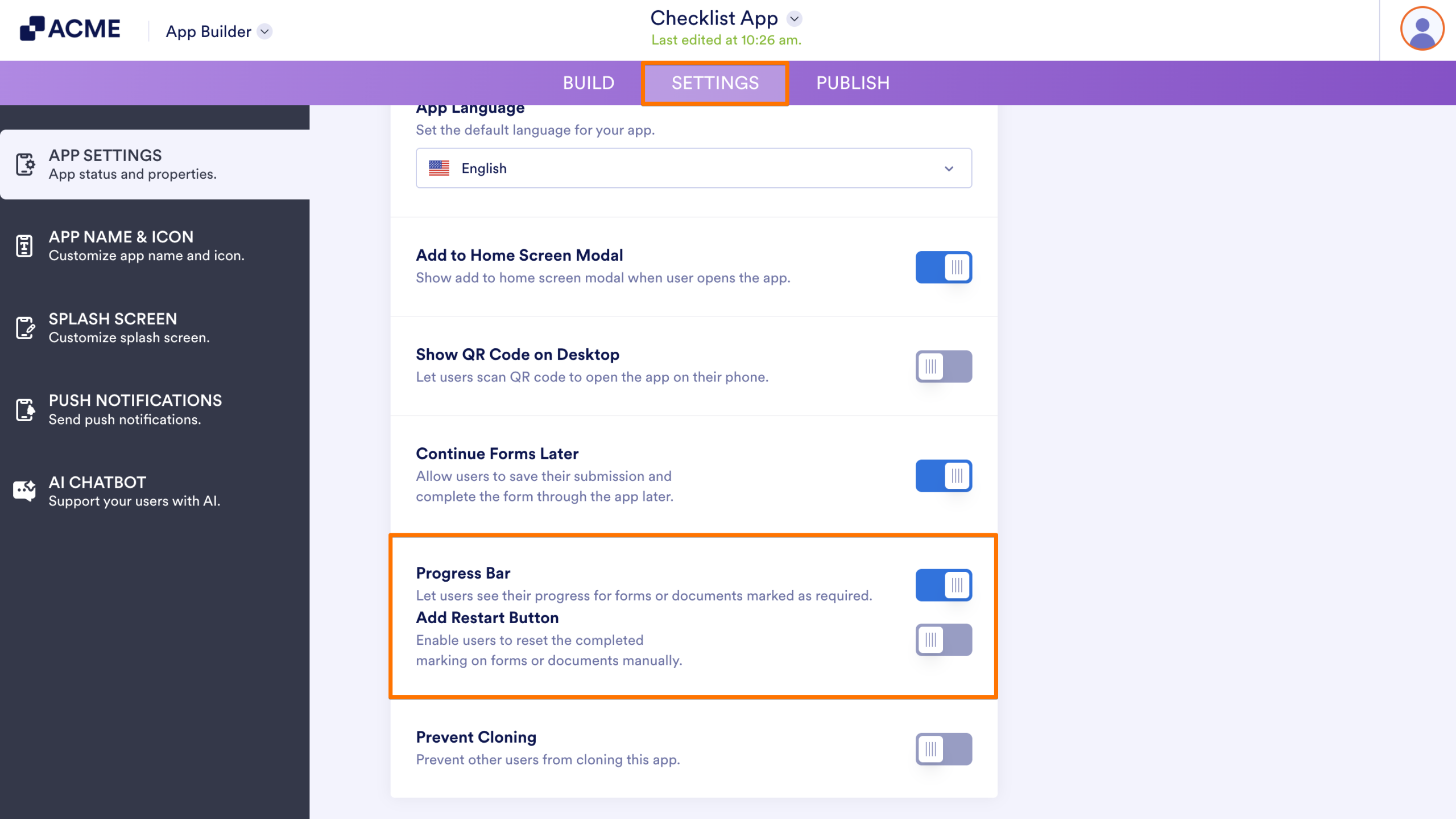
Enabling Mark as Required for two or more form elements also turns on the Progress Bar under the Settings tab. And once that’s active, the Add Restart Button will be available, allowing users to manually reset the checklist app if they need to.

Send Comment: