Jotform’s Button Radios widget lets you present choices as easy-to-click buttons instead of standard radio options, giving your form a clean, modern look. It’s a simple way to make your form more engaging and help users pick one option quickly and confidently.
Here are a few ways to use it:
- Simplify Multiple-Choice Questions — Instead of small circles, people have to click; users can tap big, bold buttons to make their selection. It feels more interactive and user-friendly—especially on mobile.
- Add Style to Your Forms — These buttons don’t just work well, they look good too. You can customize the colors and style to match your brand or the vibe of your form.
- Use Them for Stylish Yes/No Questions — Sometimes a simple yes/no looks better as a clean pair of buttons instead of traditional radios.
- Perfect for Quick Surveys or Polls — If you’re asking for opinions like “Which design do you prefer?” or “What’s your favorite flavor?”, button radios make responses feel instant and fun.
Notes
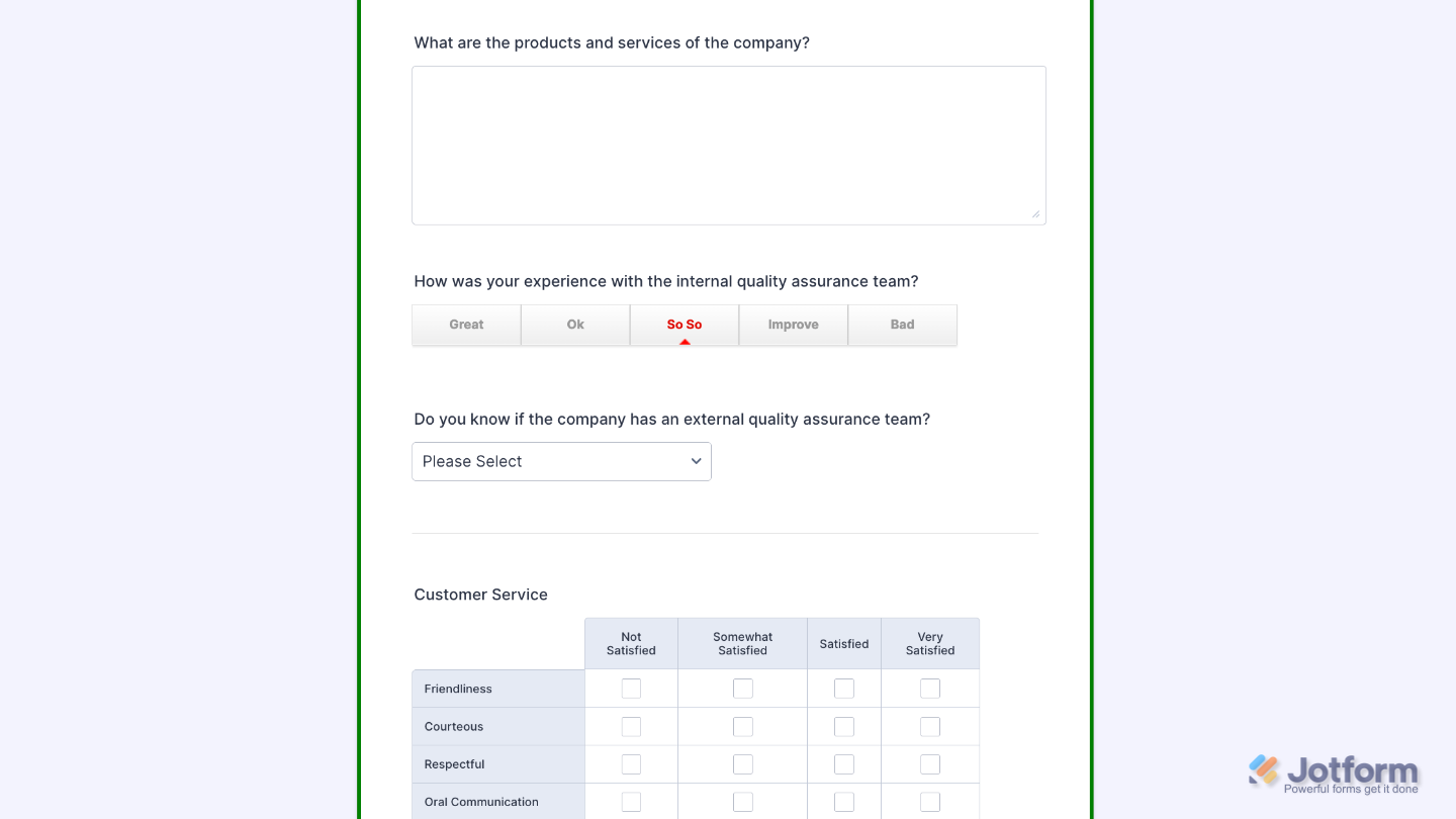
- The Button Radios widget lets users pick just one option from a set.
- Each option shows up as a clickable button, making the selection feel more interactive and visually appealing.
Adding and Setting Up the Button Radios Widget
Adding the Button Radios widget to your form to give users a quick and easy way to choose just one option from a set will keep your form clean and engaging. Setting it up takes no time, here’s how:
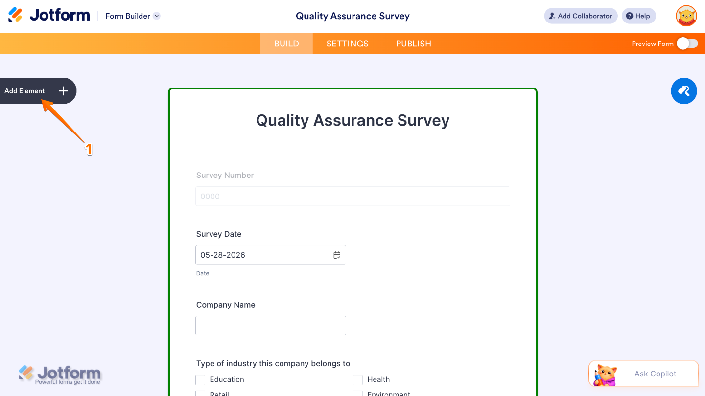
- In Form Builder, click on Add Element on the left side of the page.
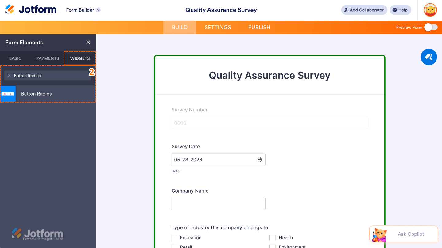
- Now, in the Form Elements menu, under the Widgets tab, search for Button Radios and then click on it. Or, just drag and drop it to where you want it to be on your form.
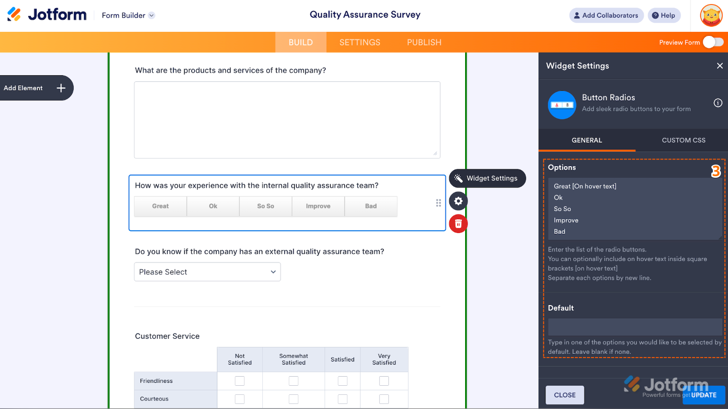
- Next, in the Widget Settings window that opens on the right side of the page, under the General tab, set up the following options:
- Options — Enter here the list of the clickable button choices that users can select from. Make sure to enter each option on a new line.
- Default — Use this to show a pre-selected choice when the form loads.
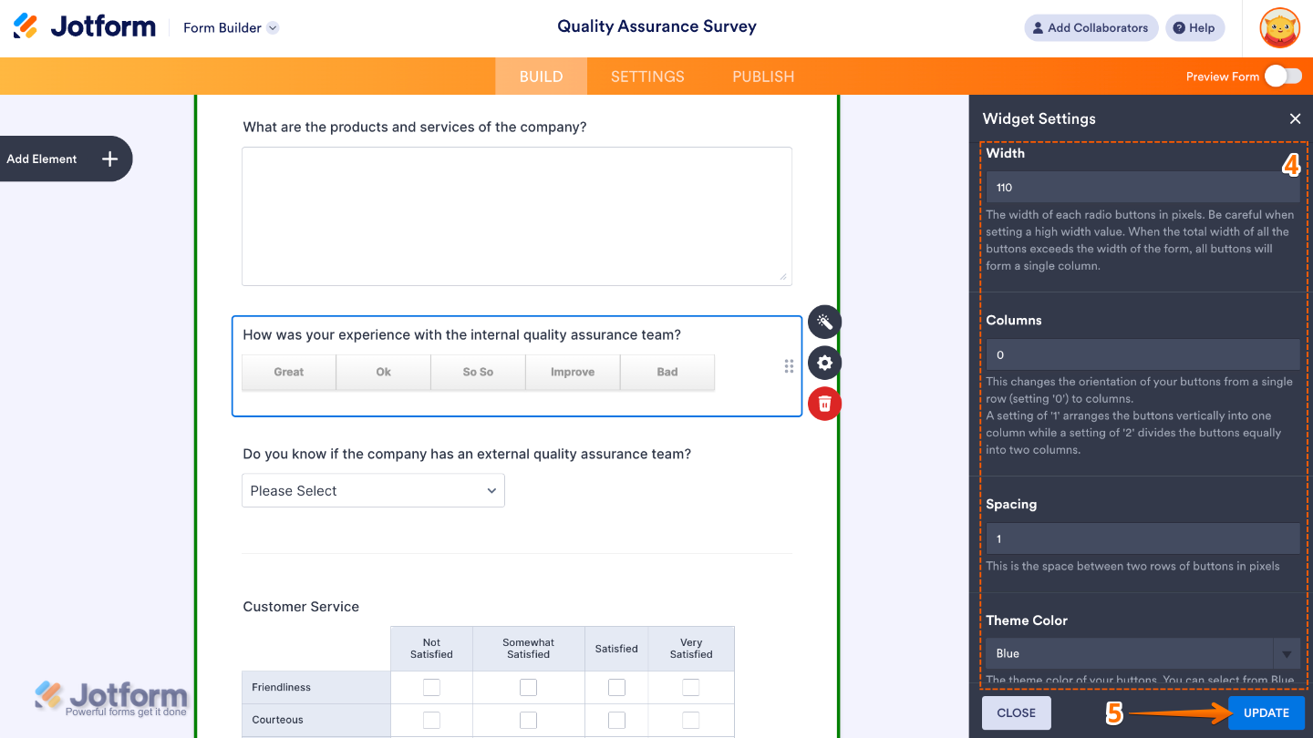
- Then, scroll down to the bottom and continue to set up these options:
- Width — Use this to control the overall width of the button group.
- Columns — Adjust this to arrange the buttons the way you want: set it to 0 for a single row, 1 for a single column, or 2 to split the buttons evenly into two columns.
- Spacing — Fine-tune this to adjust the space between each button.
- Theme Color — Choose Red, Blue, or Black to set the color of the selected button.
- Once you’re done, click on Update.
That’s it. You’ve successfully added and set up the Button Radios widget to your form. Now, you’ve allowed your users to choose only one option from a set, just like standard radio buttons, but with a modern button-style design. To see how it looks on a live form, check out this Demo Form.
To further customize your Button Radios field appearance, just click on the Gear icon to open its properties. For a full breakdown of how to do it, head over to our guide on How to Access and Configure the Question Properties of a Widget.
Note
For advanced styling, you can add your own custom CSS under the Custom CSS tab in the widget settings and style the Button Radios field. Explore our guide on How to Inject CSS Codes to Widgets to dive in deeper.
Pro Tips
- Keep your options short and simple so they look neat—especially when you’re using multiple columns or viewing on a mobile device.
- Give your form a quick check on mobile to make sure buttons are easy to read and tap.
- Set a default option to gently guide people toward the choice you recommend or the one most users pick.
- Don’t overwhelm with too many choices—sticking to about 4–6 options usually gives the smoothest experience.

Send Comment: