With Jotform Builder, you can easily create forms that are Accessible to all users. One important aspect of accessible form design is proper contrast and color use, which helps ensure that people with visual impairments, color vision deficiencies, or other accessibility needs can read and interact with your forms comfortably.
To support this, Jotform provides ready-to-use accessible color schemes and themes that are designed to meet accessibility standards by default.
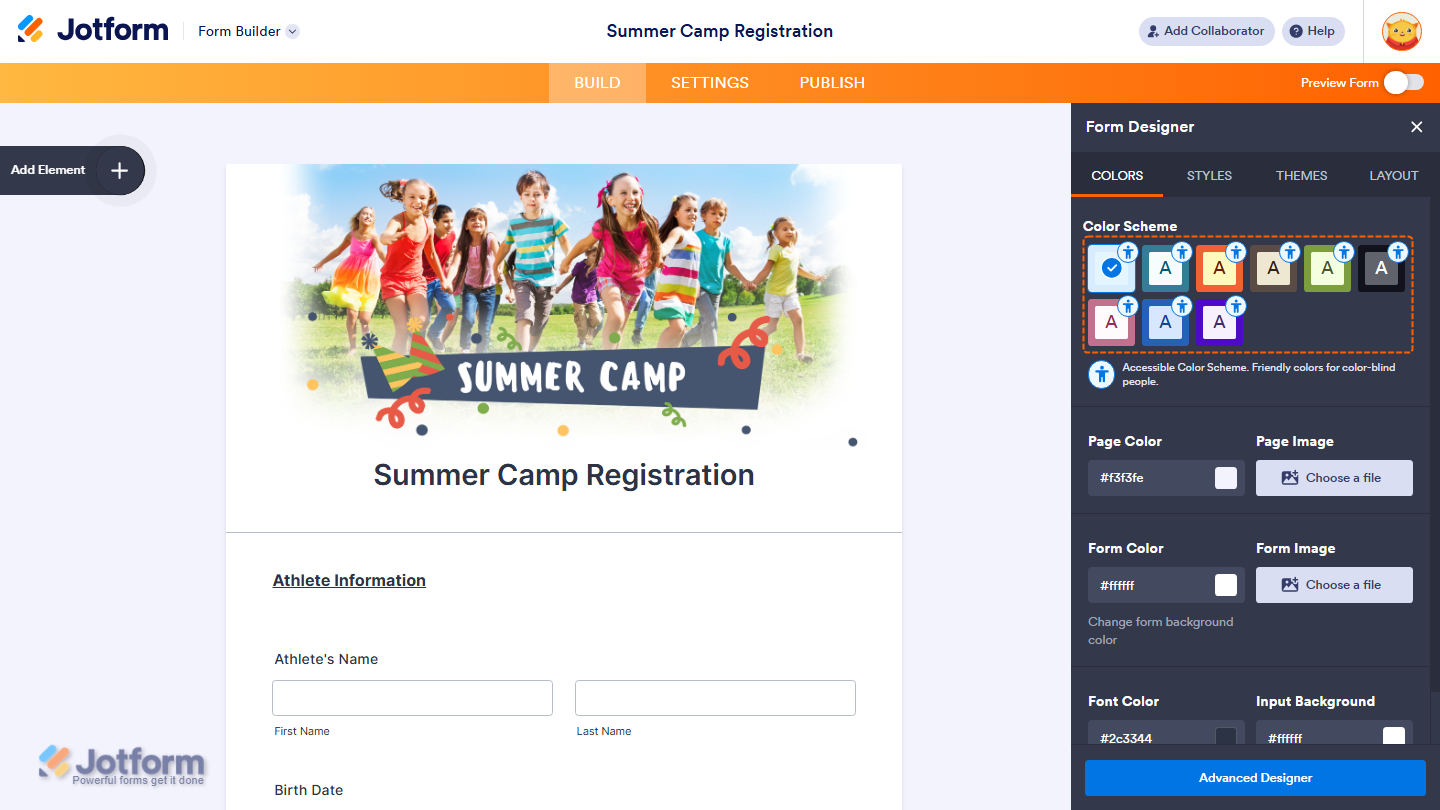
How Accessible Color Schemes Are Identified
When you enable Form Accessibility in your form settings, Jotform highlights accessible color options directly in the Form Designer. Accessible color schemes are marked with a Small Human Body icon, making it easy to identify and apply them without needing to manually check contrast ratios.

Accessible Options for Classic Forms
For Classic Forms, Jotform’s new default theme includes only accessible color schemes. This means:
- All available color schemes under this theme meet accessibility contrast standards
- Text is clearly readable against background colors
- You can apply any of these schemes without worrying about accessibility issues
You can review examples of accessible Classic Forms here:
- Accessible Classic Form Example 1
- Accessible Classic Form Example 2
- Accessible Classic Form Example 3
- Accessible Classic Form Example 4
If you’re using the old default theme, you can choose from three accessible color schemes.

Accessible Options for Card Forms
For Card Forms, you can select from five pre-designed accessible themes. These themes are specifically optimized for the Card Form layout and ensure proper contrast and readability.


You can view the available accessible Card Form themes here:
- Accessible Card Form Example 1
- Accessible Card Form Example 2
- Accessible Card Form Example 3
- Accessible Card Form Example 4
Customizing Colors and Accessibility Warnings
You can still customize your form’s colors to match your brand or personal preference. But, Jotform includes a built-in accessibility safeguard. If your color changes create contrast or accessibility issues, you’ll see an accessibility warning in the Form Editor.

You can check out our guide on How to Fix the Form Accessibility Errors to learn more.

Send Comment:
1 Comment:
June 4, 2022
I'd just like to know what the parameters are so that I can create a custom color palette that works.
I wish I knew what was wrong with mine.
Some kind of general guide on how to make accessible color schemes would be good, because I'm not see the pattern from these examples.