The Section Header element is a great way to organize your Card form and guide users through each step more clearly. It helps break your form into smaller, easy-to-follow sections, making the overall experience feel smoother and less overwhelming. With a well-placed header, you can introduce each part of your form and keep everything structured from start to finish.
Here are a few ways to use it:
- Use it to introduce each step so users know what to expect before answering.
- Break your form into smaller sections to make it feel easier and less overwhelming.
- Add short descriptions or instructions to guide users through each part.
- Highlight important sections, like personal details or payment steps.
Adding and Setting Up the Section Header Element
Whether you’re building a new form or editing an existing one, you can add and configure the Section Header element in just a few steps. This is how it’s done:
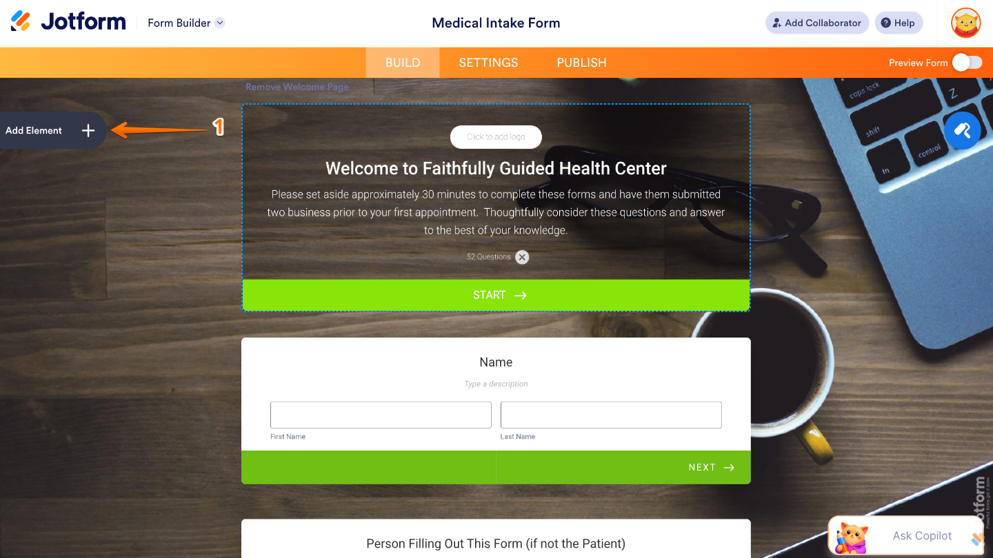
- In Form Builder, click on Add Element on the left side of the page.
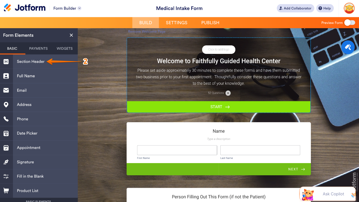
- Then, in the Form Elements menu, under the Basic tab, click on Section Header. Or, just drag and then drop it to where you want it to be on your form.
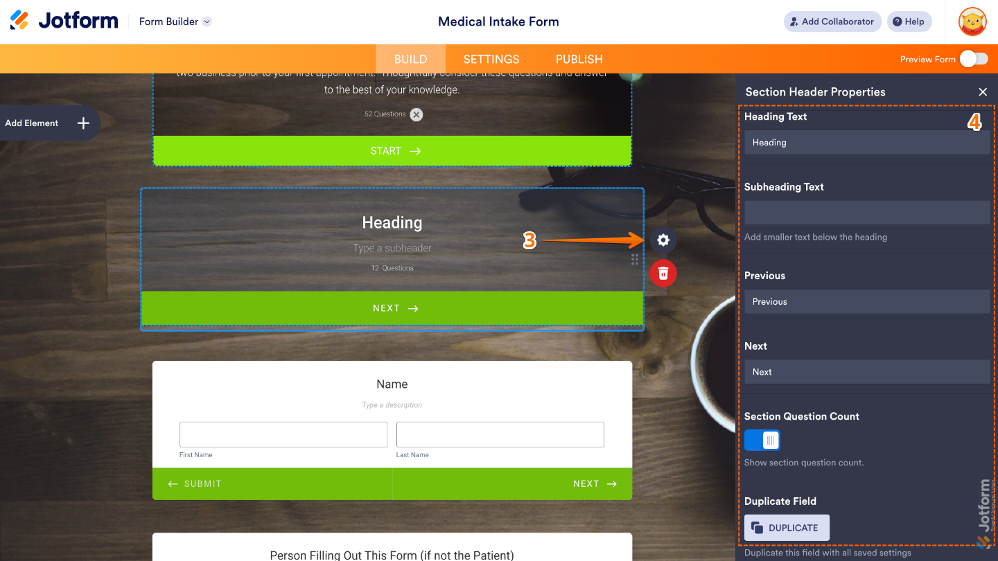
- Next, click on the Gear icon to open the Section Header Properties menu on the right side of the page.
- Then, set up these things:
- Heading Text — Add here the main title text displayed in the Heading element.
- Subheading Text — Enter here the secondary text shown below the main heading.
- Previous — Set this up to add a Previous button that lets users go back to the earlier section of the form, making navigation easier in multi-page forms.
- Next — Customize this to adds a Next button that moves users to the following section, helping guide them through the form step by step.
- Section Question Count — Displays the number of questions included in the current section, giving users a better idea of how much they still need to complete.
- Duplicate Field — Click on it Duplicate to create a copy of this field with all its saved settings.
That’s it. You now have a fully set-up Section Header element that helps organize your Card form into clear, easy-to-follow steps, making it smoother for users to navigate and complete. Want a quick preview? This demo form shows how it looks in action.

Note
The Section Header element is currently only available in the Card form layout and can’t be used in Classic forms. If you’re using the Classic layout, you can use the Heading element instead, which offers a similar way to organize and introduce sections in your form.
Pro Tips
- Add helpful descriptions under your headers to guide users and explain what information they need to provide.
- Arrange your sections in a logical order so the form flows naturally from one step to the next.
- Preview your Card form before publishing to make sure the headers display clearly and improve the overall user experience.

Send Comment: