


-
officebuddyAsked on October 24, 2014 at 5:18 PM
Hello,
I have a form that I have my potential customers use and it isn't working properly on i phones & mac computers :(
Any ideas on what I can do to solve this issue?
Thank you!
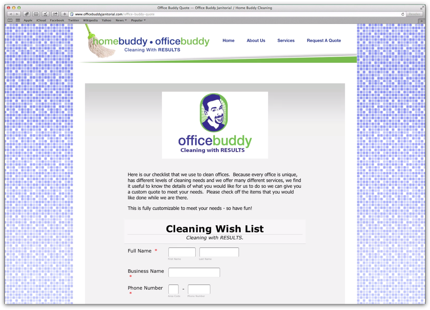
http://www.officebuddyjanitorial.com/home-buddy/
http://www.officebuddyjanitorial.com/office-buddy/
-
Mike_T Jotform SupportReplied on October 24, 2014 at 6:49 PM
Thank you for contacting us.
The forms are supposed to be compatible with apple products too. When I check the form using Safari through browserstack.com it appears to be fine.
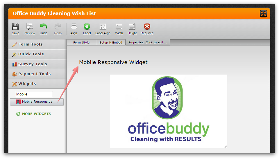
To improve the mobile form layout please add a Mobile Responsive widget to the form.
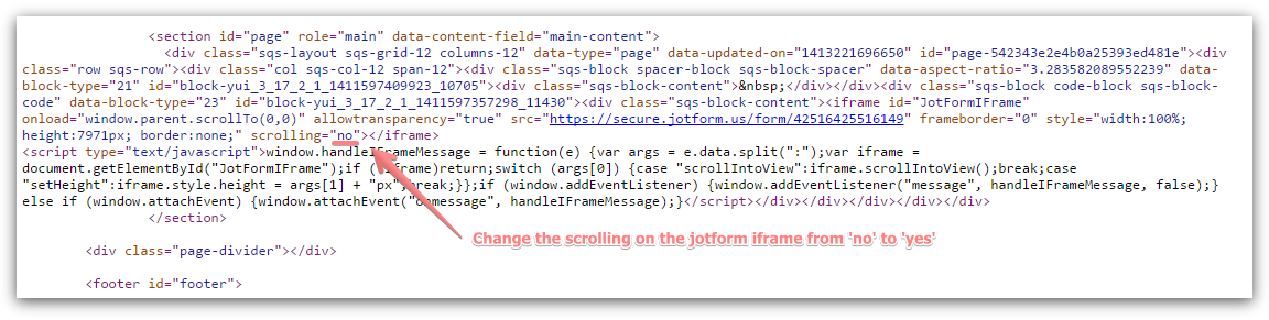
Also, please consider changing the form iFrame scrolling from 'no' to 'yes' to avoid any possible height issues.
Please give it a try and let us know if you need any further assistance on this.
-
officebuddyReplied on October 27, 2014 at 5:52 PM
Thank you so much! I did the mobile responsive widget, but didn't know how to do the "yes" for the iframe. Could you please check it to make sure it works on ios phones now? If it doesn't, would you please walk me through how to get the iframe changed. Thank you!!! :)
-
Mike_T Jotform SupportReplied on October 27, 2014 at 6:40 PM
You are welcome.
You can basically change the iFrames' scrolling to 'yes' on your website editor. When you copy the standard iFrame code from JotForm it comes with the scrolling set to 'no', but you can change it to 'yes' when you add that code to your website. The process depends on the website editor / web design software you use.

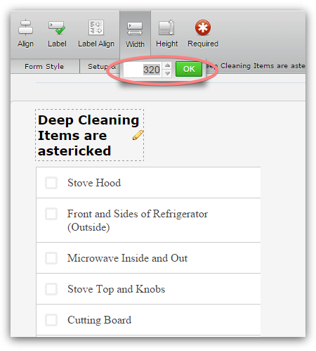
Please note that most of the widgets are not considered as the native fields, they are loaded from external widgets domain and might be not optimized for the mobile devices.
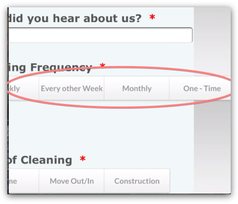
For example, the Cleaning Frequency field (Button Checkboxes widget) width seems to be too wide on the mobile screen.
Also, a 320px width for a Checklist widget might look better on the mobile screen.
Thank you.
- Templates
- Integrations
- INTEGRATIONS
- See 100+ integrations
- FEATURED INTEGRATIONS
 PayPal
- Slack
- Google Sheets
- Mailchimp
- Zoom
- Dropbox
- Google Calendar
- Hubspot
- Salesforce
- See more Integrations
- Products
- PRODUCTS
- Form Builder
- Jotform Enterprise
- Jotform Apps
- Store Builder
- Jotform Tables
- Jotform Inbox
- Jotform Mobile App
- Jotform Approvals
- Report Builder
- Smart PDF Forms
- PDF Editor
- Jotform Sign
- Jotform for Salesforce Discover Now
- Support

