
-
virtualearth13 Nisan 2015 00:43 tarihinde soruldu
Hi,
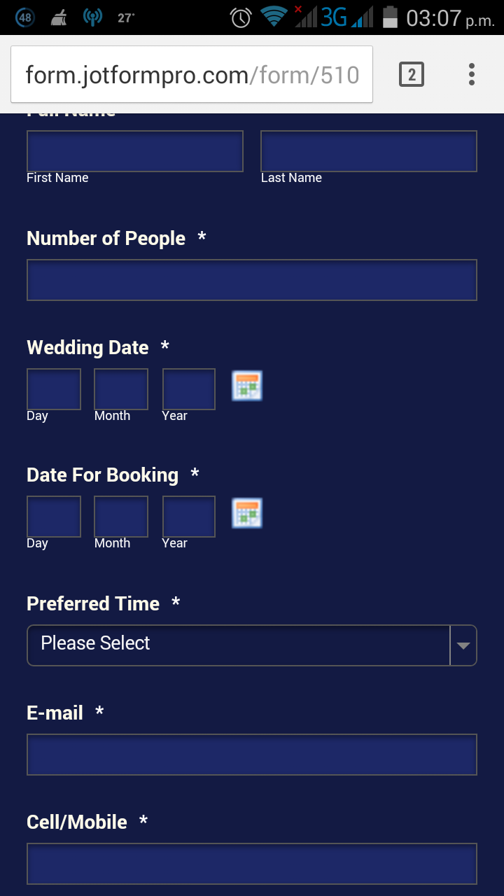
We've tried everything to hold the fields on an iPhone browser so they display the same as when viewed in a desktop web browser.
The name and date fields stretch across the screen destroying the look, feel and usability.
When we set the field widths in either the date or full name tools the fields fold under each other. If we don't set them they spread across the screen.
Any suggestions would be warmly welcomed.
Thank you
Kind regardsBrad

-
virtualearth13 Nisan 2015 04:34 tarihinde yanıtlandı
Change to responsive yes. Fixed the horizontal issue with Full Name Tool however added a large margin/padding. The date tool has day and month dropping down.
-
Jan13 Nisan 2015 12:13 tarihinde yanıtlandı
Hi there,
I cloned your form and I was able to see the issue. Please try the following steps:
1. On the Form Builder, please "Shrink" the wedding date and date for booking fields.
2. Go to Form Designer.
3. Enable the "Make this form responsive" option.
4. Save the changes and then please test it.
Hope this works. Thank you.
-
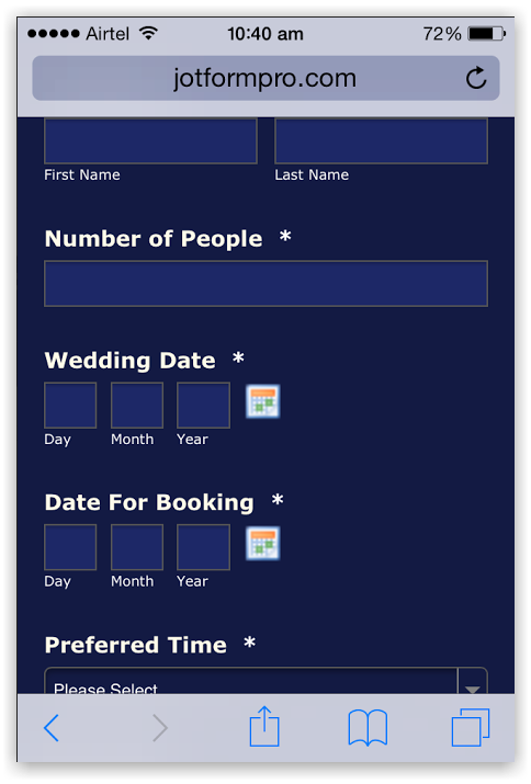
virtualearth13 Nisan 2015 16:04 tarihinde yanıtlandı
Thank you, appreciate your input.
Your recommendation works fine in portrait however the date tool falls apart in landscape view and most of the form aligns left of screen rather than centre.
Kind regards
Brad
-
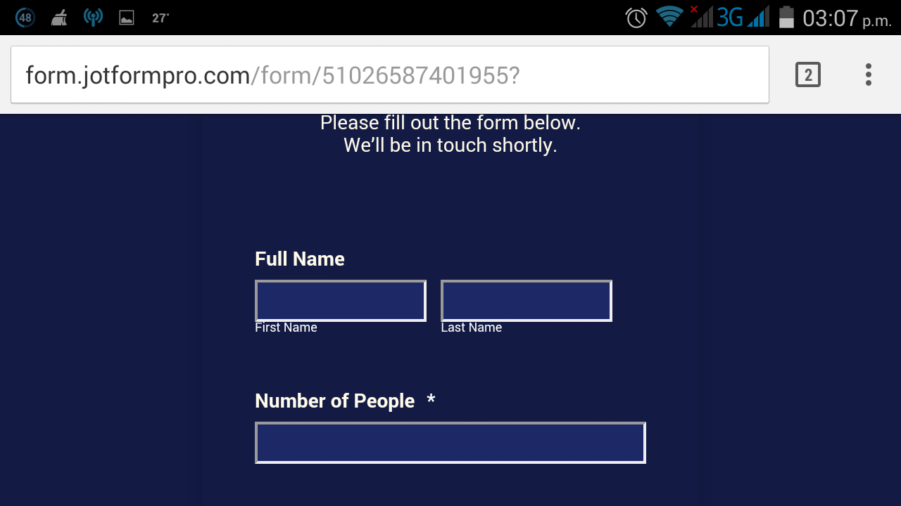
raul13 Nisan 2015 17:15 tarihinde yanıtlandı
I've created a cloned version of your form and made some changes in the custom CSS code that it had (I removed the custom width settings for the fields and set them all using the form designer) and this is how it looks like in my phone.
Portrait
Landscape
You can find my version here: http://form.jotformpro.com/form/51026587401955 feel free to clone it to your account if you want to inspect further the changes I made.
-
virtualearth13 Nisan 2015 19:01 tarihinde yanıtlandı
Thank you Raul,
Is there anyway we can contain the fields to the width of the form? Form is centered and set at width: 350px, max-width: 350px however in landscape, on an iPhone, the fields spread across the whole screen.
Kind regards
Brad
PS: I also need to reduce the default padding at the top of the form
-
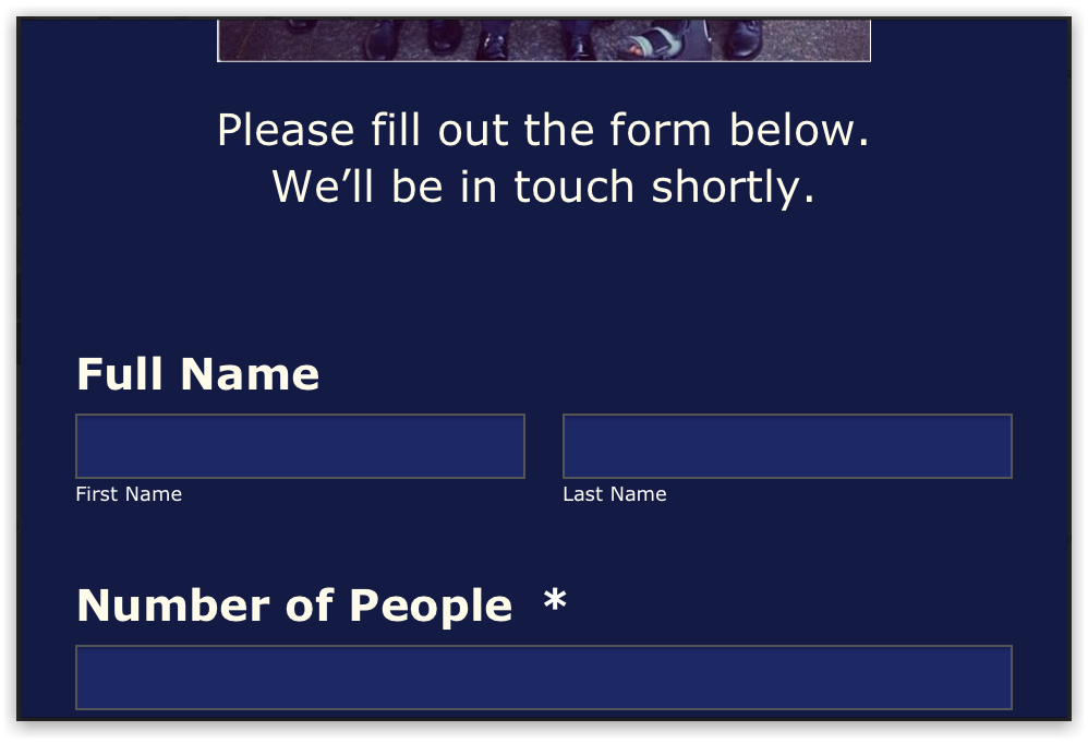
Ashwin Jotform Support14 Nisan 2015 01:28 tarihinde yanıtlandı
Hello Brad,
I did check my colleagues's form in my iPhone device and it is displayed correctly. Please check the screenshot below:
Responsive form should adjust the width of the form fields based on the screen size. If you do not want the fields to be displayed in full width, you will have to disabled the "Responsive Form" property of your form. Please take a look at the following cloned form and see if this works fine: http://form.jotformpro.com/form/51030507523947?
Thank you!
-
virtualearth14 Nisan 2015 09:58 tarihinde yanıtlandı
Hi guys,
The URL we are using (https://secure.jotformpro.com/form/51027081993961) is showing two forms in our application. On the web it is one form however for some reason which we haven't been able to find it is pulling two exact same forms.
You can download the app on a mobile at: http://weddings.shareableapps.comIn the hamburger menu go to Book a Consultation. The app is still in dev so it may load a little slow. Just close the app and reopen if it lags.
Kind regards
Brad
-
Ashwin Jotform Support14 Nisan 2015 12:15 tarihinde yanıtlandı
Hello Brad,
Since we cannot answer multiple questions in one thread, I have moved your latest question to a new thread and you will be answered here: http://www.jotform.com/answers/552259
Thank you!
- Şablonlar
- Entegrasyonlar
- ENTEGRASYONLAR
- 100'den fazla entegrasyonu gör
- ÖNE ÇIKAN ENTEGRASYONLAR
- PayPal
- Slack
- Google E-Tablolar
- Mailchimp
- Zoom
- Dropbox
- Google Takvim
- Hubspot
- Salesforce
- Daha fazla gör Integrations
- Ürünler
- ÜRÜNLER
- Form Oluşturucu
- Jotform Kurumsal
- Jotform Uygulamalar
- Mağaza Oluşturucusu
- Jotform Tablolar
- Jotform Gelen Kutusu
- Jotform Mobil Uygulaması
- Jotform Onaylar
- Rapor Oluşturucu
- Akıllı PDF Formlar
- PDF Düzenleyici
- Jotform İmza
- Salesforce için Jotform Hemen Keşfet
- Destek


