


-
budgetlettingAsked on February 21, 2017 at 8:28 PM
This has still not been resolved! although this may display correctly on your system it is not on mine see screen shot
i need the label and input to be on the same line - although it displays perfect in the jotform program it does not on pc or laptop nor smart phone.
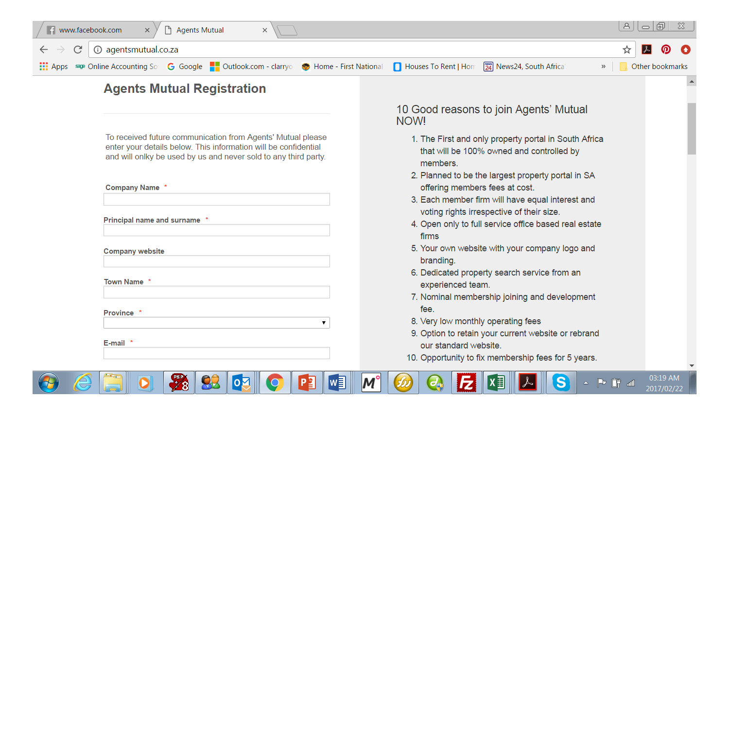 Page URL: http://www.agentsmutual.co.za
 -
Elton Support Team LeadReplied on February 22, 2017 at 12:46 AM
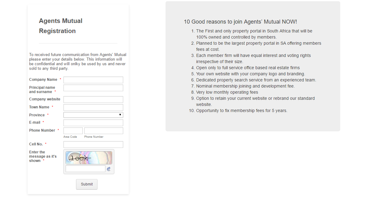
Thanks for providing the screenshot.
It is clear to us now the issue you're experiencing. It appears that way because the form renders the mobile responsive style. It changes the display of the fields so it is easier to fill on small screens especially on mobile.
Anyway, if you want to retain the layout of the form - label and fields side by side, inject this CSS codes to your form.
.form-label {
width: 33% !important;
float: left !important;
display: inline-block;
}
.form-input{
width: 60% !important;
display: inline-block;
}
Guide: http://www.jotform.com/help/117-How-to-Inject-Custom-CSS-Codes
Result:
Let us know if you see any problems.
Thanks
- Templates
- Integrations
- INTEGRATIONS
- See 100+ integrations
- FEATURED INTEGRATIONS
 PayPal
- Slack
- Google Sheets
- Mailchimp
- Zoom
- Dropbox
- Google Calendar
- Hubspot
- Salesforce
- See more Integrations
- Products
- PRODUCTS
- Form Builder
- Jotform Enterprise
- Jotform Apps
- Store Builder
- Jotform Tables
- Jotform Inbox
- Jotform Mobile App
- Jotform Approvals
- Report Builder
- Smart PDF Forms
- PDF Editor
- Jotform Sign
- Jotform for Salesforce Discover Now
- Support

