


-
fraanco3Asked on March 23, 2017 at 3:06 PM
Should we use the Mobile Responsive widget or use the "Make Form Responsive" checkbox in the Layout section of the Advanced Form Designer? OR both??
-
jonathanReplied on March 23, 2017 at 5:46 PM
Forms that were generated or saved using the new Form Builder should now be mobile responsive by default. There is no need to use the Mobile Responsive widget (it is actually not available anymore on the widgets group list).
If further customization is needed to address issue with mobile browser view, injection of custom CSS codes will be the next procedure.
The "Make Form Responsive" option is not just for mobile browser viewer use. It makes the form become responsive when the viewer screen is resize also.
Let us know if there's more we can help you with.
-
jonathanReplied on March 23, 2017 at 6:37 PM
I apologize for my mistake about the Mobile Responsive widget. It was now actually brought back on the Widgets group list again.
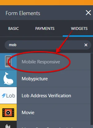
So you can also use this option.
-
fraanco3Replied on March 24, 2017 at 5:16 PM
So now I am really confused :)
To achieve full and effective form responsiveness across all device type (i.e. screen / viewport sizes), which is the minimum needed (single or combination)?
-- Nothing, forms will be (mobile) responsive by default if using the new Forms Builder
OR
-- Use the Mobile Responsive Widget (does it add value to the "Nothing" option above?).
OR
-- Check the Make Forms Responsive checkbox in the Forms Layout section of the Advanced Editor (if this is NOT checked, will the "Nothing" option above still work? What value does it add?).
Thanks
-
jonathanReplied on March 24, 2017 at 6:40 PM
Sorry for that confusing response. Allow me to try again.
---
Should we use the Mobile Responsive widget or use the "Make Form Responsive" checkbox in the Layout section of the Advanced Form Designer? OR both??
By default, the forms are mobile responsive already.
When you create the form, it does not require you to tick "Make Responsive" option or add the mobile responsive widget on it. When you use the form as is on your mobile device browser, it should be responsive already.
Different system, different browsers and different combination of systems, browsers, device settings will sometimes prevent the mobile responsive function to take effect on the form used.
When this happen, you can try adding the Mobile responsive widget first and then test again on the mobile browser (to see if mobile responsive take effect)
If still did work to the desired result, adding custom injected CSS codes (for @media or mobile viewport) will be the next option.
---
The "Make Responsive" option does not take effect only for mobile browser view, you can also see it taking effect on desktop browsers. Example if you drag resize the browser screen, due to the "Make Responsive" option enabled, the form elements will do a responsive effect by auto resizing the field sizes and even reposition themselves so they always will be visible on the viewport screen.
Let me know if still not clear.
Regards
-
fraanco3Replied on March 24, 2017 at 7:41 PM
Much clearer, thanks!
- Templates
- Integrations
- INTEGRATIONS
- See 100+ integrations
- FEATURED INTEGRATIONS
 PayPal
- Slack
- Google Sheets
- Mailchimp
- Zoom
- Dropbox
- Google Calendar
- Hubspot
- Salesforce
- See more Integrations
- Products
- PRODUCTS
- Form Builder
- Jotform Enterprise
- Jotform Apps
- Store Builder
- Jotform Tables
- Jotform Inbox
- Jotform Mobile App
- Jotform Approvals
- Report Builder
- Smart PDF Forms
- PDF Editor
- Jotform Sign
- Jotform for Salesforce Discover Now
- Support
