


-
Bainn01Asked on April 27, 2017 at 7:47 PM
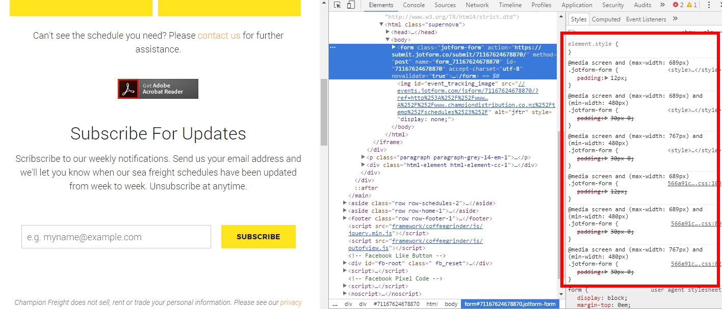
I've noticed forms by default have the following @media screen stylings in CSS.
@media screen and (max-width: 689px)
@media screen and (max-width: 689px) and (min-width: 480px)
@media screen and (max-width: 767px) and (min-width: 480px)
This adds additional padding that isn't required. How do I remove these default @media stylings? I've tried adding my own with !important to override these, but nothing seems to work.
Any assistance you can provide would be greatly appreciated. Thanks.
-
MikeReplied on April 28, 2017 at 12:10 AM
Those @media rules are a part of our standard theme, so they cannot be removed. You may try to add the next CSS in order to remove mentioned paddings.
@media screen and (min-width: 1024px) {
.jotform-form {
padding: 0;
}
}
@media screen and (max-width: 1024px) and (min-width: 768px) {
.jotform-form {
padding: 0;
}
}
@media screen and (max-width: 768px) and (min-width: 480px) {
.jotform-form {
padding: 0;
}
}If you need any further assistance, please let us know.
- Templates
- Integrations
- INTEGRATIONS
- See 100+ integrations
- FEATURED INTEGRATIONS
 PayPal
- Slack
- Google Sheets
- Mailchimp
- Zoom
- Dropbox
- Google Calendar
- Hubspot
- Salesforce
- See more Integrations
- Products
- PRODUCTS
- Form Builder
- Jotform Enterprise
- Jotform Apps
- Store Builder
- Jotform Tables
- Jotform Inbox
- Jotform Mobile App
- Jotform Approvals
- Report Builder
- Smart PDF Forms
- PDF Editor
- Jotform Sign
- Jotform for Salesforce Discover Now
- Support

