


-
zoiglobalAsked on May 24, 2017 at 2:50 PM
When looking at the subject form on a mobile device, it is not well structured. Is it due to my injected CSS where I am trying to position things in a certain manner? Any suggestions how to get it corrected?
Page URL: https://form.jotform.us/71168406898166 -
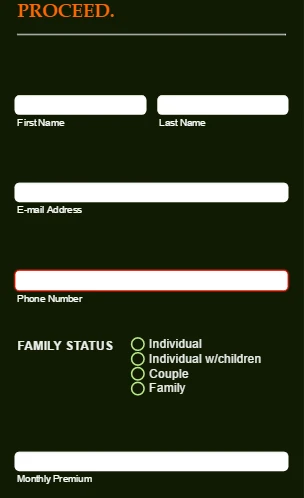
Kiran Support Team LeadReplied on May 24, 2017 at 4:37 PM
I have checked your JotForm on a mobile emulator and seems to be working fine at my end. Please see the screenshot below:
You may make the form mobile responsive by enabling the Mobile responsive option in the Form layout section of Advanced Form Designer. Also, please refer to the guide below that can help you with making mobile responsive forms.
https://www.jotform.com/help/322-How-to-make-mobile-friendly-forms-on-JotForm
Hope this information helps!
-
zoiglobalReplied on May 24, 2017 at 5:04 PM
Thank you for your response. However, when I open Form Designer, the checkbox you are referring to to make my form mobile responsive is not there. Can you help me understand why it is not there?
Denise
-
MikeReplied on May 24, 2017 at 6:25 PM
That option seems to be integrated as a default now. Your form looks good when I check it using a mobile device.
There is also a Mobile Responsive widget available which may improve the mobile layout in some cases.
Thank you.
- Templates
- Integrations
- INTEGRATIONS
- See 100+ integrations
- FEATURED INTEGRATIONS
 PayPal
- Slack
- Google Sheets
- Mailchimp
- Zoom
- Dropbox
- Google Calendar
- Hubspot
- Salesforce
- See more Integrations
- Products
- PRODUCTS
- Form Builder
- Jotform Enterprise
- Jotform Apps
- Store Builder
- Jotform Tables
- Jotform Inbox
- Jotform Mobile App
- Jotform Approvals
- Report Builder
- Smart PDF Forms
- PDF Editor
- Jotform Sign
- Jotform for Salesforce Discover Now
- Support


