


-
timbroerAsked on July 31, 2017 at 3:40 AM
Hi,
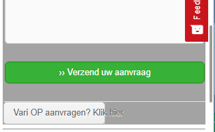
I have problem with my form. The buttons on the bottom of the page aren't (good) visible.
https://royalbrinkman.nl/promotie/folie-configurator


Can you help me to solve this problem?
Thank you in advance!
-
CharlieReplied on July 31, 2017 at 6:35 AM
Hi,
The form itself is actually responsive. The problem in the next and back button is that the text you set is too long. Note that the buttons takes 50% of the width on mobile devices.
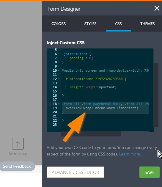
If you want the text in the buttons to adjust or wrap properly. Please try adding this custom CSS code inside the @media rule block:
.form-all .form-pagebreak-back, .form-all .form-pagebreak-next {
overflow-wrap: break-word !important;
}
Let us know if that works.
-
timbroerReplied on July 31, 2017 at 8:10 AM
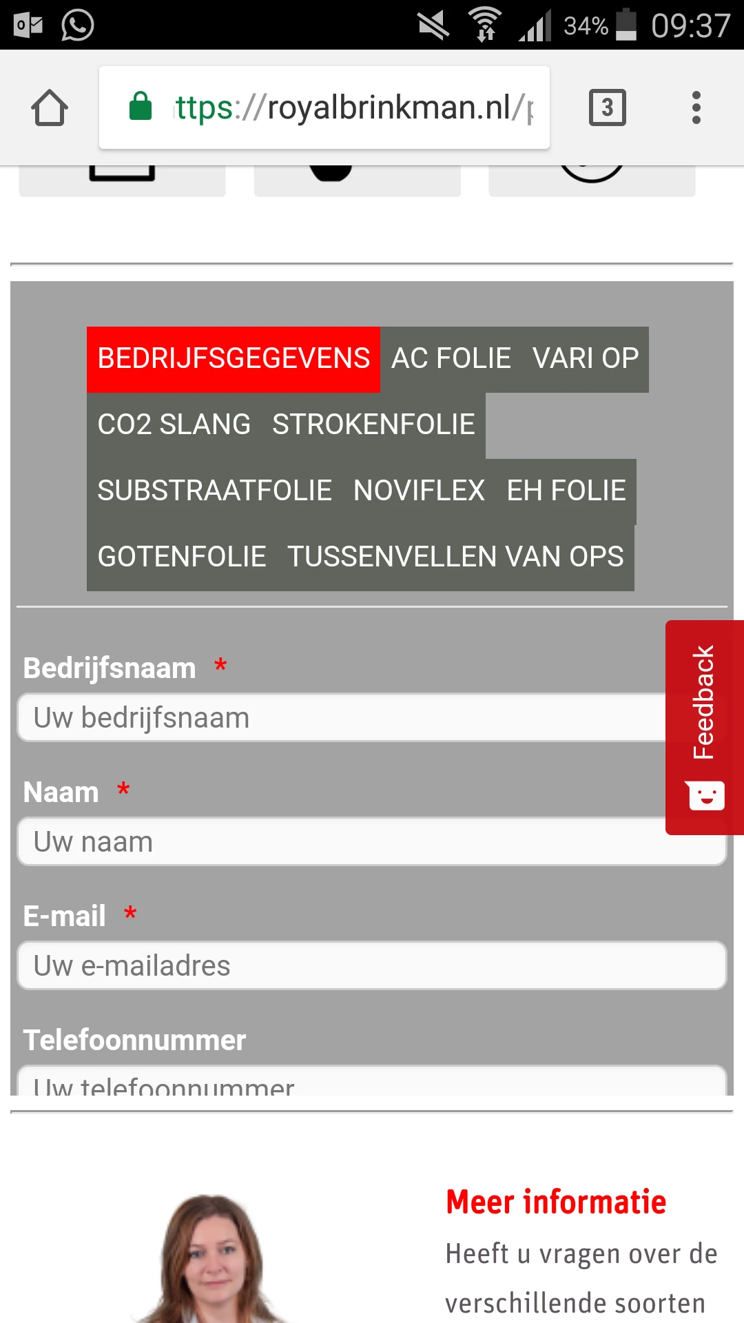
I have shortened the text in the buttons. But the buttons at the bottom of the page are not shown properly. When I add CSS code, then the form is not responsive anymore.
.form-all .form-pagebreak-back, .form-all .form-pagebreak-next {
overflow-wrap: break-word !important;
}

https://royalbrinkman.nl/promotie/folie-configurator
-
denizgReplied on July 31, 2017 at 11:51 AM
You should remove the following codes. Because this codes limits the form with specific size (700px). So, there are some issues on mobile. While testing on iphone, the following part of email field does not be shown because of css restriction.

you should add your code instead to solve this problem.

-
John_BensonReplied on July 31, 2017 at 2:46 PM
If the issue still persists, please try adding this Custom CSS Code to your form:
.tabs-list.electricred li {
padding: 5px;
}
To add a Custom CSS Code to your form, please follow this guide:

Here's the result:

I hope that helps. If you need further assistance, please let us know.
-
timbroerReplied on August 1, 2017 at 3:44 AM
Thanks for your help.
I have addes both codes, but the form is now no longer responsive on mobile.
Do you have any tips?
-
Chriistian Jotform SupportReplied on August 1, 2017 at 4:42 AM
Could you please try to add the two codes provided inside the following @media query rule block?
@media only screen and (max-width: 40em){}
So for example:
@media only screen and (max-width: 40em){
.form-all .form-pagebreak-back, .form-all .form-pagebreak-next {
overflow-wrap: break-word !important;
}
.tabs-list.electricred li {
padding: 5px;
}
}
Hope this helps.
- Templates
- Integrations
- INTEGRATIONS
- See 100+ integrations
- FEATURED INTEGRATIONS
 PayPal
- Slack
- Google Sheets
- Mailchimp
- Zoom
- Dropbox
- Google Calendar
- Hubspot
- Salesforce
- See more Integrations
- Products
- PRODUCTS
- Form Builder
- Jotform Enterprise
- Jotform Apps
- Store Builder
- Jotform Tables
- Jotform Inbox
- Jotform Mobile App
- Jotform Approvals
- Report Builder
- Smart PDF Forms
- PDF Editor
- Jotform Sign
- Jotform for Salesforce Discover Now
- Support


