


-
yvettehweeAsked on October 19, 2017 at 10:51 PM
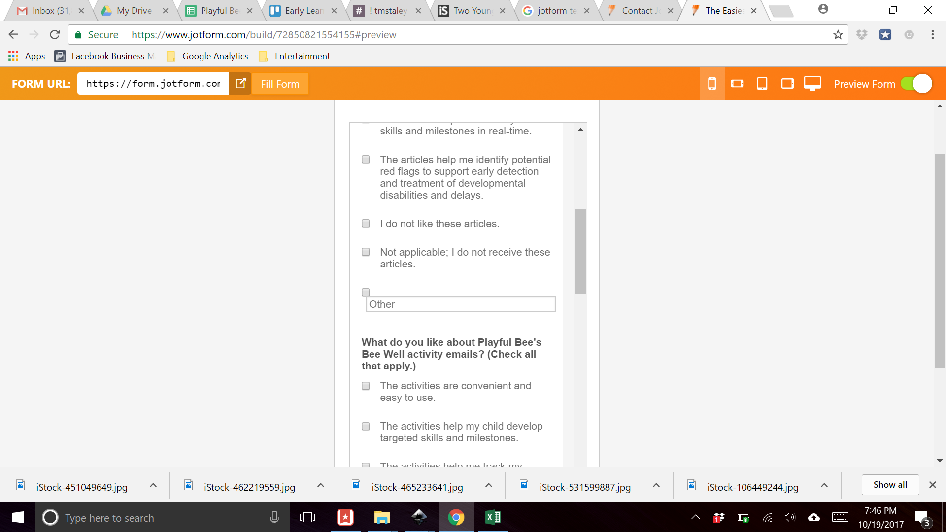
Pls help!
My form looks great, EXCEPT for the last answer option of "Other". The text box in mobile "vertical" view is not mobile responsive. Pls see screenshot. I believe it looks great in the rest of the device views. Please tell me what code to inject into the CSS. Based on what I've read to date on other support threads, I've tried injecting this code:
.form-input{width:100%;}
This does not work for the mobile vertical responsive view. Thank you for your support.
Yvette
-
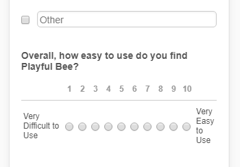
Elton Support Team LeadReplied on October 20, 2017 at 3:21 AM
Inject this CSS codes to your form.
@media screen and (max-width:480px){
.form-checkbox-other-input {
width: 92% !important;
margin-left: 0 !important;
float: right;
}
.form-scale-table td {
padding: 9px 3px;
}.form-all {
width: 99%!important;
}
}
I have included the scale rating as well so it fits on mobile view.
Result:
Guide: http://www.jotform.com/help/117-How-to-Inject-Custom-CSS-Codes
- Templates
- Integrations
- INTEGRATIONS
- See 100+ integrations
- FEATURED INTEGRATIONS
 PayPal
- Slack
- Google Sheets
- Mailchimp
- Zoom
- Dropbox
- Google Calendar
- Hubspot
- Salesforce
- See more Integrations
- Products
- PRODUCTS
- Form Builder
- Jotform Enterprise
- Jotform Apps
- Store Builder
- Jotform Tables
- Jotform Inbox
- Jotform Mobile App
- Jotform Approvals
- Report Builder
- Smart PDF Forms
- PDF Editor
- Jotform Sign
- Jotform for Salesforce Discover Now
- Support
