


-
Mallfox1Asked on November 21, 2017 at 7:37 AM
Greetings,
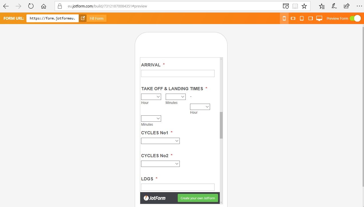
I've been testing your platforms for a project of a potential client, and I have encountered this problem: when I use a time field with the time range & duration indicator options enabled, and while using "All questions in one page" layout (both of which are absolutely crucial for my form to have), the mobile layout is broken as you can see on my screenshot. The form in question is this one : https://form.jotformeu.com/73121870084351 and the mobile preview is exactly what I view on both android and ios mobile devices. How can I fix this? Shrinking the selectors or have the second below the first are both acceptable solutions in case there's no relevant CSS command to shrink the field somehow altogether.
Thank you very much for your time
-
Elton Support Team LeadReplied on November 21, 2017 at 9:56 AM
Inject this CSS codes to your form, this should fix it.
[data-type=control_time] .form-sub-label-container {
width: 20 %!important;
margin-right: 2% !important;
}
[data-type=control_time] .form-sub-label-container:nth-child(3){
width: 3% !important;
}
li#id_24 {
display: inline-block;
}
Guide: http://www.jotform.com/help/117-How-to-Inject-Custom-CSS-Codes
Result:
I have also escalated this to our developers so this will be fixed on the default theme.
Thanks
-
Mallfox1Replied on November 21, 2017 at 11:26 AM
Thank you for the fast response, i very much appreciate it.
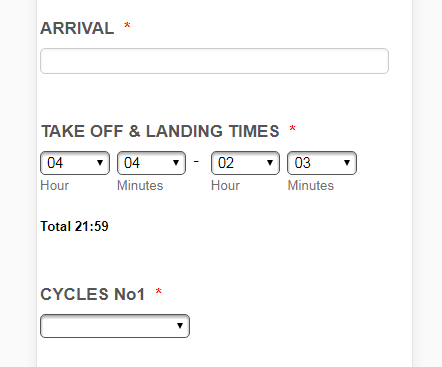
I did inject the CSS as shown in your link, but initially did not corrected the problem. I removed the "mobile responsive" widget and it kinda corrected the problem, as it now appears as shown below:
So, is it possible to make it appear like your screenshot? I do not have any other widgets, and i only added the "mobile responsive" one in my attempt to fix the layout. Am i doing something wrong? Thank you again for your time.
-
Elton Support Team LeadReplied on November 21, 2017 at 11:37 AM
Apologies, there seems to have been a mistake with the first CSS. I added a space between 20 %, it should just be 20%. Anyway, please replace the CSS with the following so it will only affect the mobile view.
@media screen and (max-width:480px){
[data-type=control_time] .form-sub-label-container {
width:20% !important;
margin-right:2% !important;
}
[data-type=control_time] .form-sub-label-container:nth-child(3){
width:3% !important;
}
li#id_24 {display: inline-block;}
}
-
Mallfox1Replied on November 21, 2017 at 11:44 AM
Thank you very much, the problem is resolved. I really do appreciate the timely response.
Cheers!
-
beril JotForm UI DeveloperReplied on October 23, 2018 at 11:19 AM
Hi,
It should be fixed now.
Thank you
- Templates
- Integrations
- INTEGRATIONS
- See 100+ integrations
- FEATURED INTEGRATIONS
 PayPal
- Slack
- Google Sheets
- Mailchimp
- Zoom
- Dropbox
- Google Calendar
- Hubspot
- Salesforce
- See more Integrations
- Products
- PRODUCTS
- Form Builder
- Jotform Enterprise
- Jotform Apps
- Store Builder
- Jotform Tables
- Jotform Inbox
- Jotform Mobile App
- Jotform Approvals
- Report Builder
- Smart PDF Forms
- PDF Editor
- Jotform Sign
- Jotform for Salesforce Discover Now
- Support


