


-
SDFFormsAsked on April 5, 2018 at 5:34 PM
https://www.jotform.com/build/80745915379166
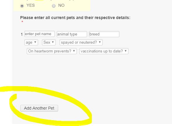
Was working and now only the itty bitty left is clickable. I removed all related CSS. Also hoping to move it up closer to the records.
-
jonathanReplied on April 5, 2018 at 6:20 PM
The issue had to do with the erroneous custom CSS codes you have injected on the configurable list widget on your form.
I used a cloned test form and I was able to restore the working add button when I removed the injected CSS codes in the widget.

From what I see, you must be trying to make the configurable list layout have multiple rows for mobile browser use.
You can follow the steps from the user guide here: How to Make the Configurable List Widget Mobile Responsive
I will try create also the demo form with the custom CSS codes that will work properly to make the configurable list have mobile browser layout.
I will update you here when as soon as I can.
-
jonathanReplied on April 5, 2018 at 6:28 PM
Please try using the custom CSS codes below in the configurable list widget on your form.
.checkbox, .radio {margin: 3px 0; min-width: 70px; } div#listContainer {background: #fff; } th {display: none; } td {float: left; margin: 6px 0 !important; display: block; min-height: none !important; box-sizing: border-box; } td:before {display: block } input[type=text], select, textarea {box-shadow: none; border-radius: 0; padding: 4px; } td[class*="col"]:before {width: 30%; float: left; font-weight: bold; } td {max-width: 620px; width: 100% !important; } td [name="input"], td > select, textarea {width: 68% !important; box-sizing: border-box; } img.calendarIcon {display: none; } .radio {width: 30%; float: left; } .buttonsColumn {min-height: 30px; } textarea {min-height: 120px; } .buttonsColumn {text-align: right; } table {border-collapse: collapse; } #list tbody > tr + tr + tr {margin-top: 22px; border-top: 1px solid #ccc; box-shadow: 1px 0 0 #ccc; } #list tbody tr td:first-child {padding-top: 20px !important; } input.stepper {width: 100% !important; }.radio-container {width: 70% !important; display: inline-block; }
td.col1:before {
content: "Pet Name";
}
td.col2:before {
content: "Animal Type";
}
td.col3:before {
content: "Breed";
}
td.col4:before {
content: "Age";
}
td.col5:before {
content: "Sex";
}
td.col6:before {
content: "Spayed or Neutered?";
}
td.col7:before {
content: "Vaccinations up to date?";
}
td.col8:before {
content: "on heartworm prevention?";
}---
You can check it working in clone test form version https://www.jotform.com/80947503759973
Let us know how it goes.
-
SDFFormsReplied on April 5, 2018 at 6:45 PM
What took you so long? Must have been at least 30 minutes! 🤪 Never seen such prompt responses before!! Yours looks sooooooooo much better!!!! THANK YOU! Spent all day trying to get that right.
-
Elton Support Team LeadReplied on April 5, 2018 at 6:52 PM
We also have a guide about it here https://www.jotform.com/help/456-How-to-Make-the-Configurable-List-Widget-Mobile-Responsive.
Cheers! :)
-
SDFFormsReplied on April 5, 2018 at 7:25 PM
I do have a question...sorry...I added ur code to my tester which is a clone (so I thought) but in my live version it's wicked wide and the labels aren't wrapping. I'm afraid to muck with your code. Any ideas?
-
MikeReplied on April 5, 2018 at 8:49 PM
This is how it is currently displaying on my end:
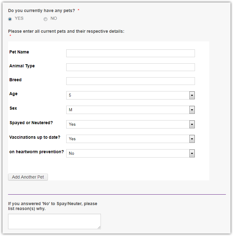
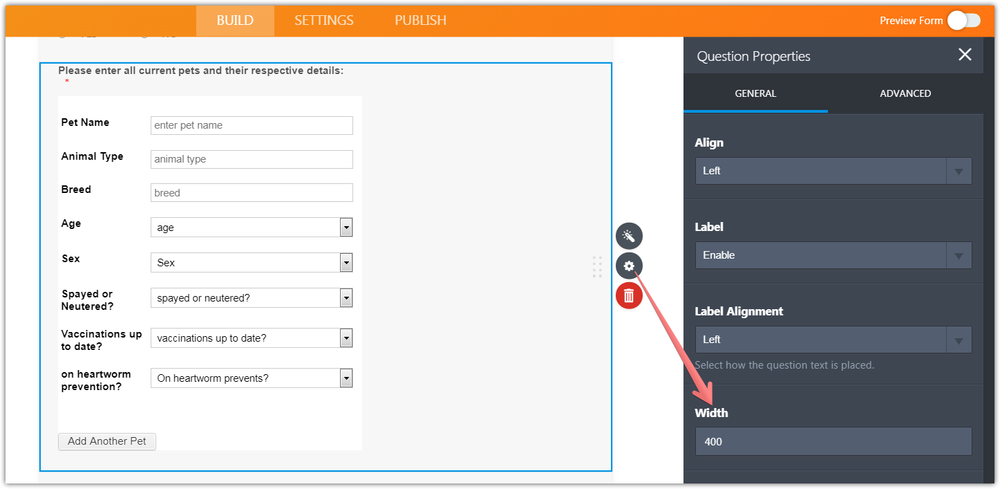
If the field is too wide, you may decrease the width:
Is there anything else?
-
SDFFormsReplied on April 6, 2018 at 9:48 AM
Should have known that! Thank you...again!
- Templates
- Integrations
- INTEGRATIONS
- See 100+ integrations
- FEATURED INTEGRATIONS
 PayPal
- Slack
- Google Sheets
- Mailchimp
- Zoom
- Dropbox
- Google Calendar
- Hubspot
- Salesforce
- See more Integrations
- Products
- PRODUCTS
- Form Builder
- Jotform Enterprise
- Jotform Apps
- Store Builder
- Jotform Tables
- Jotform Inbox
- Jotform Mobile App
- Jotform Approvals
- Report Builder
- Smart PDF Forms
- PDF Editor
- Jotform Sign
- Jotform for Salesforce Discover Now
- Support


