


-
odilebAsked on April 27, 2018 at 2:08 PM
-
Richie JotForm SupportReplied on April 27, 2018 at 2:25 PM
It seems that the first Input table is covered by the second input table. To fix this issue, we just need to edit the first input table inside the mobile responsive code I have given and add the css code.
z-index: 1!important;
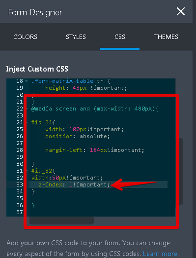
We can also add the css code outside the mobile responsive form so that it will also work when not in mobile view.
#id_32{
z-index: 1!important;
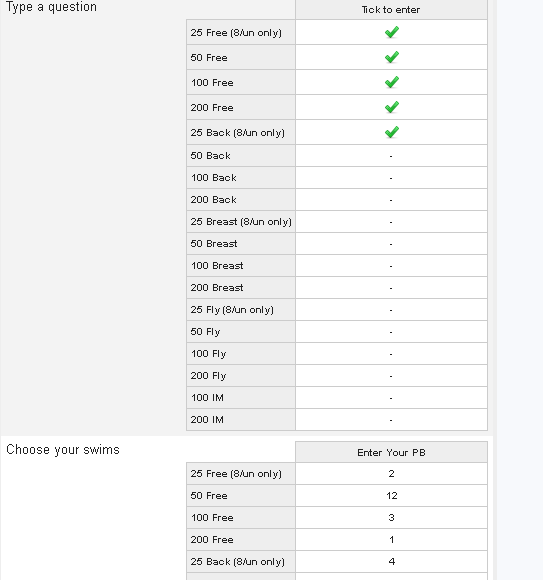
}Here is my screenshot of the submission after I have added the css code.
Please give it a try and let us know how it goes.
Thank you.
-
odilebReplied on April 27, 2018 at 2:35 PM
Hi sorry where do I add the css for the non mobile version
-
Richie JotForm SupportReplied on April 27, 2018 at 2:45 PM
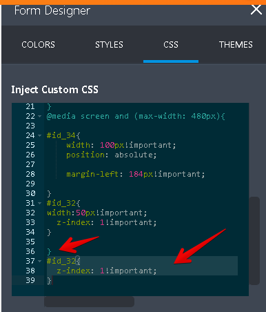
You can add it after the } of the mobile version custom CSS.
- Templates
- Integrations
- INTEGRATIONS
- See 100+ integrations
- FEATURED INTEGRATIONS
 PayPal
- Slack
- Google Sheets
- Mailchimp
- Zoom
- Dropbox
- Google Calendar
- Hubspot
- Salesforce
- See more Integrations
- Products
- PRODUCTS
- Form Builder
- Jotform Enterprise
- Jotform Apps
- Store Builder
- Jotform Tables
- Jotform Inbox
- Jotform Mobile App
- Jotform Approvals
- Report Builder
- Smart PDF Forms
- PDF Editor
- Jotform Sign
- Jotform for Salesforce Discover Now
- Support


