


-
nomadicloomAsked on June 14, 2018 at 12:49 PM
-
Victoria_KReplied on June 14, 2018 at 1:24 PM
Your form itself is responsive on mobile devices. But, embedded one is moved to the right a bit. This is likely because of your page's styling. I have injected the following code to fix the issue from our side:


-
nomadicloomReplied on June 14, 2018 at 1:51 PM
Thank you. What do I need to do to increase the height of the upload button?
-
luisvcsilvaReplied on June 14, 2018 at 2:21 PM
Using the custom CSS code that already is in your form, simply edit the attribute line-height at line 51 in your code, increase the value from 18 px to the one you wish, as shown by the images below:


Contact us if you need any assistance,
Thanks.
-
nomadicloomReplied on June 14, 2018 at 2:52 PM
Thank you! Is there anyway to center 'no file chosen with the height of the box?
-
nomadicloomReplied on June 14, 2018 at 2:59 PM
Also is there a way to make this space smaller. I would like to move last name closer to First Name

-
nomadicloomReplied on June 14, 2018 at 3:09 PM
One other thing. Can phone and website be put on the same line. Like First and Last Name. I don't mind if on mobile if they are on two, but on desktop would prefer them side by side.
-
Victoria_KReplied on June 14, 2018 at 3:10 PM
I have added the following lines to position the button higher:
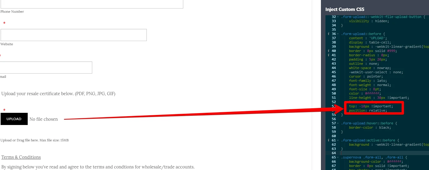
This allows "no file chosen" to be vertically centered.
-
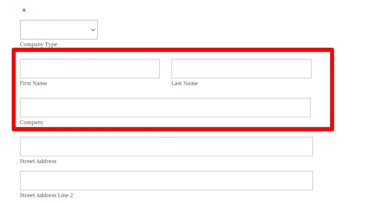
Victoria_KReplied on June 14, 2018 at 3:25 PM
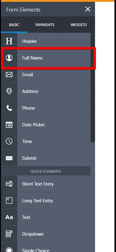
I have now aligned First and Last name fields with custom css, but usually we recommend to use Full Name form element. It is displayed in one line by default:
-
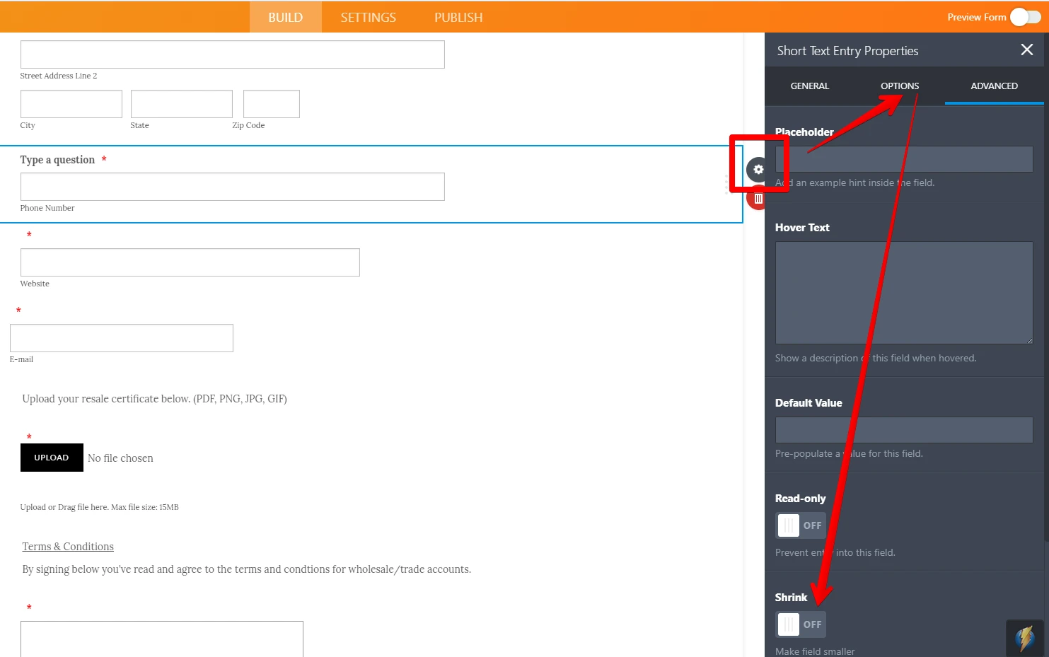
Victoria_KReplied on June 14, 2018 at 3:27 PM
To position fields on a same line, please "Shrink" both of them:
-
nomadicloomReplied on June 14, 2018 at 3:52 PM
Awesome. Thank you! I think I used two fields for mapping with Mailchimp.
-
nomadicloomReplied on June 14, 2018 at 3:56 PM
Sorry I was trying to get email and phone on same line. They both have shrink enabled but are not going to same line.
-
Victoria_KReplied on June 14, 2018 at 4:20 PM
When I checked, one of fields was not shrinked. I have fixed that and added some css to move Website field closer to Phone.
Please check and let us know if you need more help.
Thank you.
-
nomadicloomReplied on June 14, 2018 at 6:43 PMI noticed no file selected is cut off on mobile.
... -
Victoria_KReplied on June 14, 2018 at 7:32 PM
Hello again,
I have adjusted the mobile layout for your form:


-
nomadicloomReplied on June 14, 2018 at 8:43 PM
-
nomadicloomReplied on June 14, 2018 at 8:43 PMHi,
The first and last name have become different sizes.
... -
Kiran Support Team LeadReplied on June 15, 2018 at 1:15 AM
I have checked the web page on an iPhone emulator and see that the issue is being caused due to the CSS code added to #id_30. Please see the screenshot below:

I have now removed it from the CSS code and the first name is displaying correctly on the mobile. Please check and let us know if you need any further assistance.
The question related to the other form is moved to a separate thread and shall be addressed there shortly.
https://www.jotform.com/answers/1500374
Thank you!
-
nomadicloomReplied on June 15, 2018 at 9:09 AM
For some reason the first and last name fields are apart again. Any suggestions how to get them to appear like they did when you fixed them?
-
Kiran Support Team LeadReplied on June 15, 2018 at 11:00 AM
It seems that the custom CSS code on the form is conflicting. Please allow me sometime to check this up and get back to you with relevant information.
Thank you for your patience.
-
Kiran Support Team LeadReplied on June 15, 2018 at 2:48 PM
Thank you for your patience. Please try injecting the following CSS code the form to align the name fields on the form.
#id_30.form-line-column {
width: 32%;
}
@media screen and (min-width: 10px) and (max-width: 540px){
#id_30.form-line-column {
width: 100%;
}
}
Thanks!
- Templates
- Integrations
- INTEGRATIONS
- See 100+ integrations
- FEATURED INTEGRATIONS
 PayPal
- Slack
- Google Sheets
- Mailchimp
- Zoom
- Dropbox
- Google Calendar
- Hubspot
- Salesforce
- See more Integrations
- Products
- PRODUCTS
- Form Builder
- Jotform Enterprise
- Jotform Apps
- Store Builder
- Jotform Tables
- Jotform Inbox
- Jotform Mobile App
- Jotform Approvals
- Report Builder
- Smart PDF Forms
- PDF Editor
- Jotform Sign
- Jotform for Salesforce Discover Now
- Support


