


-
jabedoya60Asked on July 18, 2018 at 1:42 PM
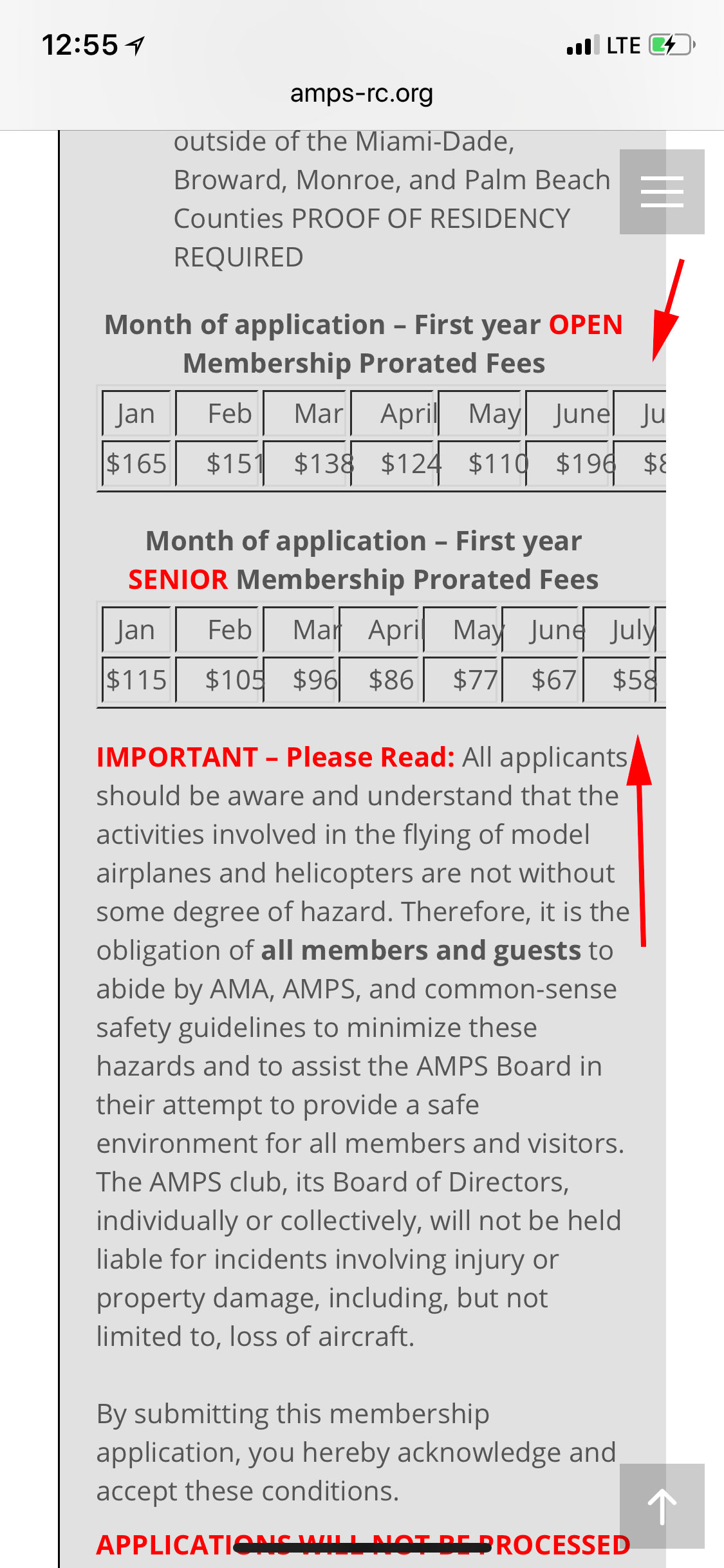
Hi Guys, I have a small problem with our online form when viewed on mobile devices, there is a chart with various columns that is not responsive, can you please take a look at it and see if you can help me fix this issue? Thank you.
James
-
David JotForm SupportReplied on July 18, 2018 at 2:49 PM
Since the table is in a text field, I am not sure it can be made mobile responsive. My best recommendation would be to split each table into 2 separate tables, one on top of the other, so that they can fit naturally on mobile.
-
jabedoya60Replied on July 18, 2018 at 3:51 PM
I can't copy the table so I can split it into 2 separate tables, is there a trick to do this?
-
Jed_CReplied on July 18, 2018 at 5:08 PM
You can split the table like what is shown in my screenshot below.
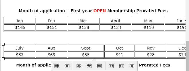
Currently, manual splitting the table is the only if you are using the Text field. If you use the input table field, that can be split / customize with CSS.
Let us know if you have any questions or if you need further assistance.
-
jabedoya60Replied on July 19, 2018 at 9:18 AM
Hi guys, I can't get it to split like the image above, that would resolve my issue on mobile devices, can you please help me split the table? Thank you.
-
David JotForm SupportReplied on July 19, 2018 at 11:14 AM
While editing the Text field contents, select the columns you want to remove then click on "Delete column":

After that, insert a new table and add back the contents that were just removed. Once each table is split to 2 tables, it should look much better on mobile.
- Templates
- Integrations
- INTEGRATIONS
- See 100+ integrations
- FEATURED INTEGRATIONS
 PayPal
- Slack
- Google Sheets
- Mailchimp
- Zoom
- Dropbox
- Google Calendar
- Hubspot
- Salesforce
- See more Integrations
- Products
- PRODUCTS
- Form Builder
- Jotform Enterprise
- Jotform Apps
- Store Builder
- Jotform Tables
- Jotform Inbox
- Jotform Mobile App
- Jotform Approvals
- Report Builder
- Smart PDF Forms
- PDF Editor
- Jotform Sign
- Jotform for Salesforce Discover Now
- Support


