


-
LibertyAsked on September 20, 2018 at 5:08 PM
Hi,
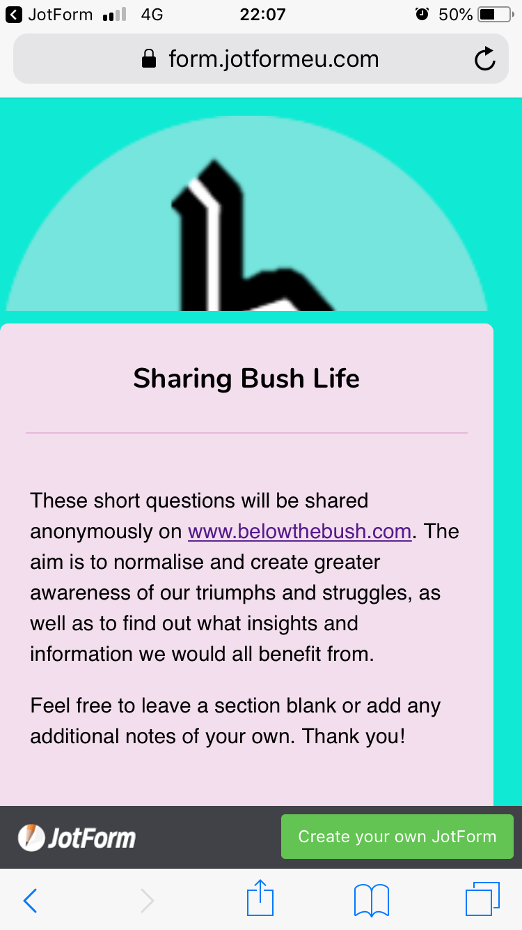
The form I’ve created is great and I love your site thank you, however on the mobile version the header image is half cut out and the whole form sticks to the left of the page with a margin only on the right side, even though all settings are central.
Please advise, thank you!
liberty
-
David JotForm Support ManagerReplied on September 20, 2018 at 6:49 PM
Please inject the following CSS code in your form:
@media screen and (max-width: 480px){
.form-all {
margin-left: auto !important;
margin-right: auto !important;
}
div.form-all:before {
background-size: contain !important;
}
}
Result: https://form.jotform.com/82627589274976

Let us know if you need more help.
-
belowthebushReplied on October 24, 2018 at 4:43 PMHi,
That worked last time but has not worked this time. It is definitely
the correct code? There were fewer lines last time (I'm not sure which
spaces to delete or not)
Thanks
Liberty
Quoting JotForm :
... -
David JotForm Support ManagerReplied on October 24, 2018 at 6:02 PM
I just checked your form, and it looks mobile responsive: https://form.jotformeu.com/belowthebush/sharing-bush-life

Are you referring to a different form?
- Templates
- Integrations
- INTEGRATIONS
- See 100+ integrations
- FEATURED INTEGRATIONS
 PayPal
- Slack
- Google Sheets
- Mailchimp
- Zoom
- Dropbox
- Google Calendar
- Hubspot
- Salesforce
- See more Integrations
- Products
- PRODUCTS
- Form Builder
- Jotform Enterprise
- Jotform Apps
- Store Builder
- Jotform Tables
- Jotform Inbox
- Jotform Mobile App
- Jotform Approvals
- Report Builder
- Smart PDF Forms
- PDF Editor
- Jotform Sign
- Jotform for Salesforce Discover Now
- Support


