


-
MDDC1908Asked on December 19, 2018 at 3:06 PM
Hi, I can't get the form to be reponsive on all devices. I cut out the first and last line and pasted the additional CSS code on the first line, but it will not wrap on tablet or desktop preview. Can you post the entire CSS string to make it responsive on all devices?
-
David JotForm Support ManagerReplied on December 19, 2018 at 5:25 PM
I supposed that this is the form in question: https://www.jotform.us/form/83524069341153
I cloned it, and the reason why it is still off the form width is due to the width you have set up for the widget:

Please set 500 max. Result: https://form.jotform.com/83526896895985

-
MDDC1908Replied on December 19, 2018 at 6:30 PM
I have changed the width of the form to 500 as requested, and it still is not mobile responsive for desktop or tablet. Any help?
-
Elton Support Team LeadReplied on December 19, 2018 at 9:04 PM
You have to change the width of the widget, not the form width.
Anyway, your form looks fine on mobile and desktop now.
-
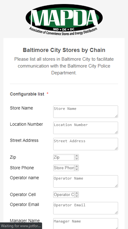
MDDC1908Replied on December 20, 2018 at 7:52 AM
Sorry, it still is not working on desktop and tablet. Mobile is fine. See screenshot below. Where would I change the width of the widget? I only saw the ability to change the form width.
I see that you all cloned my original form and your link looks correct. However, I can't find the cloned form in my forms - did you rename it? I am working with the MAPDA - Baltimore City Stores. Thanks for working through this with me.
-
David JotForm Support ManagerReplied on December 20, 2018 at 10:35 AM
Probably it is not looking good on the desktop in your end due to the cache, try clearing your browser's cache. I just checked your form, and it looks fine:

- Templates
- Integrations
- INTEGRATIONS
- See 100+ integrations
- FEATURED INTEGRATIONS
 PayPal
- Slack
- Google Sheets
- Mailchimp
- Zoom
- Dropbox
- Google Calendar
- Hubspot
- Salesforce
- See more Integrations
- Products
- PRODUCTS
- Form Builder
- Jotform Enterprise
- Jotform Apps
- Store Builder
- Jotform Tables
- Jotform Inbox
- Jotform Mobile App
- Jotform Approvals
- Report Builder
- Smart PDF Forms
- PDF Editor
- Jotform Sign
- Jotform for Salesforce Discover Now
- Support


