


-
mrdanielhchoAsked on January 14, 2019 at 3:22 AM
I noticed that the lightbox wasn't behaving as intended?
When previewed from jotform:

When viewed live on mobile:

Thank you again for the help!
-
jherwinReplied on January 14, 2019 at 8:38 AM
Could you please try embedding your form using this embed code:
<script src ="https://form.jotform.com/static/feedback.js" type="text/javascript"></script><script type="text/javascript">
var parentWidth = window.innerWidth;
if(window.innerWidth <= 499) {parentWidth = window.innerWidth;} else {parentWidth = 500;}
var JFL_90107882108152 = new JotformFeedback({
formId: '90107882108152',
base: 'https://form.jotform.com/',
windowTitle: 'Canine Adventure Club Contact',
background: '#4a90e2',
fontColor: '#FFFFFF',
type: '1',
height: 600,
width: 900,
openOnLoad: false
});
</script>
<a class="btn lightbox-90107882108152" style="margin-top: 16px">
Book a Free Walk
</a>
I added custom script that would automatically adjust the width of the lightbox depending on the window size it is viewed e.g. mobile and desktop.
Give it a try and let us know how it goes.
-
mrdanielhchoReplied on January 14, 2019 at 3:08 PM
I really do appreciate all the help Jotform is providing in getting this to work. I do appreciate jotform features and would love implement across my sites!
However, the above script did not have any effect upon the mobile sizing.
The code is currently live and implemented on canineadventureclub.comThank you!
-
Elton Support Team LeadReplied on January 14, 2019 at 4:59 PM
I checked the embedded form on your website and found out that the container where the form is embedded has a width of 700px which does not fit perfectly on mobile, in short not responsive.
To fix it, update the width to 100% when on mobile view only so it won't affect the display on desktop view. You might be able to find that option in your WP editor.
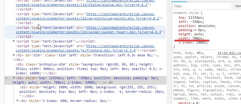
Or if you can inject custom CSS code within that page alone, use the following.
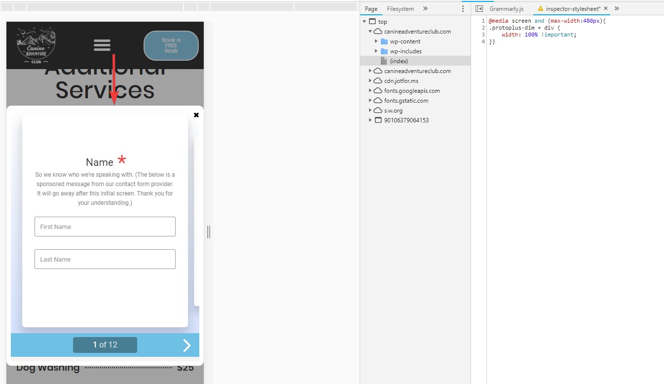
@media screen and (max-width:480px){
.protoplus-dim + div {
width: 100% !important;
}}
Result:
-
mrdanielhchoReplied on January 18, 2019 at 4:37 AM
Setting the container to full width did not solve the problem, but the CSS code did. Thank you!
-
Kiran Support Team LeadReplied on January 18, 2019 at 9:24 AM
Glad to see that the issue is resolved and the form on your web page is working as intended. Please do not hesitate to get back to us if you need any further assistance. We will be happy to help.
Thank you for using JotForm!
- Templates
- Integrations
- INTEGRATIONS
- See 100+ integrations
- FEATURED INTEGRATIONS
 PayPal
- Slack
- Google Sheets
- Mailchimp
- Zoom
- Dropbox
- Google Calendar
- Hubspot
- Salesforce
- See more Integrations
- Products
- PRODUCTS
- Form Builder
- Jotform Enterprise
- Jotform Apps
- Store Builder
- Jotform Tables
- Jotform Inbox
- Jotform Mobile App
- Jotform Approvals
- Report Builder
- Smart PDF Forms
- PDF Editor
- Jotform Sign
- Jotform for Salesforce Discover Now
- Support


