


-
ChildrensChristianSchoolAsked on February 21, 2019 at 7:24 PM
Hi!
I have a form that I am testing and can't get it to work.
On mobile android chrome browser, the background image (not jotform background BUT the background on my own domain) gets zoomed. When I delete the form all together, then my background is fine.
Can you tell me the solution and how to avoid this problem with future forms?
https://childrenschristianschool.org/test.html
https://www.jotform.com/build/90315746186158
Thanks!
-
Bojan_RReplied on February 21, 2019 at 8:20 PM
I cloned and explore your form, and I think can help you.
Please follow these instructions:
1. Go to Form Designer (blue circle in the right corner)
2. Click on CSS-tab
3. Delete "width: 100% !important;" (row 67)
4. Click on SAVE
Look at the picture below: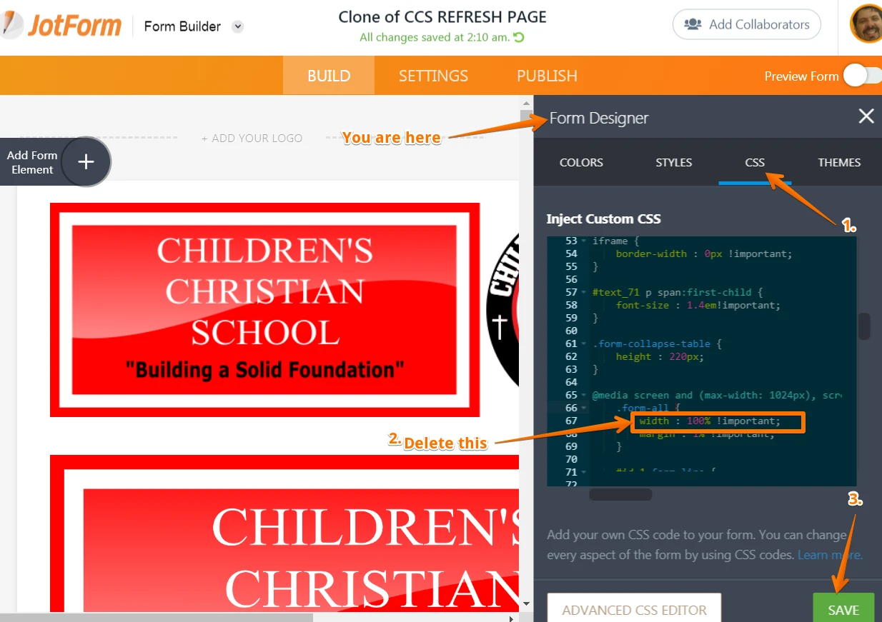
Hoe this helps. Let us know if you need any further assistance. -
Bojan_RReplied on February 22, 2019 at 10:05 AM
Sorry, I didn't understand your question correctly. I was thinking about it and tried to solve it again. Please, you can neglect my previous answer.
In your own CSS code, in class .bodyBackgroud, you should change background-size to "auto"..bodyBackgroud{
background-size: auto;
}
I inspected your page as you can see below.
When you set it to "auto" your background will be stable.
Hope this helps. If you need any other assistance do not hesitate to ask.
-
ChildrensChristianSchoolReplied on February 27, 2019 at 3:40 PM
This is all i got. its from the index.html
Would I change something here?
I know that if the form doesn't overflow the mobile screen, then the background is fine.
It's when scrolling needs to happen, that is when the background zooms in to fill up the area.
<html><head><meta charset="utf-8"><title>CCS</title><meta name="robots" content="all"><meta name="generator" content="One.com Web Editor"><meta http-equiv="Cache-Control" content="must-revalidate, max-age=0, public"><meta http-equiv="Expires" content="-1"><meta name="viewport" content="width=1130" minpagewidth="1130"><meta name="MobileOptimized" content="320"><meta name="HandheldFriendly" content="True"><link rel="shortcut icon" href="//childrenschristianschool.org/____impro/1/onewebmedia/CCSFAVICON.png?etag=W%2F%221f5a7-59507534%22&sourceContentType=image%2Fpng&resize=16,16&format=ico"><link rel="stylesheet" href="//childrenschristianschool.org/onewebstatic/2e25f62d79.css"><script src="//childrenschristianschool.org/onewebstatic/95155764a0.js"></script><link href="//fonts.googleapis.com/css?family=Alex%20Brush%3A100%2C100italic%2C200%2C200italic%2C300%2C300italic%2C500%2C500italic%2C600%2C600italic%2C700%2C700italic%2C800%2C800italic%2C900%2C900italic%2Citalic%2Cregular&subset=all" rel="stylesheet" type="text/css"><link href="//fonts.googleapis.com/css?family=Open%20Sans%3A100%2C100italic%2C200%2C200italic%2C300%2C300italic%2C500%2C500italic%2C600%2C600italic%2C700%2C700italic%2C800%2C800italic%2C900%2C900italic%2Citalic%2Cregular&subset=all" rel="stylesheet" type="text/css"><link rel="stylesheet" href="//childrenschristianschool.org/onewebstatic/8bfdf041b7.css"><link rel="stylesheet" href="//childrenschristianschool.org/onewebstatic/545ade87c5.css"></head><body class="Preview_body__2wDzb bodyBackground" style="overflow-y:auto" data-mobile-editor="{"data":{"5B872C67-9602-4822-9037-368D64337A28":["856D82EB-D633-4C8E-8F0B-9011636BD185"]},"wrappedCmpsMap":{},"root":"5B872C67-9602-4822-9037-368D64337A28","styles":{"856D82EB-D633-4C8E-8F0B-9011636BD185":{"marginTop":35,"marginBottom":35}}}"><div><link rel="stylesheet" href="//childrenschristianschool.org/onewebstatic/530a22ae40.css"></div><div class="template mobileV"><div class="Preview_row__3Fkye row" style="width:1000px"><div class="Preview_float__1PmYU float" style="top:28px;left:65px;z-index:999"><div data-id="856D82EB-D633-4C8E-8F0B-9011636BD185" data-kind="CODE" style="width:1000px;min-height:80px" class="Preview_componentWrapper__2i4QI"><div data-id="856D82EB-D633-4C8E-8F0B-9011636BD185" data-kind="Component" data-specific-kind="CODE" class=" Preview_component__SbiKo"><div id="code-component-856D82EB-D633-4C8E-8F0B-9011636BD185" class="preview_code__2Lr3m">
-
MikeReplied on February 27, 2019 at 6:00 PM
You may try adding the next code to somewhere in your web page, for example before a closing html tag:
<style>
@media only screen and (max-width: 40em) {
.bodyBackground {
background-size: auto !important;
}
}
</style>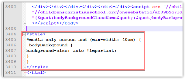
- Templates
- Integrations
- INTEGRATIONS
- See 100+ integrations
- FEATURED INTEGRATIONS
 PayPal
- Slack
- Google Sheets
- Mailchimp
- Zoom
- Dropbox
- Google Calendar
- Hubspot
- Salesforce
- See more Integrations
- Products
- PRODUCTS
- Form Builder
- Jotform Enterprise
- Jotform Apps
- Store Builder
- Jotform Tables
- Jotform Inbox
- Jotform Mobile App
- Jotform Approvals
- Report Builder
- Smart PDF Forms
- PDF Editor
- Jotform Sign
- Jotform for Salesforce Discover Now
- Support


