


-
apavittAsked on August 3, 2019 at 4:57 AM
Hi,
I am looking to make my PDF attached to my auto-res-ponder and email forwards more visual. Am I able to show my form data, for a single submission, in the form of charts or graphs or any visual way for that matter?
If so how?
-
jherwinReplied on August 3, 2019 at 7:39 AM
Do you mean you want to make a chart for your PDF document? If so, you can use a text element and add the table in there:
1.) Add the text:

2.) Add the table and pull the fields from there:

Let us know if you are referring to something else. -
apavittReplied on August 3, 2019 at 8:06 AM
Being able to create a table is good, I didn't know that was possible, but I was looking more for a way of adding colour, like a bar chart or Pie chart.
-
jherwinReplied on August 3, 2019 at 10:53 AM
Unfortunately, that is not yet possible. However, You may want to consider creating a visual report in your form, though, you cannot attach it to an autoresponder or email.
Guide: How-to-Create-a-Visual-Report-with-Your-Form-Submissions
Let us know if you would like us to create a feature request for your requirements. However, please keep in mind that there's no assurance whether this will be implemented. It will highly depend on the viability of the feature, the number of similar requests we get, along with the workload of our Developers.
Looking forward to your response.
-
apavittReplied on August 3, 2019 at 11:04 AM
I would love to submit a feature request for this please.
-
Mike_G JotForm SupportReplied on August 3, 2019 at 3:27 PM
We will be glad to submit your concern to our developers as a feature request, however, we may need to ask you for some clarification regarding the data that will be shown in the chart that will be shown on the PDF Submission. May we know what data will the chart(s) be representing and where will the data come from, please? Will it be per submission, which means each chart may be different in every submission? Will it mean also that the data that will be shown on the chart are based on the answer(s) in each field on the form.
We will wait for your response.
-
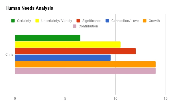
apavittReplied on August 5, 2019 at 5:56 AM
This is an example of the chart I can produce using Google Sheets and this is great. However if I can fully automate this and create it for each submission in their auto response email that would enable me to do much more.
Does this answer all your questions?
-
apavittReplied on August 5, 2019 at 7:12 AM
In the short term could I calculate a number field, input a number between 1 - 10 into a hidden Star rating or emoji slider that would then show graphically in a PDF?
I tried this and it doesn't appear to work am I doing something wrong or is this something that could be updated in the short term?
-
Victoria_KReplied on August 5, 2019 at 8:57 AM
Hi!
As far as I understand, the chart is supposed to be created based on responses of a same person, right? What is the type of question you would like to use to build a chart?
-
apavittReplied on August 5, 2019 at 9:47 AM
In this questionnaire I have asked 84 questions each have a numerical answer.
I then calculate those answers into a total score for 1 of 6 categories. The score can be depicted as a % or a score out of 10 or natively as a score out of 14. The chart above shows this.
-
Richie JotForm SupportReplied on August 5, 2019 at 10:58 AM
I have forwarded a feature request to our developers to allow visual report charts inside the PDF documents.
Do note that we cannot give an ETA when this feature would be added or will it be passed however, we will keep you posted via this thread for updates.
-
apavittReplied on August 6, 2019 at 8:12 AM
-
Richie JotForm SupportReplied on August 6, 2019 at 9:46 AM
I have moved your question to a new thread to assist you better.
Kindly follow this link https://www.jotform.com/answers/1917297
- Templates
- Integrations
- INTEGRATIONS
- See 100+ integrations
- FEATURED INTEGRATIONS
 PayPal
- Slack
- Google Sheets
- Mailchimp
- Zoom
- Dropbox
- Google Calendar
- Hubspot
- Salesforce
- See more Integrations
- Products
- PRODUCTS
- Form Builder
- Jotform Enterprise
- Jotform Apps
- Store Builder
- Jotform Tables
- Jotform Inbox
- Jotform Mobile App
- Jotform Approvals
- Report Builder
- Smart PDF Forms
- PDF Editor
- Jotform Sign
- Jotform for Salesforce Discover Now
- Support


