


-
renessa.boleyAsked on October 18, 2019 at 5:21 PM
Hello,
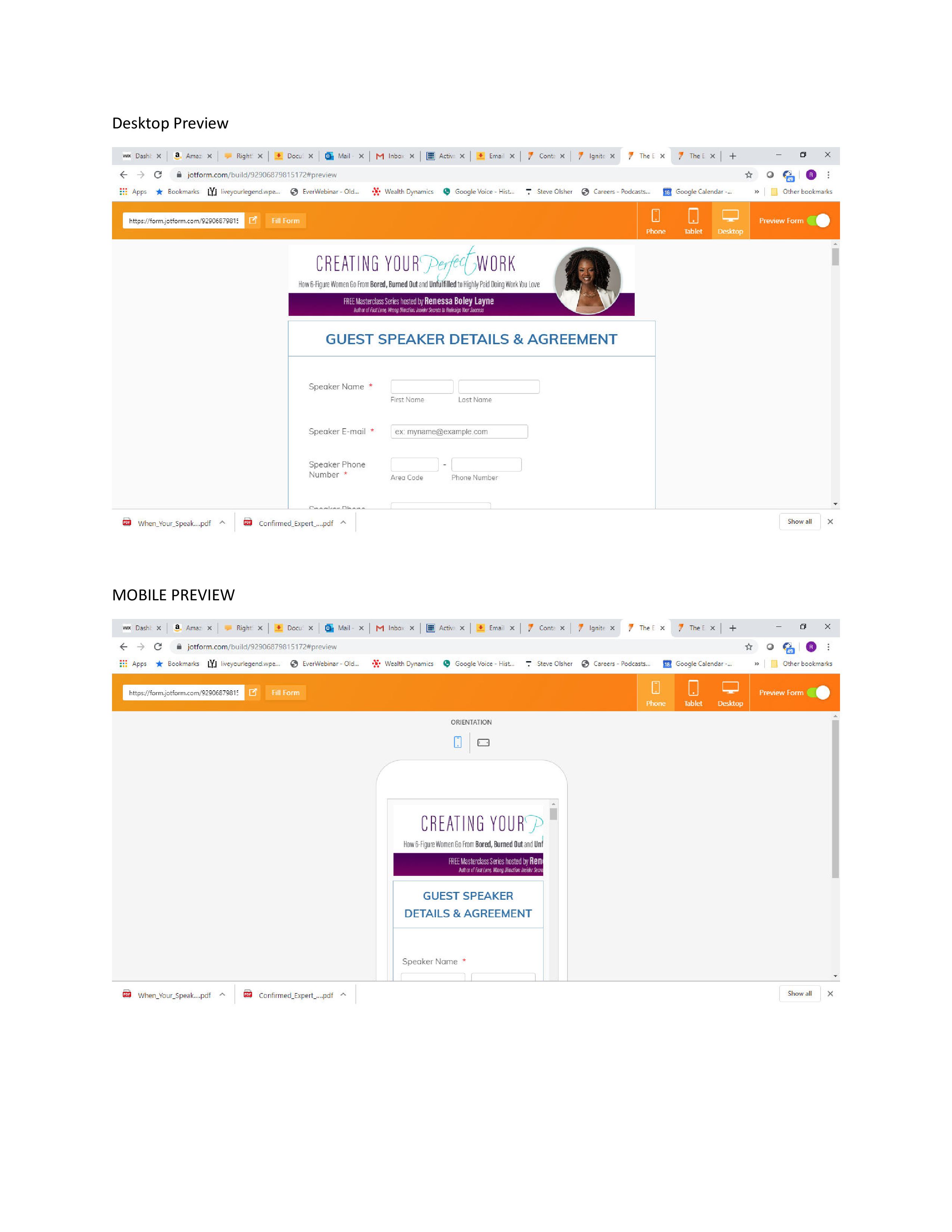
I am creating a form that has a banner image at the top. Obviously the image shows fine in the preview for desktop. However, the image is truncated on the mobile preview. How can I make the image "responsive" such that it shows smaller on a mobile phone and full size on the desktop. Right now, only half the image shows in mobile the left and right ends are cut off.
-
Girish JotForm SupportReplied on October 18, 2019 at 7:35 PM
It seems that you have modified the form content and banner and it is looking fine on the mobile device too:

OR is there another form that you want us to look into?
- Templates
- Integrations
- INTEGRATIONS
- See 100+ integrations
- FEATURED INTEGRATIONS
 PayPal
- Slack
- Google Sheets
- Mailchimp
- Zoom
- Dropbox
- Google Calendar
- Hubspot
- Salesforce
- See more Integrations
- Products
- PRODUCTS
- Form Builder
- Jotform Enterprise
- Jotform Apps
- Store Builder
- Jotform Tables
- Jotform Inbox
- Jotform Mobile App
- Jotform Approvals
- Report Builder
- Smart PDF Forms
- PDF Editor
- Jotform Sign
- Jotform for Salesforce Discover Now
- Support


