


-
MetropolinetAsked on October 22, 2019 at 3:37 AM
Dear Jotform,
There is a form that opens a payment box we built, this box is not responsive to mobile.
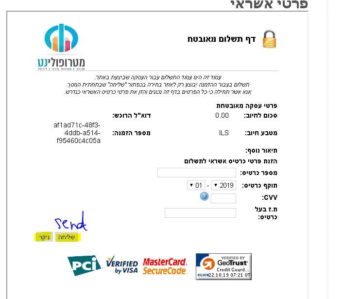
This is what it looks like on a desktop computer (the good looking):
(all the Iframe appear in the screen)
This is what it looks like on a mobile (the badlooking):
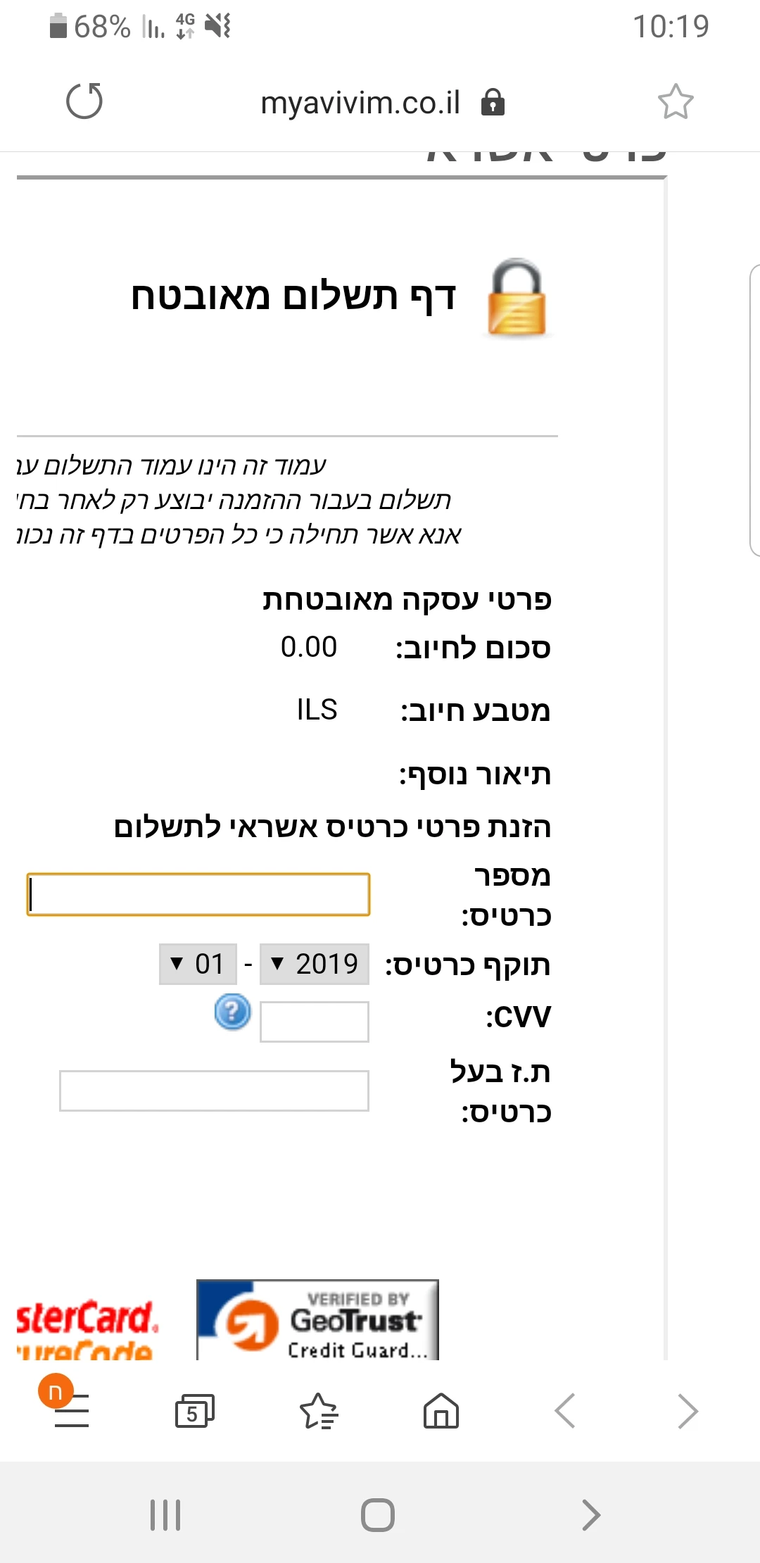
I need that in mobile it is look the same the desktop, that all Ifra,e appears with all the buttons like a the desktop.
Plese your help
-
roneetReplied on October 22, 2019 at 3:50 AM
We are really sorry for the inconvenience this is causing.
Would you mind sharing the URL of the website so that we can test and inject custom CSS to rectify the alignment in the mobile phone?
Let us know if you have further questions.
Thanks.
-
MetropolinetReplied on October 22, 2019 at 3:52 AM
URL of the website : https://myavivim.co.il/jotform/?formid=80843200506447&source=site
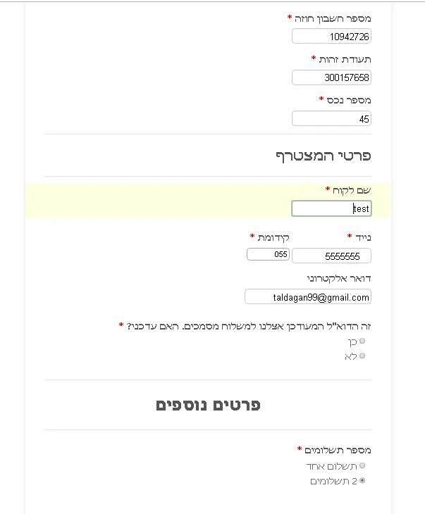
For the Iframe open you have to fill it all the field like this:
-
Mike_G JotForm SupportReplied on October 22, 2019 at 4:19 AM
I have opened the website you linked and filled the fields in the form embedded on the website as you instructed, however, this is what I got when I did that.
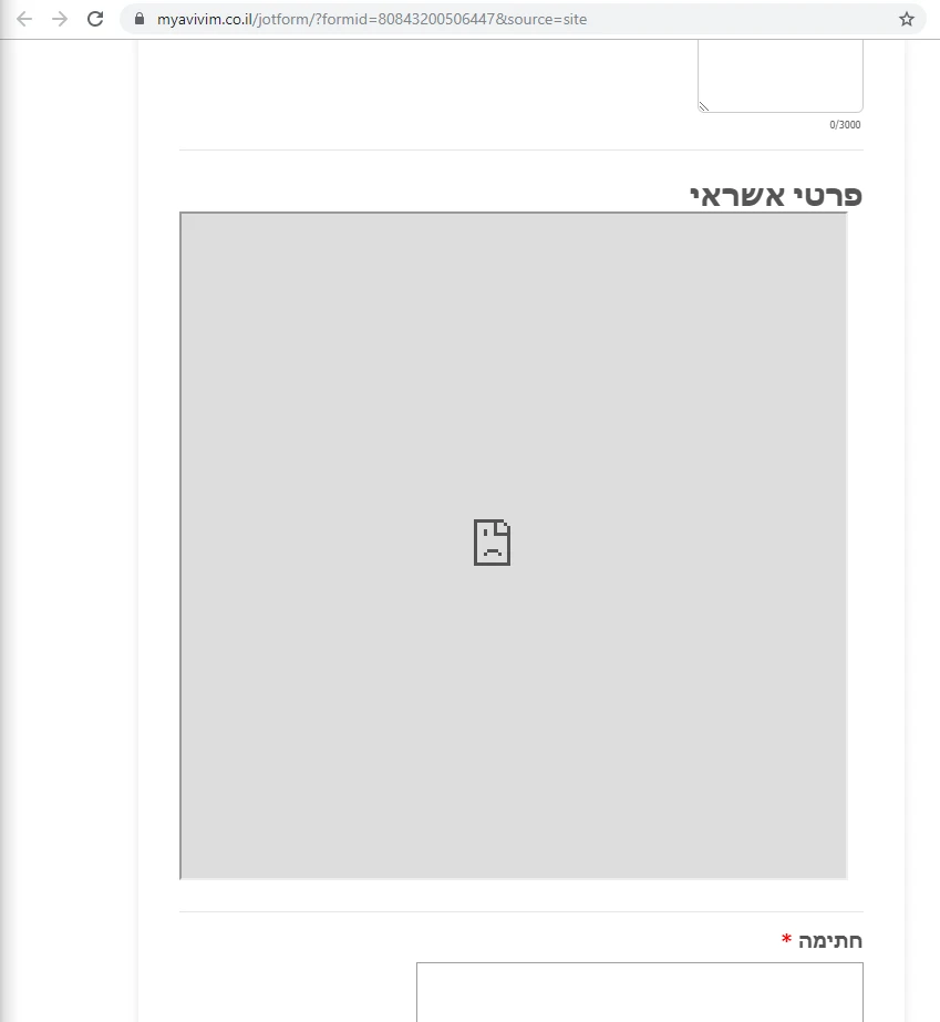
I also checked the form you embedded from its direct link and the embedded iframe on the form is no longer there. Did you recently remove it from your form?
Can you try re-embedding your form using its iframe embed codes, please?
- Templates
- Integrations
- INTEGRATIONS
- See 100+ integrations
- FEATURED INTEGRATIONS
 PayPal
- Slack
- Google Sheets
- Mailchimp
- Zoom
- Dropbox
- Google Calendar
- Hubspot
- Salesforce
- See more Integrations
- Products
- PRODUCTS
- Form Builder
- Jotform Enterprise
- Jotform Apps
- Store Builder
- Jotform Tables
- Jotform Inbox
- Jotform Mobile App
- Jotform Approvals
- Report Builder
- Smart PDF Forms
- PDF Editor
- Jotform Sign
- Jotform for Salesforce Discover Now
- Support


