


-
thechemistAsked on May 28, 2020 at 12:05 AM
Hi there! I am unable to resize the Input table. I have injected some codes from the Forum but it won't work. Kindly help Thanks.
I need two modification on the input table:
1. Make it mobile screen responsive.
2. Remove the extra spacing from the Header of each row.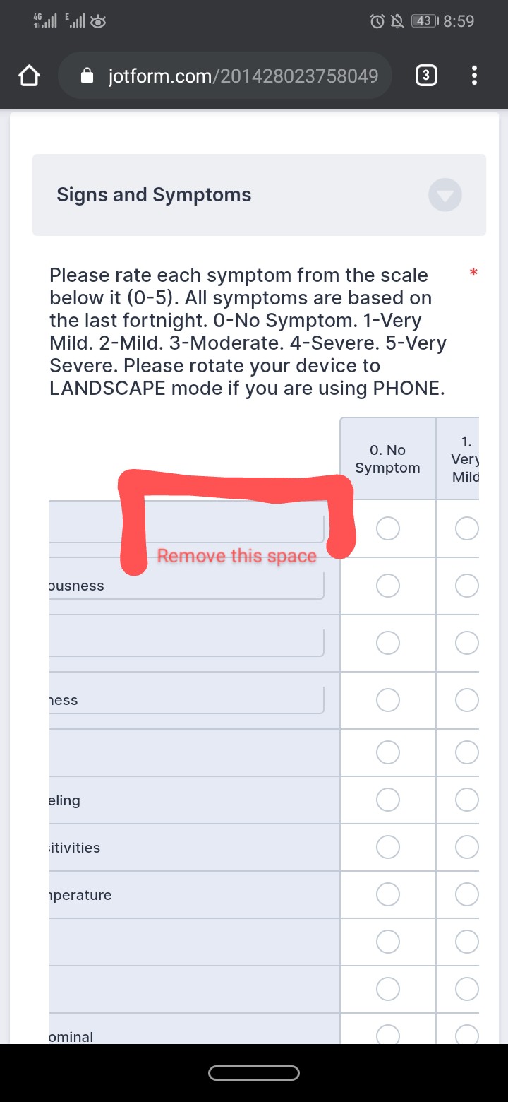 Page URL: https://www.jotform.com/201428023758049
 -
jherwinReplied on May 28, 2020 at 3:56 AM
Let me check this further and I will update you via this support ticket.
-
thechemistReplied on May 30, 2020 at 9:46 PM
I am still waiting for your response. Thank you.
-
Elton Support Team LeadReplied on May 31, 2020 at 3:32 AM
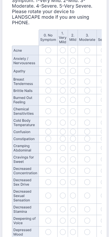
You may inject this CSS code to your form to get rid of the extra space and shrink its width.
.form-matrix-row-headers label table td {
border: none !important;
}
table {
width: 100% !important;
}
th.form-matrix-headers {
padding: 4px !important;
}
Guide: How to Inject Custom CSS Codes
Result:
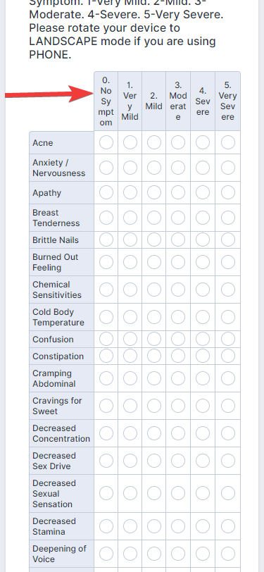
There's still a cut off on the right side as you could see but your users will be able to scroll horizontally to view the rest of its part. If in case you want to fit them perfectly on mobile, you can add this CSS code.
.form-matrix-column-headers {
word-break: break-word;
}
This breaks the column label letters so it perfectly fits into its container. This will shrink the column width and gives enough space for the entire table to display on mobile.
Result:
Let us know if you have any other questions.
-
thechemistReplied on May 31, 2020 at 6:51 AM
Worked perfectly. Thank you.
- Templates
- Integrations
- INTEGRATIONS
- See 100+ integrations
- FEATURED INTEGRATIONS
 PayPal
- Slack
- Google Sheets
- Mailchimp
- Zoom
- Dropbox
- Google Calendar
- Hubspot
- Salesforce
- See more Integrations
- Products
- PRODUCTS
- Form Builder
- Jotform Enterprise
- Jotform Apps
- Store Builder
- Jotform Tables
- Jotform Inbox
- Jotform Mobile App
- Jotform Approvals
- Report Builder
- Smart PDF Forms
- PDF Editor
- Jotform Sign
- Jotform for Salesforce Discover Now
- Support


