


-
CherrycrestAsked on May 29, 2020 at 1:54 PM
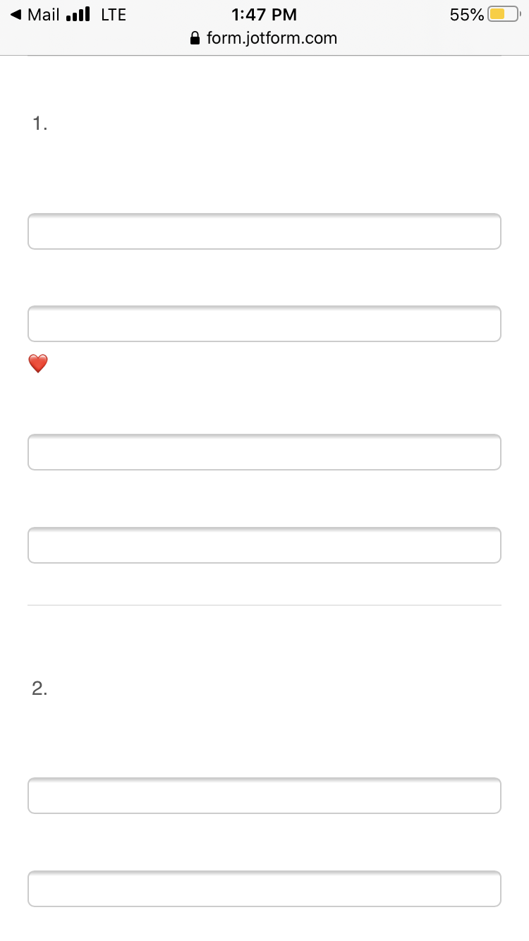
We are using Jotform for an Ispy adventure where guests fill in letters of the animals they are able to spy. On my phone the spaces for the letters do not line up in the same line like the desktop version. Is there a way to correct this?
-
John Support Team LeadReplied on May 29, 2020 at 4:56 PM
Hello @Cherrycrest - I can see that you have a placed a few text boxes in one line:

This will require a lot of custom CSS codes to make these fields appear on one line when the form is accessed on mobile.
However, I'm afraid it won't work for these questions below considering the screen size of a mobile device. These may not fit horizontally:

But let me check for possible custom CSS codes you can use and get back to you here.
-
John Support Team LeadReplied on May 31, 2020 at 4:20 AM
Thank you for waiting!
After a few tests, I came up with a workaround. Could you please try replacing the existing custom CSS codes in your form with the below?
@media screen and (max-device-width: 40em){
.form-line.form-line-column {
width: 62.1563px!important;
}
.form-line-column .form-sub-label {
width: 25px;
text-align: center;
}
}
Please try that and let us know how it goes.
- Templates
- Integrations
- INTEGRATIONS
- See 100+ integrations
- FEATURED INTEGRATIONS
 PayPal
- Slack
- Google Sheets
- Mailchimp
- Zoom
- Dropbox
- Google Calendar
- Hubspot
- Salesforce
- See more Integrations
- Products
- PRODUCTS
- Form Builder
- Jotform Enterprise
- Jotform Apps
- Store Builder
- Jotform Tables
- Jotform Inbox
- Jotform Mobile App
- Jotform Approvals
- Report Builder
- Smart PDF Forms
- PDF Editor
- Jotform Sign
- Jotform for Salesforce Discover Now
- Support


