


-
sgonzalAsked on April 10, 2014 at 3:18 PM
-
KadeJMReplied on April 10, 2014 at 4:07 PM
Did you mean " How " instead of I? Your form should already be responsive for the most part.
I found you have one form on your account which works well on my end. Is this the form you were having some sort of issue with and if so can you please describe the problem to us more?
-
sgonzalReplied on April 10, 2014 at 5:04 PM
Yes KJM, i saw that I had "I" instead of "How", my apologies.
And thanks, for the quick response.
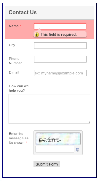
When I was creating my form, I didn't see an option for responsive capability, and so I was just curious. Yes, this is the form in question. It's 260px wide, but when the page that the form resides on scales down to satisfy the media, the form itself doesn't. Or at least, it appears that way. I believe I may have determined what the issue is. I believe it may be something on my end. I will get back to you.
Again, thanks for the response.
SGE
-
sgonzalReplied on April 10, 2014 at 5:54 PM
Hello JKM,
I looked into it, and it wasn't what I thought it was. It appears that in the media screen size with a max-width of 758px and a min-width of 524px that the form is not scaling down.
Here is a demo link of the page: http://www.jacksonlawatx.com/demo3.html
Please take a look at it in that media size and let me know what you think.
-
jonathanReplied on April 10, 2014 at 9:01 PM
Hi SGE,
Please refer also to this thread for more helpful details
-How-to-make-the-form-mobile-responsive
You can inject CSS code to the form to make it responsive according to the device browser type it will be viewed.
--
I did checked your form http://www.jotform.us/form/40994427573162 already, but I noticed that there was no included media CSS code into it yet. You can further enhance this via CSS code as described on the other thread I suggested.
Hope this help. Inform us if you need further assistance.
Thanks!
-
sgonzalReplied on April 11, 2014 at 3:30 PMHello Jonathan,
thanks for the tip.
Using FF firebug to determine the proper class tag, I modified the
.form-all class to fit in a media screen size of max-width of 758px and
min-width of 524px. However, after making this change, it appears to have
no effect. The input fields scaled down, but the other elements didn't.
Here is the link to the demo page: http://www.jacksonlawatx.com/demo3.html
Please look at it and let me know what you think.
thanks
SGE
... -
jonathanReplied on April 11, 2014 at 4:53 PM
Hi,
I need clarification regarding your requiremernt.
If I undertand correctly, what you wanted to achieve is make the form wider to 758px according to the browser type being used?
I initially thought it was the other way around, that is make the form responsive by scaling down according to the browser i.e. when in mobile device browser.
You can actually set the actual height of the form to 758px instead, and then inject the CSS code to have scaling down responsiveness.
Please update us.
Thanks.
-
sgonzalReplied on April 11, 2014 at 5:10 PMYou are understanding me correctly. I am wanting the form to scale down to
fit in a media screen width of max-width of 758px and min-width of 524px. I
didn't change the height of anything as far as the form goes. Nor do I want
to at this time.
thanks
... -
TitusNReplied on April 11, 2014 at 6:23 PM
Hello,
Each field container on your form has to be instructed to either inherit the parent width settings, or respond resposively using width:100% - fitting the parent container - even as it adjusts to a minimum or maximum.
I checked your form, but could not see what you are reffering to - which fields are not scaling into the set width?
Looking forward to your response.
-
sgonzalReplied on April 14, 2014 at 2:40 PMHello,
yes, the form looks fine in all of the sizes except for the 758px to 524px
screen size.
Also, it appears that the form information is coming/going to the jotform
account email that was submitted, which is my email. This information needs
to go to the email address that is on the following page:
http://www.jacksonlawatx.com/contact_us_form_mail.php
And that email is: allison@jacksonlawatx.com
Let me know if you have any questions.
thanks so much!
... -
jedcadornaReplied on April 14, 2014 at 3:43 PM
Try adding !important to your width. That would be something like this width:100px !important. I was testing your form and site and it seems fine even on mobile.
Which device do you test your site by the way? About your 2nd that you don't receive an email notification kindly create a seperate thread for that please use this link http://www.jotform.com/contact.
-
sgonzalReplied on April 14, 2014 at 5:00 PMHello,
Since I do not have a device that uses a screen width size of 758px to
524px, I just manually scale down the window in my browser to the screen
width size.
Concerning the email link, that link you sent me goes to JotForm's 'Contact
JotForm Support' page. Is this the correct one you were wanting to send me?
thanks
... -
Welvin Support Team LeadReplied on April 14, 2014 at 6:02 PM
You can use the browser emulator for Google Chrome and Mozilla FireFox if you do not have the actual mobile device:
For Google Chrome: Press F12 > Press Escape button to open emulation tab. From there, you should be able to select a device to emulate:
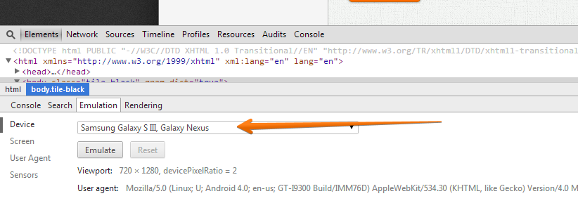
For Mozilla Firefox: Press CTRL + SHIFT + M
That is the link to a page for sending an inquiry to our support forum. Use it for posting your issue with the form notification.
Thanks
-
sgonzalReplied on April 14, 2014 at 6:50 PMOk, thanks!
...
- Templates
- Integrations
- INTEGRATIONS
- See 100+ integrations
- FEATURED INTEGRATIONS
 PayPal
- Slack
- Google Sheets
- Mailchimp
- Zoom
- Dropbox
- Google Calendar
- Hubspot
- Salesforce
- See more Integrations
- Products
- PRODUCTS
- Form Builder
- Jotform Enterprise
- Jotform Apps
- Store Builder
- Jotform Tables
- Jotform Inbox
- Jotform Mobile App
- Jotform Approvals
- Report Builder
- Smart PDF Forms
- PDF Editor
- Jotform Sign
- Jotform for Salesforce Discover Now
- Support


