


-
kjtAsked on August 31, 2014 at 10:21 PM
Hi Guys,
I have been pulling my hair out with this issue! I hope you can help?
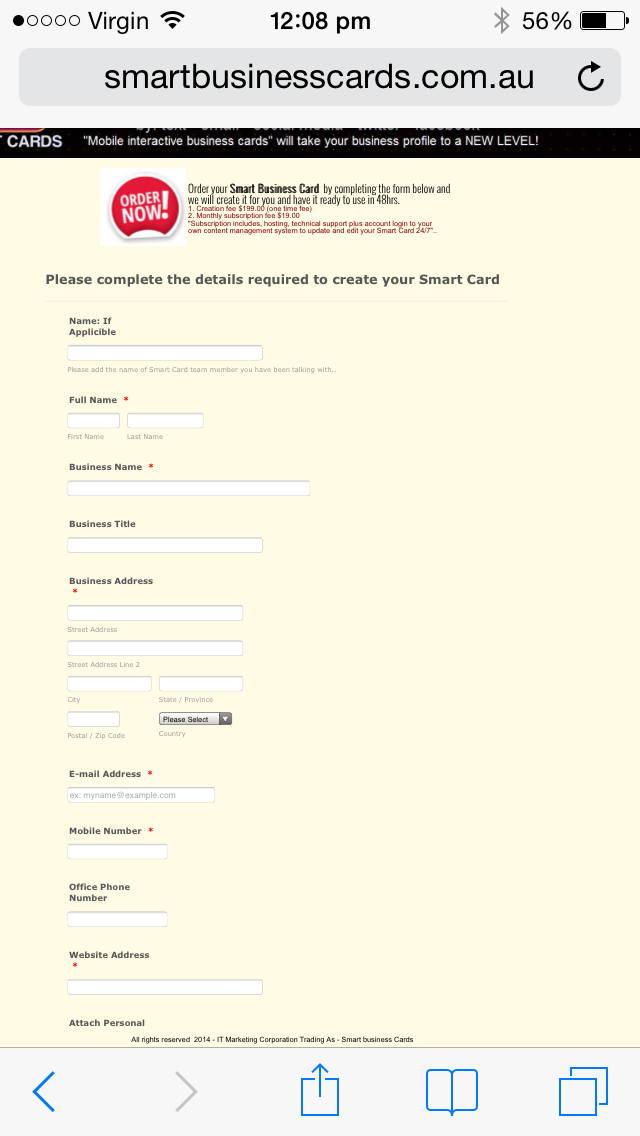
My webform displays perfect on laptops, ipads, tablets, but not on an iphone5 as per screen shot from my iphone, it only displays about 80% of the form..
Appreciate your help,
Thank You,
Ken
-
gori-mathewReplied on September 1, 2014 at 3:03 AM
Upon testing your form using a iphone5 simulator I was not able to reproduce the problem the form seems to work fine as shown in the screenshot below.

Please try to re embed your form using iframe embed code? This might fixed the form not loading issue. Please give it a try and let us know here if the issue persists.
Thanks!
-
kjtReplied on September 1, 2014 at 3:24 AM
Hi, and thanks for your response, I had changed the size of the web page to a super over sized page which now looks pretty awful on a laptop to get the form to fully appear on my iphone as a temporary measure, I have loaded the form 4 times in a iframe embed, made no difference!
So, it appears for some reason a webpage with a form on it that fits perfectly does not fit the same way on an iphone? in Jotform, the page must be nearly 40% bigger for it to appear on an iphone!
Not really the best solution for what I need as you can understand looking at the webpage on a computer...
Appreciate any other thoughts to get it right.Thank You
-
Welvin Support Team LeadReplied on September 1, 2014 at 6:12 AM
Hi,
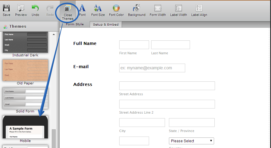
Please try adding our Mobile Responsive Widget to your form: http://widgets.jotform.com/widget/mobile_responsive. Or, use our Mobile Theme:
Please update us here for the results.
Thank you!
-
kjtReplied on September 1, 2014 at 7:42 AM
Hi Welvin,
Thank you for your advise made a huge difference.
Much Appreciated!
-
CarinaReplied on September 1, 2014 at 10:22 AM
On behalf of my colleague you are most welcome. Please contact us if you need further assistance.
Thank you
- Templates
- Integrations
- INTEGRATIONS
- See 100+ integrations
- FEATURED INTEGRATIONS
 PayPal
- Slack
- Google Sheets
- Mailchimp
- Zoom
- Dropbox
- Google Calendar
- Hubspot
- Salesforce
- See more Integrations
- Products
- PRODUCTS
- Form Builder
- Jotform Enterprise
- Jotform Apps
- Store Builder
- Jotform Tables
- Jotform Inbox
- Jotform Mobile App
- Jotform Approvals
- Report Builder
- Smart PDF Forms
- PDF Editor
- Jotform Sign
- Jotform for Salesforce Discover Now
- Support


