


-
icornierAsked on November 8, 2014 at 10:34 AM
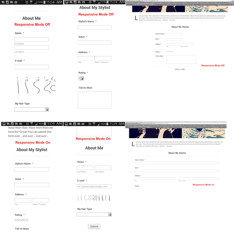
Is there a way to have a responsive form that has a max width with the "responsive" setting on? I'm trying to size the survey on mobile and it looks best with the responsive setting on (instead of using the css code that's recommended in other posts). However, the survey should be 650 max on the actual post instead of the entire window width.
When I use the css code instead of the responsive setting the mobile layout is cut off, and the star ratings go away.
I'm not sure how to fix this.
Thanks.
-
Elton Support Team LeadReplied on November 8, 2014 at 12:10 PM
Hi,
Turn on the Mobile Responsive and then replace the CSS codes you've injected to your form with the following. This should control the maximum width of the form on desktop mode.
.form-all {max-width: 650px;}
.form-line, .form-input-wide {max-width: 400px;margin: 0 auto;}
@media only screen and (max-width:400px){
.form-all {max-width: 100%;}
.form-line, .form-input-wide {max-width: 100%;margin: 0 auto;}
.form-line {padding: 10px;}
}
Let us know if you need anything else.
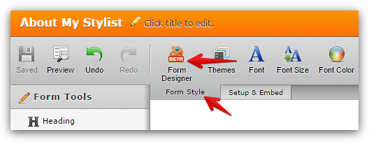
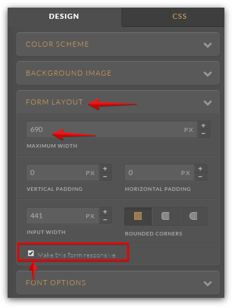
Another solution is to load your form in the form designer (Form Style tab > Form Designer). On the form designer, open Form Layout and then check the 'Make this form responsive' and set the maximum width you want. Check these screenshots.
Should you need any further assistance, let us know.
Regards!
- Templates
- Integrations
- INTEGRATIONS
- See 100+ integrations
- FEATURED INTEGRATIONS
 PayPal
- Slack
- Google Sheets
- Mailchimp
- Zoom
- Dropbox
- Google Calendar
- Hubspot
- Salesforce
- See more Integrations
- Products
- PRODUCTS
- Form Builder
- Jotform Enterprise
- Jotform Apps
- Store Builder
- Jotform Tables
- Jotform Inbox
- Jotform Mobile App
- Jotform Approvals
- Report Builder
- Smart PDF Forms
- PDF Editor
- Jotform Sign
- Jotform for Salesforce Discover Now
- Support
