


-
EpicStudioAsked on December 3, 2014 at 8:36 AM
-
CharlieReplied on December 3, 2014 at 11:38 AM
Hi,
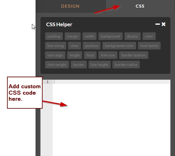
Regarding your concern, not sure what you meant by jumping the text area and submit button, you can actually add custom CSS code in your Form Designer to position fields.
Here's a sample code that you can trigger specific styles depending on the media screen display:
@media only screen and (min-device-width : 320px)
and (max-device-width : 750px)
{
/* Styles */
}
I hope this helps. Let us know if you need further assistance on this.
Thank you.
-
EpicStudioReplied on December 4, 2014 at 3:35 PM
Thanks, that will, help a lot. So, do you sugest me to create a style for each text box that in widths higher than 750px will be e.g. 40% wide and on widths equal or smaller than 750px become 100% wide. Or how should I write the code?
Thanks again..!
-
BenReplied on December 4, 2014 at 4:54 PM
Hi,
So, do you sugest me to create a style for each text box that in widths higher than 750px will be e.g. 40% wide and on widths equal or smaller than 750px become 100% wide.
This depends on what you would like it to be / look like. We can help you if you have some issues in getting it just the way you like, but I would suggest creating a design that you want to achieve which would tell you the size of the fields that you want/can have and their positions. However having that said, it is best for mobile devices to have their fields set to around 80-100% wide so that they are easier to click on and work with.
how should I write the code?
I took a look at your jotform: http://www.jotform.co/form/43357676732868
Since you have 2 fields on it and one submit button you can change the styles of the fields by adding these rules:
li.form-line[data-type="control_textbox"] {}
- This will change the CSS for the email and textbox fieldsli.form-line[data-type="control_button"] {}
- This will change the styles for the Submit Button.In combination with the code my colleague Charlie had given it would look like this:
@media only screen and (max-device-width : 750px)
{
li.form-line[data-type="control_textbox"] { /* CSS style properties go here */ }
li.form-line[data-type="control_button"] { /* CSS style properties go here */ }
}Do let us know how it goes for you and if you have any further questions.
Best Regards,
Ben
- Templates
- Integrations
- INTEGRATIONS
- See 100+ integrations
- FEATURED INTEGRATIONS
 PayPal
- Slack
- Google Sheets
- Mailchimp
- Zoom
- Dropbox
- Google Calendar
- Hubspot
- Salesforce
- See more Integrations
- Products
- PRODUCTS
- Form Builder
- Jotform Enterprise
- Jotform Apps
- Store Builder
- Jotform Tables
- Jotform Inbox
- Jotform Mobile App
- Jotform Approvals
- Report Builder
- Smart PDF Forms
- PDF Editor
- Jotform Sign
- Jotform for Salesforce Discover Now
- Support

