


-
dsecklerAsked on January 22, 2015 at 12:28 PM
I have a form where the text on the button is at the bottom of the button and half cut off when the form is viewed on mobile. Anyway to fix this?
-
Jeanette JotForm SupportReplied on January 22, 2015 at 3:28 PM
You must set the form as Mobile responsive.
Please go to Preferences and make sure you have enabled the Responsive option.

You can also use Designer tool > Form Layout > Make this form responsive.
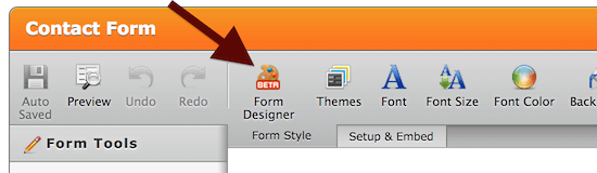
On Form Layout click on Make This Form Responsive

-
Jeanette JotForm SupportReplied on January 22, 2015 at 3:30 PM
If you already have done this, can you please clarify if the form is already embedded in a website? If so, please share the link.
Otherwise please refer the type of smart phone you are having problems with or if this is a general problem while being viewed on mobile.
-
dsecklerReplied on January 26, 2015 at 12:11 PM
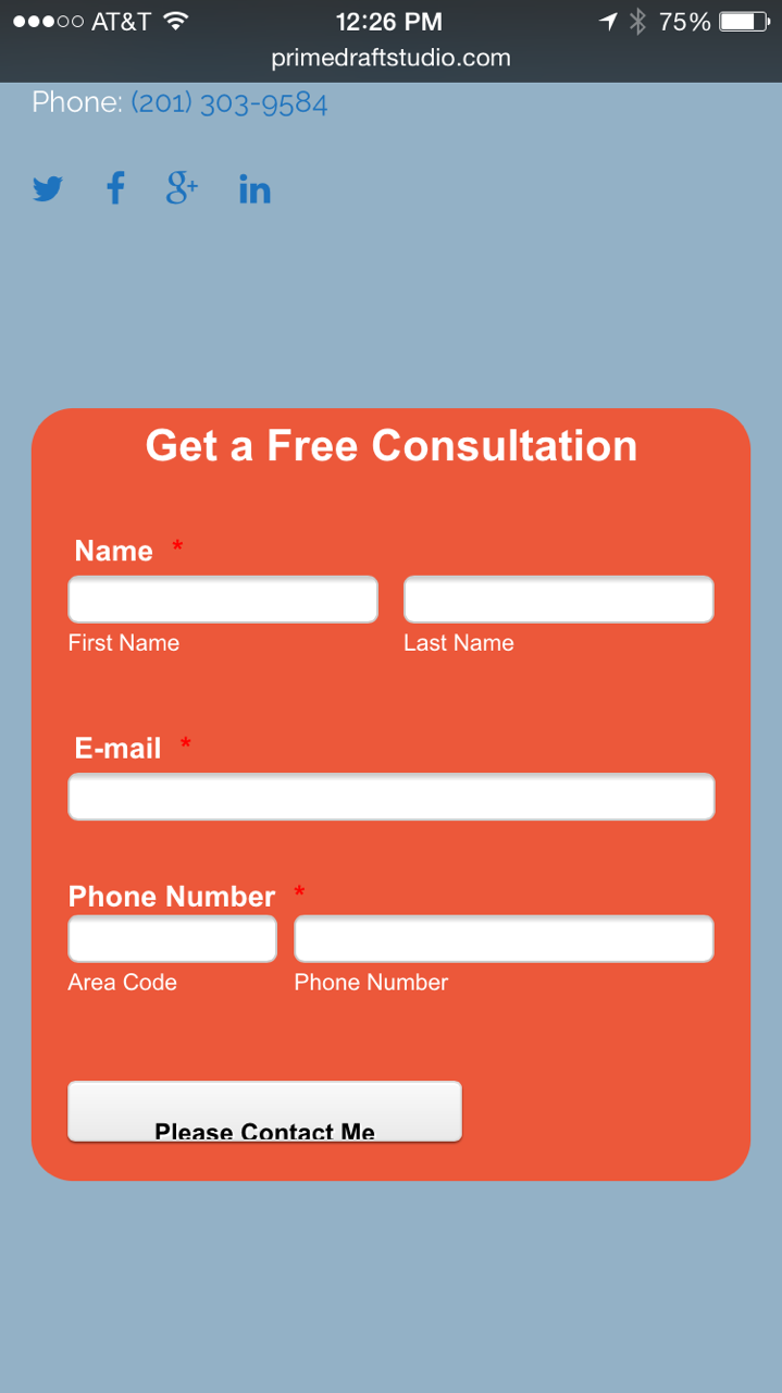
Did select responsive on preferences and in the form designer. It is embedded in the website http://primedraftstudio.com. You'll find it in the footer of the site.
I'm looking at it on an iPhone 6. Someone else saw the same thing on an android phone.
-
Jeanette JotForm SupportReplied on January 26, 2015 at 2:06 PM
I've checked the website and clicked on the Contact Us link which lead me this other page
http://primedraftstudio.com/architect-consultation/
Let us do some testing and we will get back to you later on.
-
Jeanette JotForm SupportReplied on January 26, 2015 at 2:12 PM
Please inject the following custom CSS code
.form-all .qq-upload-button, .form-all .form-submit-button, .form-all .form-submit-reset, .form-all .form-submit-print {
padding: 5px 15px!important;}
You can also change the padding do it on the Form Designer, on the submit button section.
- Templates
- Integrations
- INTEGRATIONS
- See 100+ integrations
- FEATURED INTEGRATIONS
 PayPal
- Slack
- Google Sheets
- Mailchimp
- Zoom
- Dropbox
- Google Calendar
- Hubspot
- Salesforce
- See more Integrations
- Products
- PRODUCTS
- Form Builder
- Jotform Enterprise
- Jotform Apps
- Store Builder
- Jotform Tables
- Jotform Inbox
- Jotform Mobile App
- Jotform Approvals
- Report Builder
- Smart PDF Forms
- PDF Editor
- Jotform Sign
- Jotform for Salesforce Discover Now
- Support


