


-
colehollandcollegeAsked on January 28, 2015 at 5:40 PM
I would like to add a box that displays a ? that when you hover over the ? it pops up a box to reveal text that goes away when you no longer hover. The ? could also be clickable to reveal the text.
-
colehollandcollegeReplied on January 28, 2015 at 6:25 PM
Except it would be nice if you could format the text or even place an image in the hover text, right now it's just plain text.
-
colehollandcollegeReplied on January 28, 2015 at 6:26 PM
I posted that I found this as a "Hover Text" option, except it would be nice if you could format the text or even place an image in the hover text, right now it's just plain text.
-
CharlieReplied on January 28, 2015 at 9:25 PM
Hi,
You can use custom CSS codes and place it inside the Form Designer->CSS tab to style the hint or help text.
Here's a demo form that I made: http://form.jotformpro.com/form/50278487675975
If you hover of the name field you'll see my hover text formatted with a different style.
To design yours, here's a quick guide:
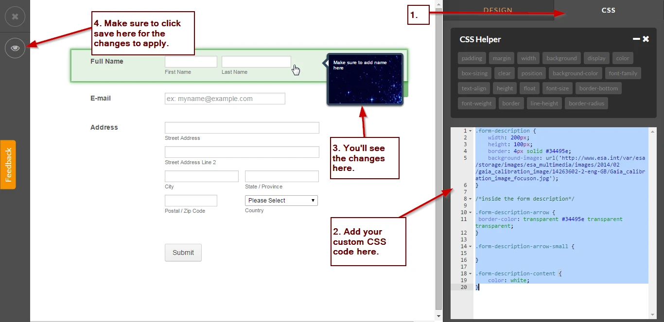
This is the custom CSS code that I have, you can follow the schema or the elements that I use.
.form-description {
width: 200px;
height: 100px;
border: 4px solid #34495e;
background-image: url('http://www.esa.int/var/esa/storage/images/esa_multimedia/images/2014/02/gaia_calibration_image/14263602-2-eng-GB/Gaia_calibration_image_focuson.jpg');
}
/*inside the form description*/
.form-description-arrow {
border-color: transparent #34495e transparent transparent;
}
.form-description-arrow-small {
}
.form-description-content {
color: white;
}
All the bold text are the elements you need to know to design the whole hint text.
.form-description - This is the main element that wraps the hover text, you can adjust size of the hover text here or add a background image as the design.
.form-description-arrow - This is the main arrow pointing to the left side where the field is, basically this is just the arrow you see at the left.
.form-description-arrow-small - This is the small arrow placed just above the main arrow.
.form-description-content - This is the wrapper or main element that holds the content, you can also style the background of this or adjust the fonts styling.
Here's a screenshot of my Form Designer:
I hope this helps. Do let us know if you need more assistance on this.
Thank you.
- Templates
- Integrations
- INTEGRATIONS
- See 100+ integrations
- FEATURED INTEGRATIONS
 PayPal
- Slack
- Google Sheets
- Mailchimp
- Zoom
- Dropbox
- Google Calendar
- Hubspot
- Salesforce
- See more Integrations
- Products
- PRODUCTS
- Form Builder
- Jotform Enterprise
- Jotform Apps
- Store Builder
- Jotform Tables
- Jotform Inbox
- Jotform Mobile App
- Jotform Approvals
- Report Builder
- Smart PDF Forms
- PDF Editor
- Jotform Sign
- Jotform for Salesforce Discover Now
- Support
