


-
PATHworksAsked on March 18, 2015 at 10:09 PM
Hi,
When I originally tested my form on my iPhone, it seemed to be working perfectly. But after a few updates in the design editor, it's now getting cut about in half. When I turn on the "responsive" option, it makes things even worse...the form is totally blown up to the point that in the header, you only see about an inch of color and none of the title. I've attached a screenshot of what it looks like with responsive turned off.
Thank you for your help!
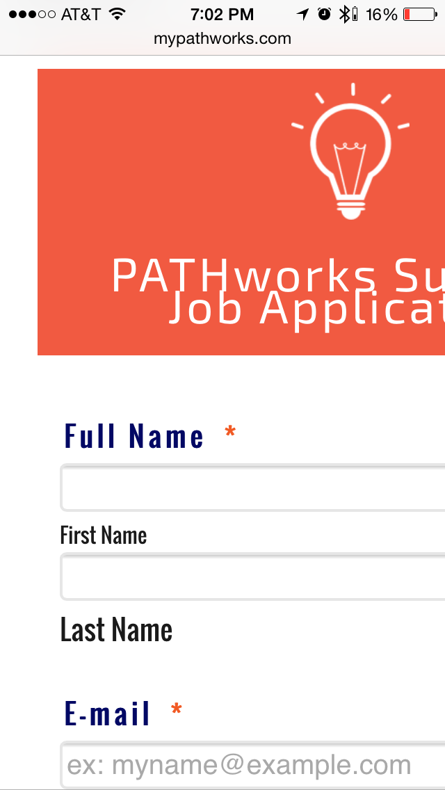 Page URL: http://www.mypathworks.com/gethired/
 -
PATHworksReplied on March 18, 2015 at 10:19 PM
Nevermind... I was able to resolve my issue by installing the "Mobile Responsive" widget. It seems strange that I would need to install a widget to do this... but either way. I just hope the widget is stable.
If you know of another fix that maybe more stable, please let me know. I would delete this post but I'm not sure how. My apologies.
-
CharlieReplied on March 19, 2015 at 3:49 AM
Hi,
I'm glad the the widget worked for you, we also have an updated guide here on how to make your form mobile responsive, you can check it here: http://www.jotform.com/help/311-How-to-make-forms-Mobile-Responsive.
For the post, I'm not sure why you would like to delete this, we would advise that you don't delete this so that you can use it for future reference. However, you can still set the thread to "Private" if you do not like to share other information. Click "Edit" on the first post and scroll down, you'll see the option to set this on "Private.
Thank you.
- Templates
- Integrations
- INTEGRATIONS
- See 100+ integrations
- FEATURED INTEGRATIONS
 PayPal
- Slack
- Google Sheets
- Mailchimp
- Zoom
- Dropbox
- Google Calendar
- Hubspot
- Salesforce
- See more Integrations
- Products
- PRODUCTS
- Form Builder
- Jotform Enterprise
- Jotform Apps
- Store Builder
- Jotform Tables
- Jotform Inbox
- Jotform Mobile App
- Jotform Approvals
- Report Builder
- Smart PDF Forms
- PDF Editor
- Jotform Sign
- Jotform for Salesforce Discover Now
- Support
