


-
rsingleton403Asked on April 2, 2015 at 2:50 PM
How do I get my header image to adjust for mobile settings?
Thanks.
-
rsingleton403Replied on April 2, 2015 at 4:11 PM
Cloning did not solve problem. See view on mobile:
-
raulReplied on April 2, 2015 at 6:34 PM
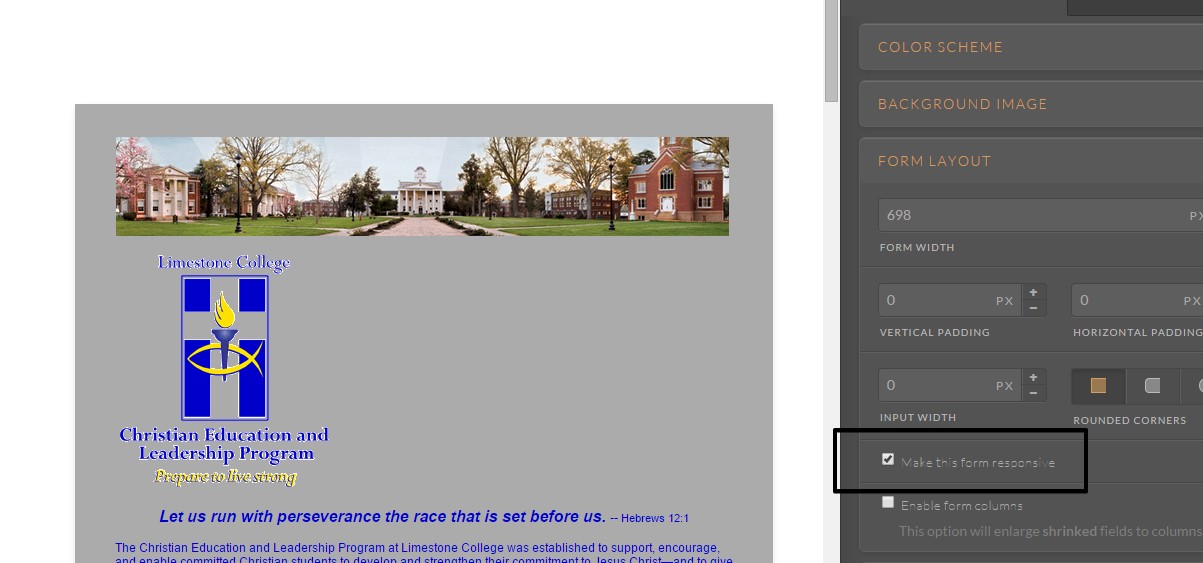
Try to enable the mobile responsiveness in your form using the form designer.
And inject the following CSS code:
.form-image {
max-width : 95% !important;
}@media screen and (max-width: 480px) {
.form-image {
max-width: 85% !important;
}
}This should be the result:

You may also try to change the width values to the ones you prefer.
Let us know if this helps. -
rsingleton403Replied on April 7, 2015 at 10:03 AM
I tried this and it only increased the space between fields. Plus, when I change the code it changes the background to this horrible gray.
I have re-cloned http://jotformpro.com/form/50963831320956
I just need the header and footer images to adjust in mobile view.
-
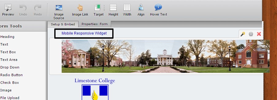
raulReplied on April 7, 2015 at 11:30 AM
Take a look at this cloned version of your form: http://form.jotformpro.com/form/50964430703957
I've added the mobile responsive widget to it and made some CSS modifications and it worked correctly on my side. If it works ok on yours, feel free to clone it to your account.
Thank you.
-
rsingleton403Replied on April 7, 2015 at 11:55 AM
Yes, that works. Can you please share the steps you used to effect these changes so that I can modify my other forms? Thanks.
-
raulReplied on April 7, 2015 at 12:13 PM
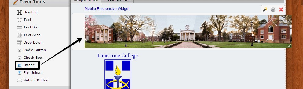
Sure, as mentioned before I added the mobile responsive widget to the form.
Then, I used an image field to render the header image (it was embedded in a Text field in the original version of your form).
And finally, I added the following CSS code to the form:
.form-image {
max-width: 100% !important;
}If you need our help with your other forms, don't hesitate to let us know and we'll be happy to assist.
-
rsingleton403Replied on April 7, 2015 at 1:53 PM
I was able to make that work with just the widget and rendering image into an image field.
What does the code do, and how do I insert it? I know how to go to preferences and form styles. Do I replace what is already in the inject custom css box? Or how do I add it?
Thanks
-
raulReplied on April 7, 2015 at 2:01 PM
The code is to make sure that the width of the image do not overpass the width of the containing div.
You can add it at the bottom of the code that's already there, you don't need to replace your current code.
- Templates
- Integrations
- INTEGRATIONS
- See 100+ integrations
- FEATURED INTEGRATIONS
 PayPal
- Slack
- Google Sheets
- Mailchimp
- Zoom
- Dropbox
- Google Calendar
- Hubspot
- Salesforce
- See more Integrations
- Products
- PRODUCTS
- Form Builder
- Jotform Enterprise
- Jotform Apps
- Store Builder
- Jotform Tables
- Jotform Inbox
- Jotform Mobile App
- Jotform Approvals
- Report Builder
- Smart PDF Forms
- PDF Editor
- Jotform Sign
- Jotform for Salesforce Discover Now
- Support
