


-
mudbuggerAsked on May 11, 2015 at 4:37 PM
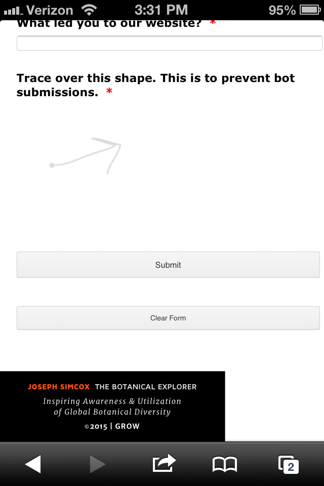
I have read through other threads with similar issues. Most say to use the Mobile Widget which I was, and I deleted and re-applied just in case. Still the same result. Please advise. The black bar at the bottom of the image should be the width of the screen. The form is not reducing to fit into the space for the following pages (other forms are working fine):
http://explorewithjoseph.com/phone/gardens-across-america.html
http://explorewithjoseph.com/phone/rare-seed-submissions.html
http://explorewithjoseph.com/phone/speaking.html
http://explorewithjoseph.com/phone/e-news.html
-
BJoannaReplied on May 11, 2015 at 5:04 PM
I have cloned and tested your form and your form is responsive.
I have also tested your website on mine Samsung Galaxy S4 and your form is responsive there as well.

Maybe there is problem with other devices.
Also after inspecting your website, I noticed that you are using script block (source code) for embedding your form on website. We recommend using of iFrame code. You can try to replace script code with iFrame to see if form will be responsive on all devices. In this article you can find out how to do it.
http://www.jotform.com/help/148-Getting-the-Form-iFrame-Code
Hope this will help. Let us know if you need further assistance.
-
mudbuggerReplied on May 11, 2015 at 5:05 PM
Thanks for checking, the pages are not changing downsizing on my iPhone... I have updated the Gardens Across America by using the iFrame code.. Still not resizing.
-
Aurora JotForm SupportReplied on May 11, 2015 at 6:04 PM
I have gone ahead, tested your Gardens Across America form in an iPhone 6 with iOS 8.3 and was not able to replicate the issue, the form works just fine.
Can you please try to clear you mobile browsers cache?, re-load the form to see how it works.
Also, it it is possible for you to test your form in another device, this issue most probably happens in one particular device.
I hope this helps.
-
mudbuggerReplied on May 11, 2015 at 6:15 PM
Thank you for checking. Cache has been cleared in browser settings on iPhone 4 (not 4s). Don't know if you have anyone checking into this device in regards to the mobile widget, but it would be appreciated.
-
David JotForm Support ManagerReplied on May 11, 2015 at 6:35 PM
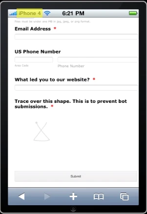
Your form is responsive in any device, I just tried it in different emulators:
iPhone 4:
iPhone 6: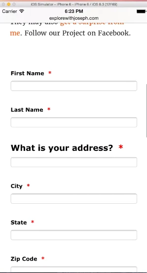
Samsung S5:
I see you have added the Mobile Responsive widget, which is the reason of it's responsiveness, have you tested it in another device?
-
mudbuggerReplied on May 11, 2015 at 7:07 PM
"I see you have added the Mobile Responsive widget, which is the reason of it's responsiveness, have you tested it in another device?"
Please note (as stated in the title of this thread) that I started out using the Mobile Responsive widget to begin with. I can not test it on another device. I appreciate your checking other devices. All I know is that is still not resizing on my own iPhone 4, even after having cleared the browser cache on the phone in settings.
-
Jeanette JotForm SupportReplied on May 11, 2015 at 11:11 PM
Please remove the Mobile Responsive Widget and do this way:
Go to preferences
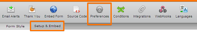
On General Settings, set Responsive Form option to Yes

Please see further details here:
-
mudbuggerReplied on May 11, 2015 at 11:50 PM
Thank you for suggesting an alternate method. The result may be 2-3 points difference horizontally... essentially the same result.
-
Chriistian Jotform SupportReplied on May 12, 2015 at 4:22 AM
Hi mudbugger,
I checked your websites using my Responsive Web Design Tester tool and here is how it looks on iPhone Portrait

It looks responsive except for the extra margin on the left side of the screen. To decrease the margin on your website http://explorewithjoseph.com/phone/gardens-across-america.html, you can add this CSS:
#u26346 {
margin-left: 0px !important;
}
Please note that it will only fix the margin on the said website as it is not part of the form.
I am not sure how it looks like on your device so if you can give us a screenshot, it will be very helpful.
Regards.
-
mudbuggerReplied on May 12, 2015 at 12:53 PM
Thank you for the continued efforts to resolve the issues.
Left Alignment: The CSS did not make any changes. I moved the element over until it appeared to line up on the left. Some forms seem to work align as they should, others do not.
Form & Column Widths: I have tried to ensure that the width of the form is no wider than 420 which would be standard widest width for most phones. I have also tried to check the width of the text columns.
Please refer to the following two pages:
1) Gardens Across America page with form
The form itself may be "responding" to fit it's width within the space now (it was not yesterday as it was running off the right side of the screen). However if you look at my top menu bar and my text, they seem to be forced to a smaller width as a result of the form itself. The menu bar is designed to be the width of the phone, responsive. Therefore the form is not corresponding with the menubar, text, and bottom bar. If I were to remove the form from the page, the menubar, text, and bottom bar would fill the width of the screen.
2) Seed Preservation page with form
Another page example with the same problem.
Please note that I have other forms on the site which are working just fine!
Gardens Across America page with form:
What it should look like on my phone:

What it actually looks like on my phone:

Here is what the whole Gardens Across America page looks like on my phone. Assuming the width is determined by the top black bar, then the form is too wide.
There is also something awry with the fonts. They are supposed to be identical size. Why are some a smaller size and others a larger size?

Here is the Seed Preservation page.
The menu bar is designed to be the width of the phone, responsive. Therefore the form is not corresponding with my menubar, text, and bottom bar. If I were to remove the form from the page, the menubar, text, and bottom bar would fill the width of the screen.

-
BJoannaReplied on May 12, 2015 at 2:28 PM
I have tested one more time your form which is embedded to your site and form by itself is responsive. Also from screenshots your provided I see that you have problem with elements that are not belonging to the form. I can also see that form on your screenshot is responsive.

What I can suggest is to check media queries for header, footer and all elements which are not responsive and which are not belonging to the form. Seems that CSS for those elements is not good. Also what I noticed is that you have console errors on your page.

Please try to fix those errors to see if page will be responsive.
-
mudbuggerReplied on May 12, 2015 at 3:09 PM
Thank you for your continued aid and suggestions. I am not a coder. I decided to rebuild the page from scratch. The header and footer are from the master pages which work for most of the pages on the website. The text is simply text.
If I do not add the form, the formatting of all of the above is as it should be. When I add the form, it changes the rest of my web page. So I still have the same visual result as seen above.
Perhaps the question to be asked now is: Why is the jotform affecting the rest of the elements on my page?
Where in preferences, setup, columns, etc in jotform can sizes be changed and wht do those sizes need to be? What is causing this affect? What if it is one element within the form that is dictating the width that I can not seem to find?
-
BJoannaReplied on May 12, 2015 at 4:08 PM
After further investigation I think that this problem is caused by padding on the right of the element of Jotform. It seems that there need to be a bit more space. But also the width of the element on the page do not seem correct, since body is set to be of a different width - it does not take the full width.
You can try to change form width (from within the preferences) to 320.

After applying this changes please try to re-embed your from with iFrame.
Also I am not sure if JotForm form is impacting layout of the site because sometimes there can be conflict between JotForm scripts and external scripts but using of iFrame should prevent that.
Hope this will help. Let us know if you need further assistance.
-
mudbuggerReplied on May 12, 2015 at 6:42 PM
>"After further investigation I think that this problem is caused by padding on the right of the element of Jotform. It seems that there need to be a bit more space."
I don't see how it could be padding when it seems some setting is too wide, prohibiting it from reducing to the width of the device.
>“since body is set to be of a different width - it does not take the full width.”
I am not sure I understand what you mean without referring to specific elements within the form which can now be found at http://explorewithjoseph.com/phone/ga.html
I also do not understand the difference between the following in the “Properties” section:
“Size”
“Columns”
“Entry Limit”After further
"Also I am not sure if JotForm form is impacting layout of the site because sometimes there can be conflict between JotForm scripts and external scripts but using of iFrame should prevent that. "
JotForms are not impacting layout of the entire site, only specific pages have issues predominantly with the phone device, not so much with tablet or desktop. It to only be an issue with the the phone device.
I have cloned the form, changed the form width in preferences to 320, and changed each element: "Size" and "Columns" to reduce so they fall within the width of the form. And saved the iframe within my project file. This appears to have worked upon publishing.
However, re-creating the form defeats the purpose of a responsive design where we only build one form, to port to each of the three types of devices (desktop, tablet, and mobile phone) without having to re-work a clone of the desktop/tablet form to work on the some phone devices.
I wonder if it has something to do with the width of "Size" and/or "Columns" which somehow dictates other elements on the page that are not JotForm elements, even when placed as in iframe. Because this is exactly the problem that is happening.
If I keep only my header and footer with no other elements other than the imported iframe—and use the desktop/tablet version of the form, it shrinks the size of my header and footer.
-
raulReplied on May 12, 2015 at 7:04 PM
We apologize for this confusion.
I see that you've changed your form here: http://explorewithjoseph.com/phone/ga.html and it's not responsive anymore.
Would you please try to http://form.jotformpro.com/form/51316845905963 and publish it on your site? This form is a cloned version of your form with some code in it to make it responsive without using the mobile responsive widget. I'm not sure if this is how it looked originally since all the screenshots are from the mobile version.
You can also try adding this code to your website stylesheet.
iframe {
width: 1px;
min-width: 100%;
*width: 100%;
}Sometimes safari doesn't play well with responsive iframes and the code above should help to fix this. If the form needs some modifications please let us know.
-
mudbuggerReplied on May 12, 2015 at 10:05 PM
Thank you. Please note the correct Gardens to America page in the very first post of this thread:
http://explorewithjoseph.com/phone/gardens-across-america.html (active on the site, cloned and amended for phone specifically)
http://explorewithjoseph.com/phone/rare-seed-submissions.html (active on the site, cloned and amended for phone specifically)
To clarify, the http://explorewithjoseph.com/phone/ga.html version was a test page for your reference.
I have said above in the above posts and in the title that the pages have been amended as per your early suggestion to remove the widget and set response to "on" in the preferences. Therefore, please refer to my previous post please.
-
Ashwin JotForm SupportReplied on May 13, 2015 at 12:41 AM
Hello mudbugger,
I did check your web page where you have embedded your form and did not find any issue with that. Your page seems to be responsive already and the footer also seems to be displayed correctly. Please check the screenshot below:

I have cleared your form cache form here. Can you please test your form again and get back to us if the issue persists. On which mobile device you are testing your form?
Thank you!
-
mudbuggerReplied on May 13, 2015 at 5:53 PM
Thank you.
In reference to your clearing the cache and having me try again in regards to the following:
"Also I am not sure if JotForm form is impacting layout of the site because sometimes there can be conflict between JotForm scripts and external scripts but using of iFrame should prevent that. "
JotForms are not impacting layout of the entire site, only specific pages have issues predominantly with the phone device, not so much with tablet or desktop. It to only be an issue with the the phone device.
I have cloned the form, changed the form width in preferences to 320, and changed each element: "Size" and "Columns" to reduce so they fall within the width of the form. And saved the iframe within my project file. This appears to have worked upon publishing.
However, re-creating the form defeats the purpose of a responsive design where we only build one form, to port to each of the three types of devices (desktop, tablet, and mobile phone) without having to re-work a clone of the desktop/tablet form to work on the some phone devices.
I wonder if it has something to do with the width of "Size" and/or "Columns" which somehow dictates other elements on the page that are not JotForm elements, even when placed as in iframe. Because this is exactly the problem that is happening.
If I keep only my header and footer with no other elements other than the imported iframe—and use the desktop/tablet version of the form, it shrinks the size of my header and footer.
This would be looking at the test page to see if clearing the cache made a difference.
http://explorewithjoseph.com/phone/ga.html (this is for troubleshooting this issue, different than the custom built one of the same content posted to the site to yield correct sizing of all elements)
Answer: No, it did not. Meaning I need to recreate the other forms specifically for phone version. In my case, as stated above, iPhone 4 (not 4s)
-
raulReplied on May 13, 2015 at 6:04 PM
It seems like you've decided to create a form specifically to be viewed on phones, is that correct?
If you still need our help on making your form responsive, please embed it using the original width you want to use here: http://explorewithjoseph.com/phone/ga.html so we can make further tests and help you on making your form responsive. Right now, the form that is embedded on that page has a width of 320px.
-
mudbuggerReplied on May 13, 2015 at 10:51 PM
It seems like you've decided to create a form specifically to be viewed on phones, is that correct?Correct. Because including the form used for desktop/tablet changes my phone pages by shrinking my header and footer.
If you still need our help on making your form responsive, please embed it using the original width you want to use here: http://explorewithjoseph.com/phone/ga.html so we can make further tests and help you on making your form responsive. Right now, the form that is embedded on that page has a width of 320px.
I have placed the desktop/tablet version of the form on the page so you can try to figure out why it is shrinking my elements. Width of form at 690.
-
SammyReplied on May 14, 2015 at 5:33 AM
It seems the form's elements are flowing beyond the borders, I would suggest setting the percentage with to 90% and not full 100% to prevent this overflow.
The class whose width we will be modifying is the .form-all class, paste the css code below in the designer mode CSS tab.
The margin also offsets the forms a bit to the left
.form-all {
width: 90% !important;
margin-left: -10px;
}
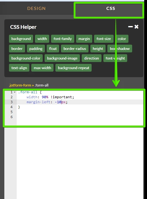
Save the changes and preview your form in the mobile device

Kindly confirm if this fixes the issue.
-
mudbuggerReplied on May 14, 2015 at 12:36 PM
Applied. No change upon viewing on iPhone 4.
-
SammyReplied on May 14, 2015 at 1:58 PM
Try changing the width of the div containing the iframe , see modified code below
Original was 396px is modified it to 320px
#u26459 {background-color: transparent;border-color: transparent;border-style: none;left: -10px;margin-top: 3px;min-height: 2311px;position: relative;width: 320px;z-index: 260;}
-
mudbuggerReplied on May 14, 2015 at 3:04 PM
>Try changing the width of the div containing the iframe
I am not a coder. Could you please explain the steps specifically?
What I infer is: Preferences> Form Styles> Inject Custom CSS
But are you asking me to replace the contents of the field for "Inject Custom CSS"?
-
SammyReplied on May 14, 2015 at 3:22 PM
Sorry for the oversight.
A simpler approach will be to set the maximum width of the embedded iframe as follows
<iframe id="JotFormIFrame" onDISABLEDload="window.parent.scrollTo(0,0)" allowtransparency="true" src="//form.jotform.us/form/51316873270151" style="height: 1998px; border: medium none; width:100%;max-width: 320px;" scrolling="no" frameborder="0"></iframe>
This should give you the same results as the screenshot in the previous answer.
-
mudbuggerReplied on May 14, 2015 at 3:55 PM
I have already performed an equivalent to this with the cloned form which was customizing the size of the original desktop/tablet form.
The current goal is to not have to customize the size for a phone version which the above recommendation is not achieving.
Please refer to post:
Answered by mudbugger on May 12, 2015 at 06:42 PM
To reiterate:
"re-creating the form defeats the purpose of a responsive design where we only build one form, to port to each of the three types of devices (desktop, tablet, and mobile phone) without having to re-work a clone of the desktop/tablet form to work on the some phone devices.
I wonder if it has something to do with the width of "Size" and/or "Columns" which somehow dictates other elements on the page that are not JotForm elements, even when placed as in iframe. Because this is exactly the problem that is happening.
If I keep only my header and footer with no other elements other than the imported iframe—and use the desktop/tablet version of the form, it shrinks the size of my header and footer."
-
David JotForm Support ManagerReplied on May 14, 2015 at 5:04 PM
The iFrame code will not conflict within anything on your site, so nothing in your JotForm will dictate other elements on the page that are not JotForm elements.
For what I understood, your form is not responsive on iPhone 4(not S), I recall testing your form in an iPhone 4 emulator, where the form looked just fine, have you tried testing in another same device? Probably the browser on that specific device is outdated, please try updating it and also testing in another device.
-
mudbuggerReplied on May 15, 2015 at 12:37 PM
Thank you.
>"For what I understood, your form is not responsive on iPhone 4(not S), I recall testing your form in an iPhone 4 emulator, where the form looked just fine"
To clarify: The form embedded via iframe itself is responding to fit in the space. Therefore the current issue is not about whether or not it is responsive.
The issue is that if all I have on a web page is
1) header
2) footer
3) basic text
then all three fill with width of my device which is acting as it should.
Yes. I have checked on another iPhone 4 and the issue persists.
However, when I embed a JotForm iframe, the contents of the form fill the width of the device while shrinking the header, footer and basic text.
I can see myself on emulators that my elements and your form fill the width and there is no shrinkage of my elements. I can also see that on my actual phone, this is not the case as posted earlier in this thread and posted again below.
The width of the field for this thread is the width of the image below. If it were working correctly, the header, footer and basic text would run the full width of this text field.
I understand that this issue may never be resolved and that I will need to clone my original forms which work for desktop/tablet and customize them for phone devices so that they no longer shrink the header, footer and basic text.
-
CharlieReplied on May 15, 2015 at 3:03 PM
Apologies for asking, the thread is quite lengthy and I'm having a hard time to track down what changes you have made. Could you confirm the following if it's alright:
1. So basically the problem is that the width for the header, footer and basic text is not responsive or does not show the correct width?
2. May I know what form and what web page it is, I see you have 3 links and now sure if you are working on test pages or you have another one.
3. What you would like to achieve is one web page where the embedded form will be responsive, and you don't need to create specific forms to cater specific devices, in this case iPhone 4 or iPhone 4S?
4. If it's possible, could you give us a final test page where we can use it as a reference to avoid confusion with others?
We'll wait for your response.
Just a quick tip also, you can try configuring your viewport here: https://developers.google.com/speed/docs/insights/ConfigureViewport. See if it'll give you a more responsive layout in your website.
Thank you.
-
mudbuggerReplied on May 15, 2015 at 3:47 PM
1. So basically the problem is that the width for the header, footer and basic text is not responsive or does not show the correct width?
They seem to be responding to the addition of your form by not displaying the correct width (not wide enough).
2. May I know what form and what web page it is, I see you have 3 links and now sure if you are working on test pages or you have another one.
The one for you to focus on http://explorewithjoseph.com/phone/ga.html as stated May 13, 2015 at 10:51 PM
Photo here:
http://submit.jotform.com/uploads/forum/guest_51137597737062/1431446344photo%20ga%20long.JPG
3. What you would like to achieve is one web page where the embedded form will be responsive, and you don't need to create specific forms to cater specific devices, in this case iPhone 4 or iPhone 4S?
To clarify: The form embedded via iframe itself is responding to fit in the space. Therefore the current issue is not about whether or not the Jotform is responsive.
The issue is that IF the only elements I have on a web page are 1) header 2) footer and 3) basic text, THEN all three fill with width of my device and act as they should.
However, IF I embed a JotForm iframe on a page with 1) header 2) footer and 3) basic text, THEN the contents of the form fill the width of the device properly but it shrinks my header, footer and basic text.
Therefore, I have no choice but to deduce that adding the JotForm is causing the problem of my elements not filing the width of my device because adding the form was the only difference.
As consistently stated throughout thread, I am using "iPhone 4 (not 4s)".
4. If it's possible, could you give us a final test page where we can use it as a reference to avoid confusion with others?
Test page: http://explorewithjoseph.com/phone/ga.html
I feel that if this can be figured out with this test page, any resulting working solution should work for the others.
Thank you for your attempts to troubleshoot.
Just a quick tip also, you can try configuring your viewport here: https://developers.google.com/speed/docs/insights/ConfigureViewport. See if it'll give you a more responsive layout in your website.
Thanks for the tip, but I am not a coder. Again: I understand that this issue may never be resolved and that I will need to clone my original forms which work for desktop/tablet and customize them for phone devices so that they no longer shrink the header, footer and basic text.
-
SammyReplied on May 15, 2015 at 5:15 PM
I will keep on working on a solution for your scenario,and will give you feedback as soon as i have a working workaround.
A suggestion i had was to build the header and footer around a responsive copy of the form then scale it up to for the web and desktop, this will ensure proper behavior across any device scenario and will also involve less effort.
Your patience is greatly appreciated
- Templates
- Integrations
- INTEGRATIONS
- See 100+ integrations
- FEATURED INTEGRATIONS
 PayPal
- Slack
- Google Sheets
- Mailchimp
- Zoom
- Dropbox
- Google Calendar
- Hubspot
- Salesforce
- See more Integrations
- Products
- PRODUCTS
- Form Builder
- Jotform Enterprise
- Jotform Apps
- Store Builder
- Jotform Tables
- Jotform Inbox
- Jotform Mobile App
- Jotform Approvals
- Report Builder
- Smart PDF Forms
- PDF Editor
- Jotform Sign
- Jotform for Salesforce Discover Now
- Support


