


-
ipbr21054Asked on July 9, 2015 at 7:05 PM
Here is the form 51895460546363
I have a condition on the following,
Which device did you use to access this website.
When Mobile or Tablet is selected you are then shown 2 boxes.
Make & Model.
Currently they are one above the other.
Is it possible to have them side by side.
If yes can you please make the edit for me.
Thanks very much.
-
deniz JotForm DeveloperReplied on July 10, 2015 at 1:19 AM
Hi,
I reccomend you to change your form to responsive.

Also you can check this link How to make Forms Mobile Responsive
Thanks.
-
ipbr21054Replied on July 10, 2015 at 4:47 AM
Thanks,i have now followed the above advice.
I would still like to know if the 2 boxes MAKE & MODEL can be put side by side.
Currently they are one above the other.
-
deniz JotForm DeveloperReplied on July 10, 2015 at 5:22 AM
Hi,
You can use shrink to put boxes side by side:
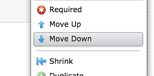
Hope this will helps.
Do get back to us if you need any further assistance.
Thanks.
-
ipbr21054Replied on July 10, 2015 at 5:38 AM
Great,that works very good.
Is there a way to apply the same to the answer fields.
example.
EBAY
FRIEND
SEARCH ENGINE
SOCIAL MEDIA
TO
EBAY FRIEND
SEARCH ENGINE SOCIAL MEDIA
I did try shrink but it did not work.
-
deniz JotForm DeveloperReplied on July 10, 2015 at 7:00 AM
Hi,
You can use spread columns for your radio buttons:

Thanks.
- Templates
- Integrations
- INTEGRATIONS
- See 100+ integrations
- FEATURED INTEGRATIONS
 PayPal
- Slack
- Google Sheets
- Mailchimp
- Zoom
- Dropbox
- Google Calendar
- Hubspot
- Salesforce
- See more Integrations
- Products
- PRODUCTS
- Form Builder
- Jotform Enterprise
- Jotform Apps
- Store Builder
- Jotform Tables
- Jotform Inbox
- Jotform Mobile App
- Jotform Approvals
- Report Builder
- Smart PDF Forms
- PDF Editor
- Jotform Sign
- Jotform for Salesforce Discover Now
- Support


